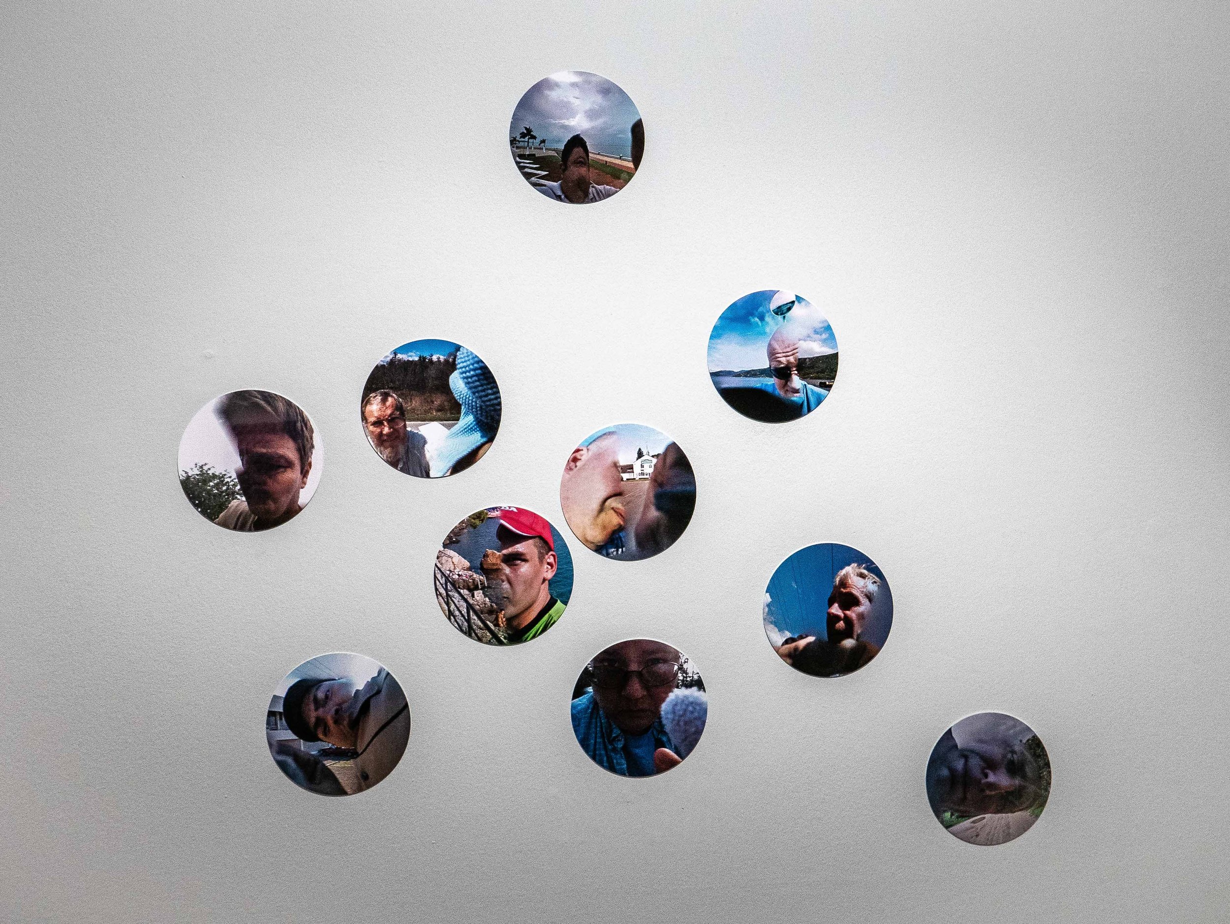
When down in London in February, I re-visited this exhibition in the Photographers Gallery just before it finished. I had spent relatively little time with the exhibits on my first visit (I had gone to the gallery primarily to see Roman Vishniac's photographs) and was anxious that I was perhaps missing the point of some of the work. The various contributors were all presenting images or artefacts from their ongoing research projects making it very relevant to this module but they were all concentrating on negative aspects of internet culture and I had struggled to find any positive messages. I felt that the issues highlighted were all important, the cynicism of the hardware manufacturers and social media platforms, the blatant deceptions perpetrated by individual and corporate users and even governments and the levels of exploitation of their workforce, potentially affecting any one of us.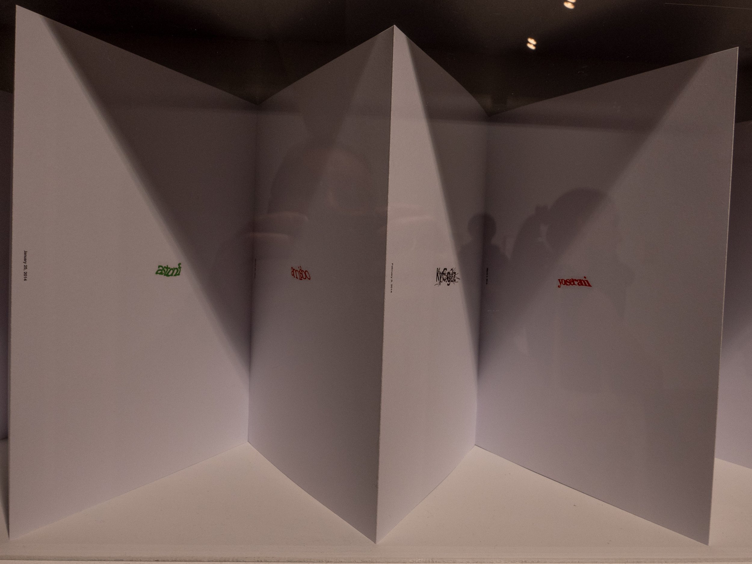
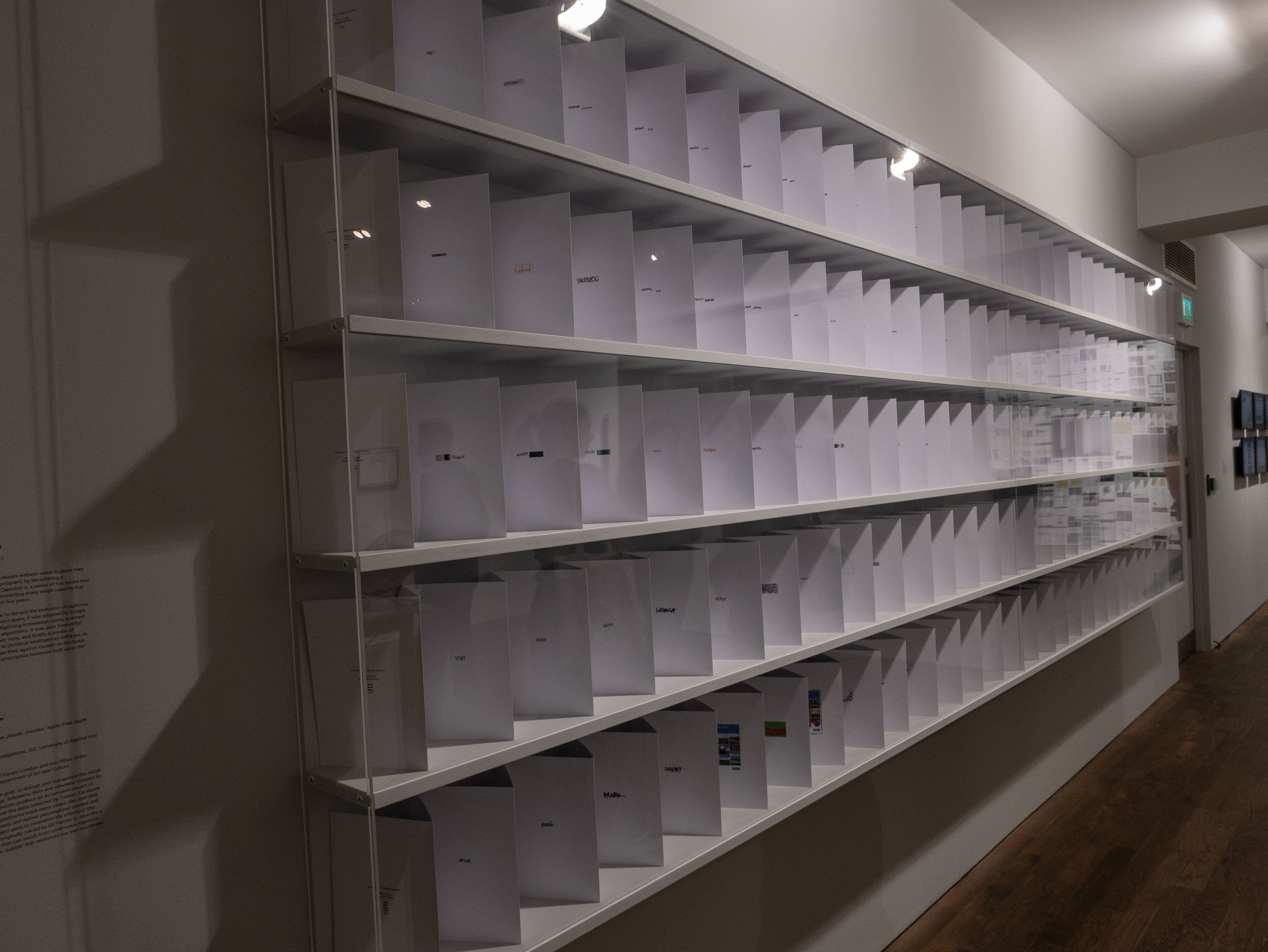 My second visit confirmed this impression and although there were several examples of novel ways of exhibiting work, and some interesting videos by groups experimenting with off grid lifestyles, there was nothing about the benefits of the digital imaging media which many currently enjoy. I initially felt that this was a missed opportunity to explore the democratisation of opportunities to use photography creatively, resulting from the ease of use and access to sophisticated technologies and sources of information but this would have needed a much larger platform and was clearly not the intention of the curators.
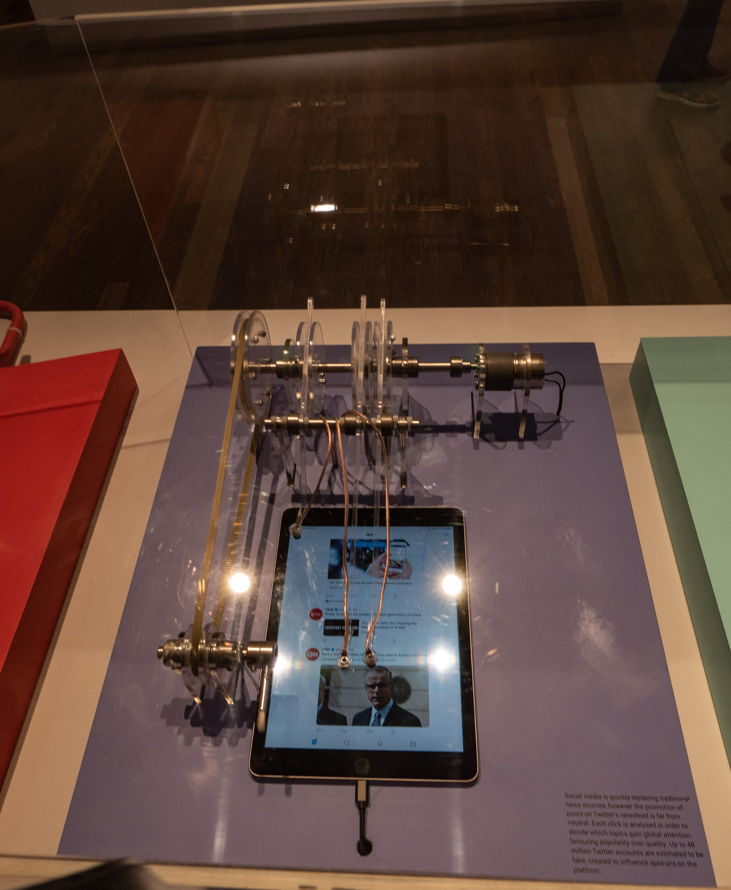
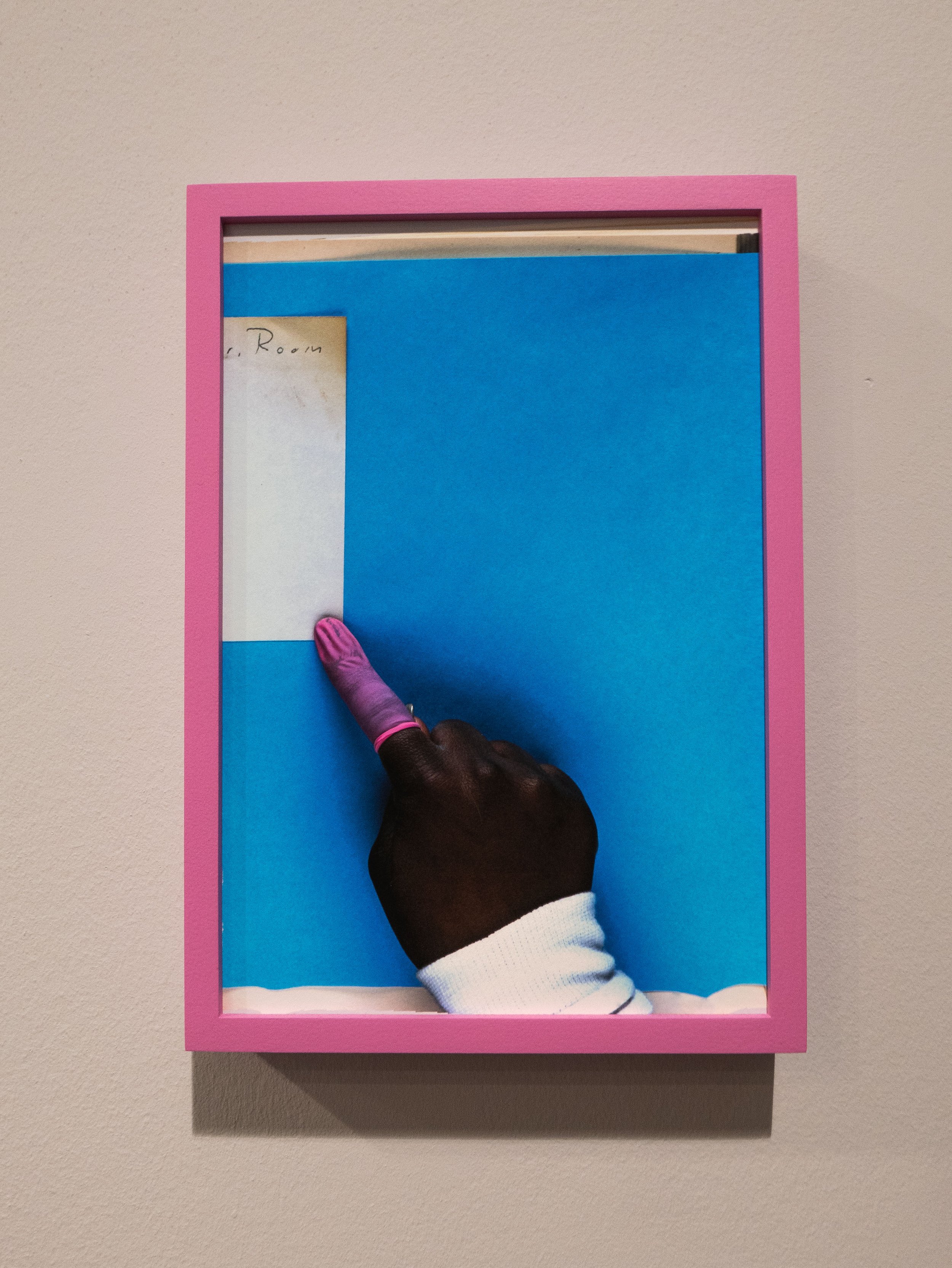 For photographers, the issues which give rise to imminent concern, online financial fraud, plagiarism or repeated recycling of cliched ideas, the rapid turnover of vast numbers of increasingly homogeneous imagery and the built in obsolescence of expensive digital hardware and software (with the failure of manufacturers to provide continuing support) are all well known but were not specifically addressed by the exhibition. Good research often leads to more questions than answers and this exhibition highlighted several new areas of concern, especially in relation to the practices of the large multi-national companies providing our online services but without offering any immediate solutions. All digital photographs of the exhibits used to illustrate this post captured in situ at the Photographers Gallery, London by the author.Featured Image: Photograph of the exhibit - 'The driver and the cameras' (Google street view camera operators), Emilio Vavarelli 2012.Further information about the exhibitors is available from: www.thephotographersgallery.org.uk/whats-on/exhibition/all-i-know-is-whats-on-the-internet
Return to Manchester : Martin Parr
This exhibition currently showing at Manchester Art Gallery focuses on Martin Parr's long term engagement with the people of the city and the surrounding industrial towns of the North West, which form the region of Greater Manchester. From his first student projects in 1970, over a period of nearly fifty years, he has returned regularly and his work now constitutes a substantial documentary record of the changes in the fabric of city's buildings along with its' cultural and social development from an industrial region to modern twenty-first century metropolis.By concentrating on the lives of the inhabitants he has recorded the effects of on one hand, the social deprivation resulting from de-industrialization and on the other, the gentrification of parts of the city, which closely mirrors the changes seen in other major UK cities. The thread which runs through these projects is his ability to capture the warmth and resilience of the people he photographed along the way, especially those from the working class areas.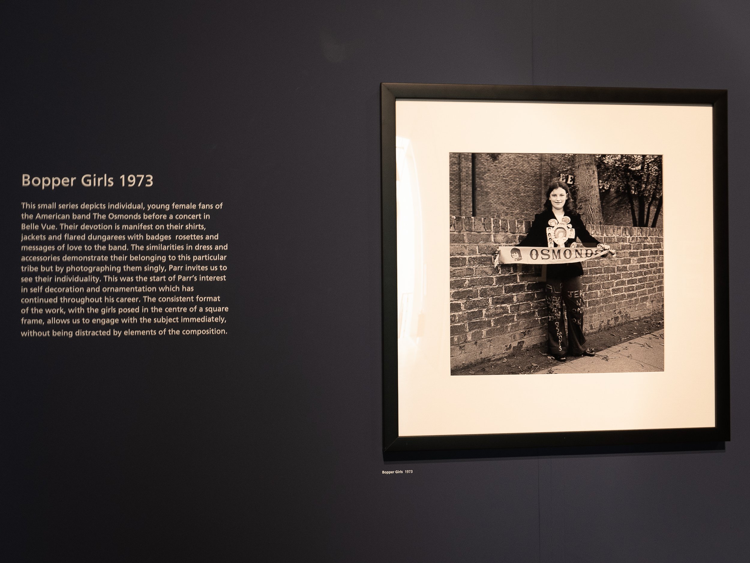 His early black and white photographs are still resonant of the times they covered. His series from the psychiatric hospital in Prestwich are especially poignant and his medium format photographs of girl 'teenyboppers’ manage to capture a sense of the personalities of the teenagers as well as the period detail of their clothing. The layout of the exhibition seamlessly follows his switch to working in colour in the early 1980’s, making the change appear to fit logically with the ways in which that period is now usually remembered (colour in television screens, magazines and newspaper supplements, at that time becoming the norm). The colours recorded in the details of people's everyday lives; shop windows, home decor, clothing, are particularly resonant of the times.
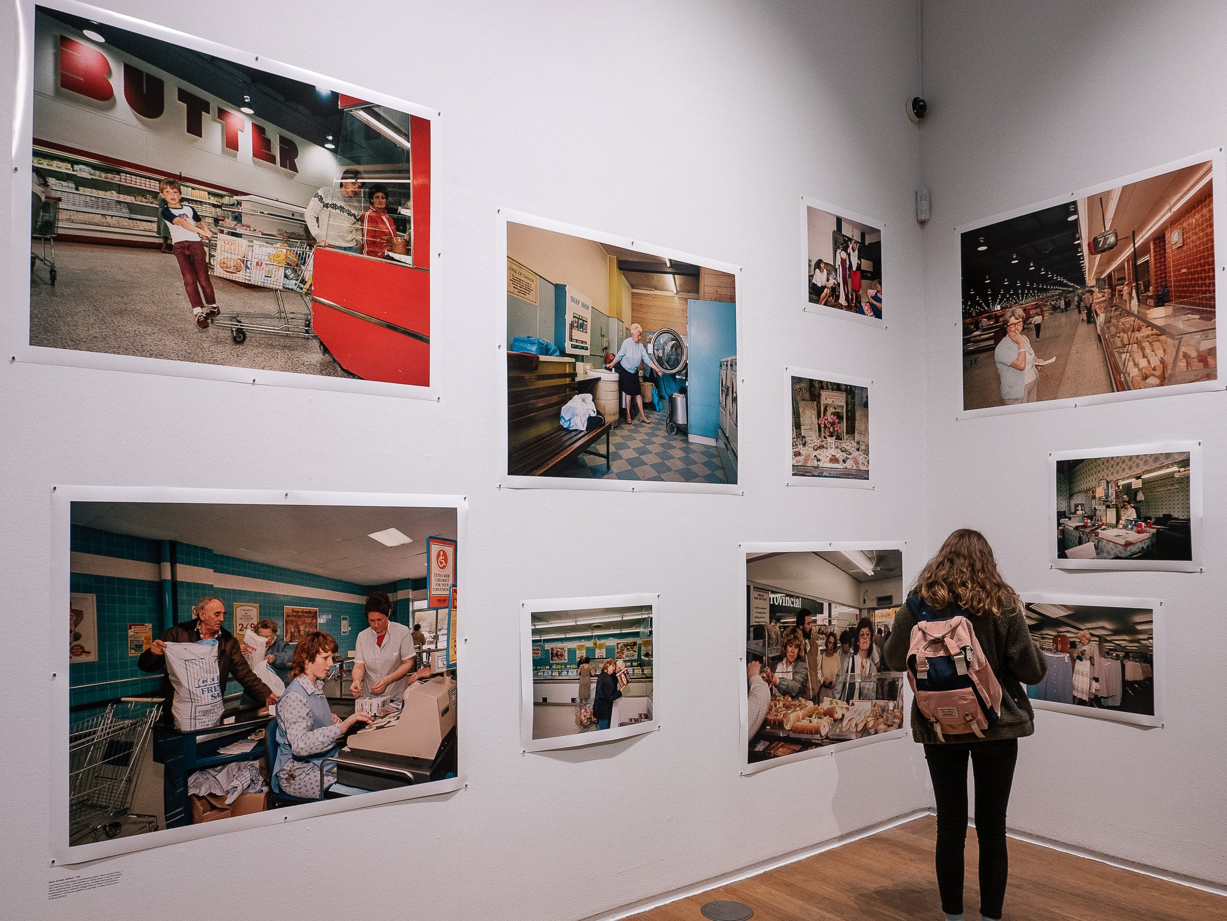 More than a few contemporary photographers (including myself) have commented that they find his more recent digital colour images less easy to relate to, which seems difficult to comprehend given that his working methods and subject matter have not significantly changed and the colours and clarity of detail in the images are if anything truer to life. Perhaps now we already know his work so well that there are now simply fewer surprises or the use of digital capture somehow lacks the resonance we felt looking at the earlier work with analogue materials. Alternatively could it be that these images are too close to what we see around us and in the media every day - does familiarity breed contempt? Perhaps if we are still here, we might respond to them more positively in another twenty years time.http://manchesterartgallery.org/exhibitions-and-events/exhibition/martin-parr/
Diane Arbus : 'in the beginning'
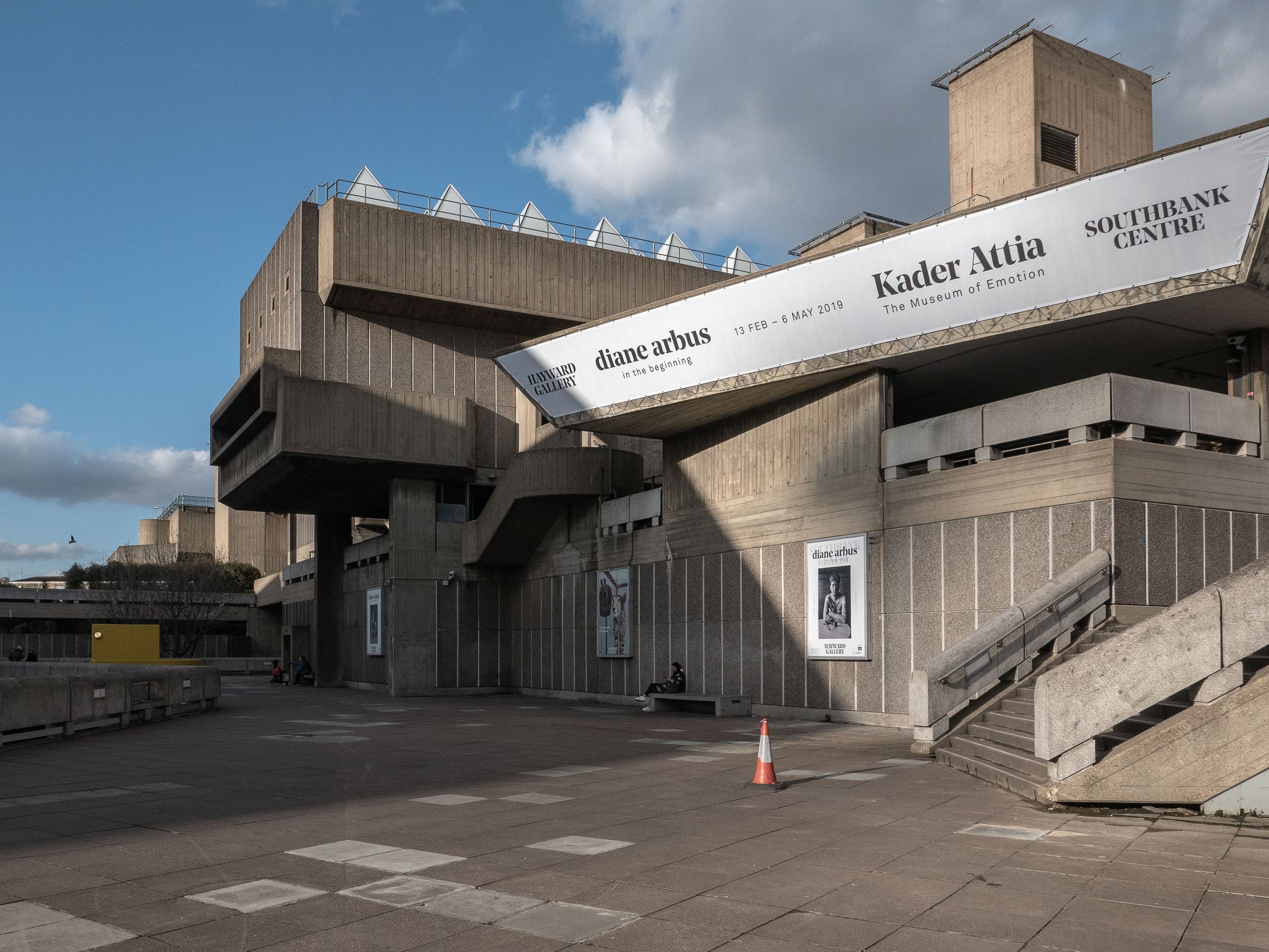 The Hayward gallery in the South Bank Centre in London is currently showing an exhibition of original monochrome analogue photographs made by Diane Arbus (1923-1971) between 1956 and 1962. Although from the age of eighteen, she had worked in fashion and advertising alongside her husband, the actor and photographer Allan Arbus, she did not embark on the work for which she is now well known, until she was in her early thirties. At that time, while she was studying with Lisette Model, she began to make photographs of people she met in the street in and around the less affluent areas of New York City and Coney Island. These images, best described as her early formative work, were made using 35mm film cameras printed at 6 x 9 inches by Arbus herself and two thirds of them have not been shown previously in the U.K.
 As perhaps expected, the quality of the images does not equate with that of her much better known later medium format photographs but the gallery did not permit photography in this exhibition so I have no available examples to show. There was a small area, separate from the main body of the exhibition, showing a folio of ten of her medium format prints (printed at 20 x 20 inches) and the difference in quality was clearly evident. That said, the earlier photographs explored a wider range of subject matter, informal portraits, street photography, people in fairgrounds or at the beach, cinema and theatre audiences and people through restaurant windows. A few images appeared to be screen shots on television sets and there were some found still lives on wet pavements. Several of the prints showed pronounced grain effects and in some (especially the low-light images) the focus was quite soft but this imparted a degree of freshness or rawness to the work which appeared less planned or staged than her photographs from the mid 1960's onwards. This would be an important collection for anyone studying Diane Arbus, demonstrating the early stages of the evolution of her working practice.
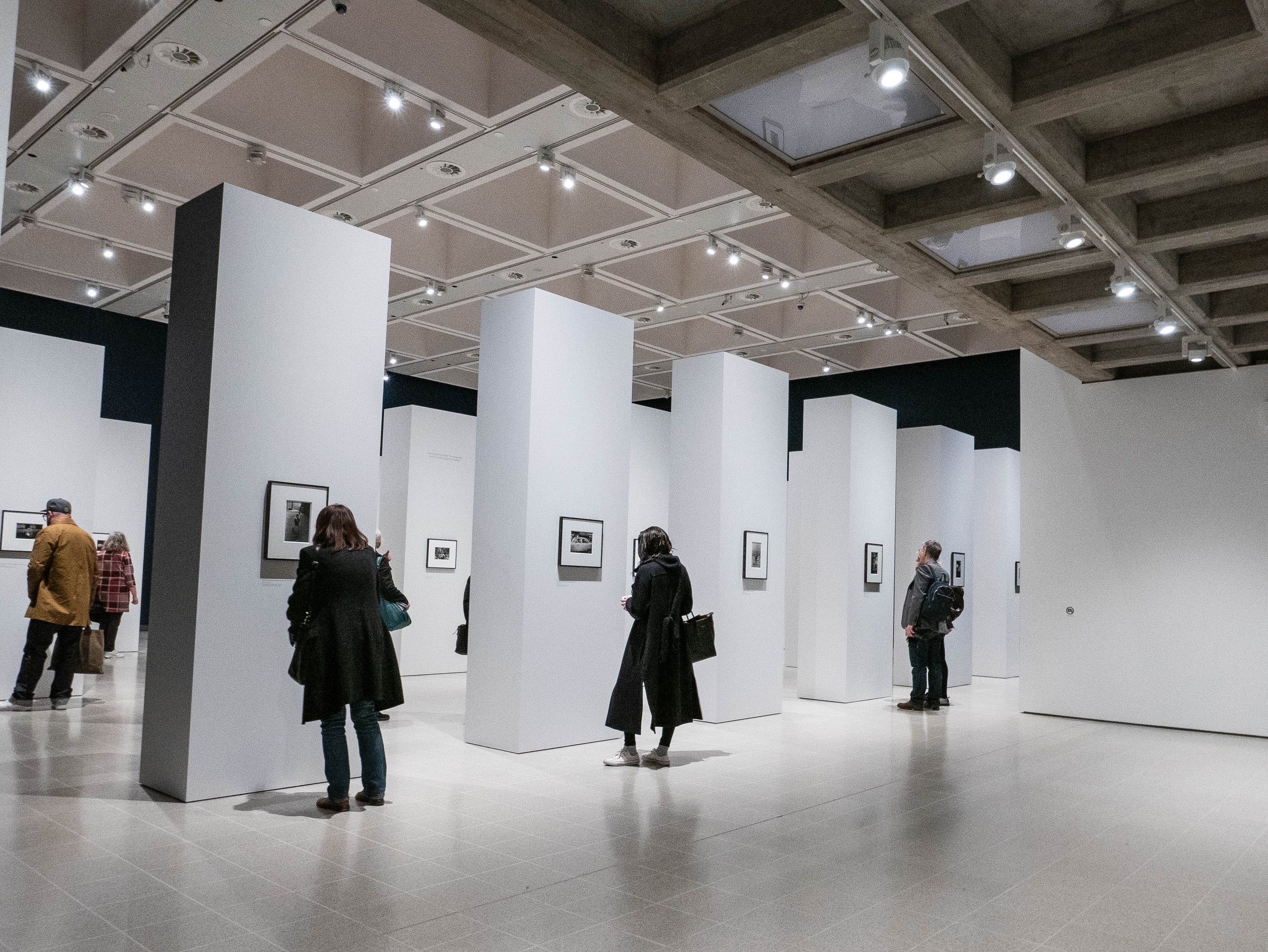 For my own research, perhaps the most striking aspect of this exhibition was the way in which the work was presented (I made the one photograph shown above before I noticed the small 'No Photography' sign on the plain wall on the right of the image). There were no photographs on the perimeter walls of the space, which were painted in a deep rich matt navy blue (almost black) colour. As shown, the main gallery contained about forty evenly spaced free standing pillars painted in matt white with one photograph only on each long side. The prints were traditionally window mounted in dark metallic pewter like frames and the immediate impressions created by the design were of light airiness and opulently high quality minimalist precision, with a hushed atmosphere indicating genuine reverence for the work being presented.Diane Arbus tragically took her own life in 1971 and I think she would have been pleased with this exhibition but although the gallery has gone to great lengths (and expense) to create an impressive setting for the photographs, I felt to an extent that the design almost overwhelmed the actual images, perhaps reinforcing my impression that this was not her best work. In the information at the gallery entrance, the curators explained that the work had not been arranged in any chronological order and that viewers should feel free to find their own route around the gallery at their own pace. This worked well while the gallery was initially quiet but it filled up quite quickly and I was conscious of people around me moving from pillar to pillar in different directions at different speeds to the extent that I felt under pressure to move on, to avoid holding them up. Although many were individually fascinating, the disparate selection of images were placed surprisingly randomly with no obvious attempt to formally sequence them. This could of course have been an attempt to subliminally re-create the feel of the circumstances in which they were created but overall it felt more like a triumph of style over substance.https://www.southbankcentre.co.uk/whats-on/exhibitions/hayward-gallery-art/diane-arbus-beginninghttps://www.biography.com/people/diane-arbus-9187461
Anders Pleass : Making and taking pictures - a selective relation between painting and photography.
This gallery lecture was delivered by Anders Pleass, at Oriel Colwyn on 28th February, in support of their current exhibition of John Hedley's images of rock formations and trees, which are produced using a combination of digital photography with traditional intaglio printmaking. In a wide-ranging presentation, he described his personal journey from an undergraduate in environmental biology to studying fine art and his attempts to take the lessons from his scientific background into painting, incorporating these in a creative model in developing his 'post-painterly abstraction' techniques for making images. As the slide from his talk used as a featured image for this post shows, he has a detailed knowledge of art history and an ability to recognise when artists (and photographers) reference work from the past when researching their ideas for projects. He described in detail his own research into art theory, significantly influenced by the writings of modernist and post-modernist thinkers, notably the visual art critic Clement Greenberg, the philosopher A. J. Ayer and the novelist and art theorist André Malraux. The artists whose work influenced his practice included Morris Lewis, Ian Davenport, Calum Innes and Bernard Frize but in addition to post-painterly abstraction he studied Systems Theory (Humberto Maturana), Chaos Theory (Edward Norton Lorenz) and comparative embryology, Emergence Theory and more general interests including theatre (especially Shakespeare and the Riddle of the Sphinx from Oedipus Rex).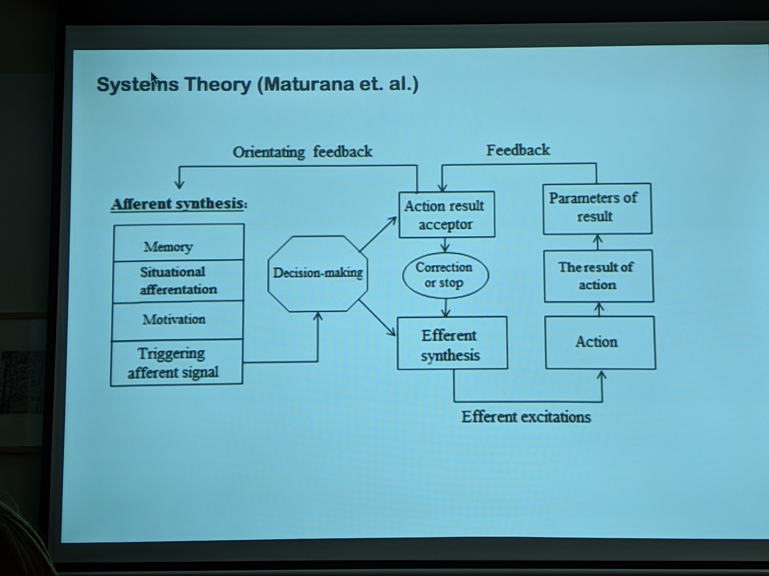 The artist he worked most closely with was Brad Lochore, some of whose large paintings of shadows (which I was previously unaware of) are superficially very similar to a series of photographs I have been making over the last two years. Pleass assisted in the making of these paintings for several years as a painter technician and explained that they were based on photographs which were transcribed onto canvas, section by section using a technique which he described as being almost like 'painting with numbers'.
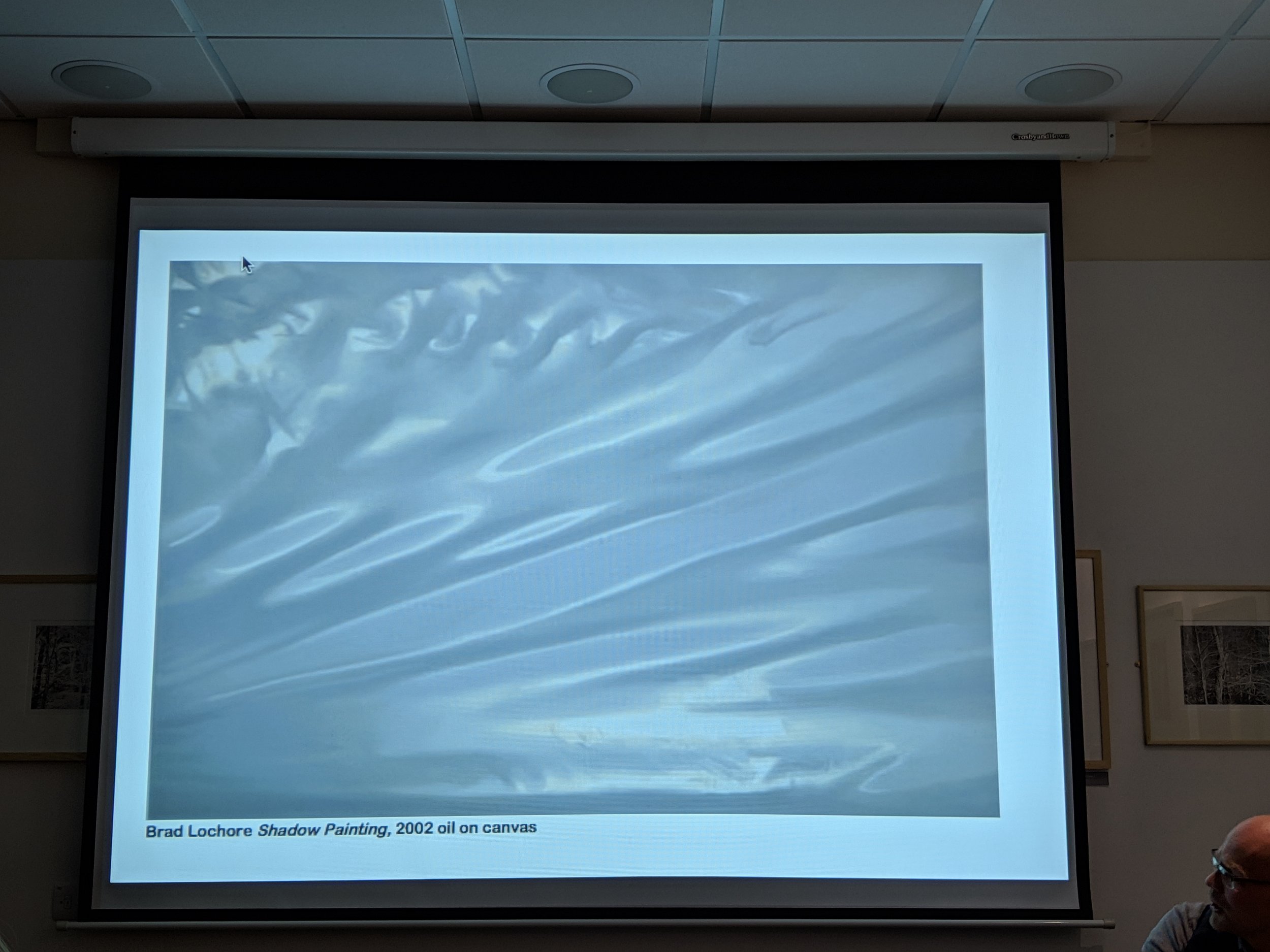 Although his work with Lochore provided an income, he had no artistic input (Lochore never involved him in the creative process or even discussed the images with him) and he went on to talk candidly about the tribulations of trying to establish his own career as an artist and his subsequent transition to his present vocation as a freelance curator. He first met John Hedley in 2014 when they were both teaching in the Arts Department at Coleg Llandrillo and credits Hedley with introducing him to the educational concepts of visual literacy and hermeneutics. He described the working process used by Hedley as 'primordial image formation', images which appear as metamorphoses evolving from the natural world. The two groups of intaglio prints in this exhibition are firstly monochrome images trees in a woodland and secondly the surfaces of rock formations (in Anglesey and Crete). Pleass feels that the real subject of them is 'time', as in ideas of time moving slowly, the timescales of their references to art history and geological time. He also commented on the similarities in some of them to satellite images and aerial photography.My interest in the work and the reason for going to this lecture, was in the process used as an example of a hybrid technique which combining photography with traditional printmaking. While I am still exploring several potential areas for my research project, it will include studying an aspect of the interface between analogue and digital technology (hence the title of my blog). I also have a shared interest in his subject matter having worked with textures in, rock surfaces, tree bark and sand dunes as well as my photographs of shadows, reflected light and paintwork. The additional bonuses of attending this talk were the depth of the contextual background information covered by Pleass and learning about several artists whose work I should now consider. John Hedley is giving his own talk about his working methods in the next few weeks and I hope to be able to get there.
Colour darkroom printing
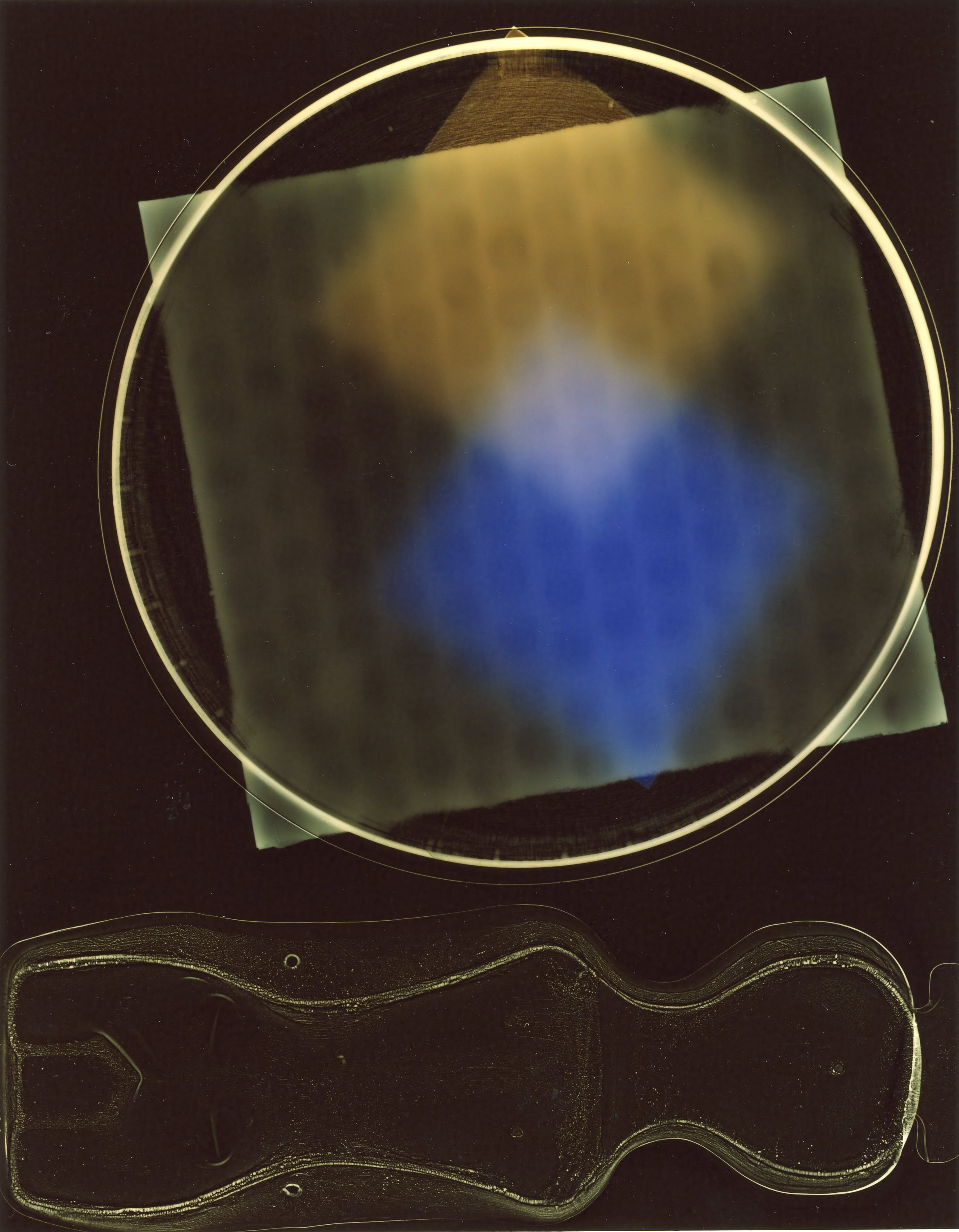
In looking for more imaginative ways of making photograms in the darkroom, I have been exploring the possibility of creating them in colour using 'C' Type papers and RA4 chemistry. As a result of the panchromatic nature of colour materials, the practicalities of colour printing are more complex than monochrome printing with silver gelatin processes. The papers need to be handled in total darkness (no safelight). They degrade quickly if not stored correctly and the chemistry also needs to be fresh. The processes require higher temperatures for the chemicals which need to be tightly controlled, especially the colour developer (to plus or minus 0.5 degrees). Although black and white darkroom papers can produce interesting results even when many years out of date, after several completely unsuccessful attempts to produce an image, I have learned the hard way that this does not work with expired colour chemicals or with colour papers which had been stored for several years. Having obtained a new box of Fujicolor Crystal Archive paper and Tetenal RA4 chemistry, I have finally managed to make some test prints which have strong bold colours and am hopefully about ready to start making some new images.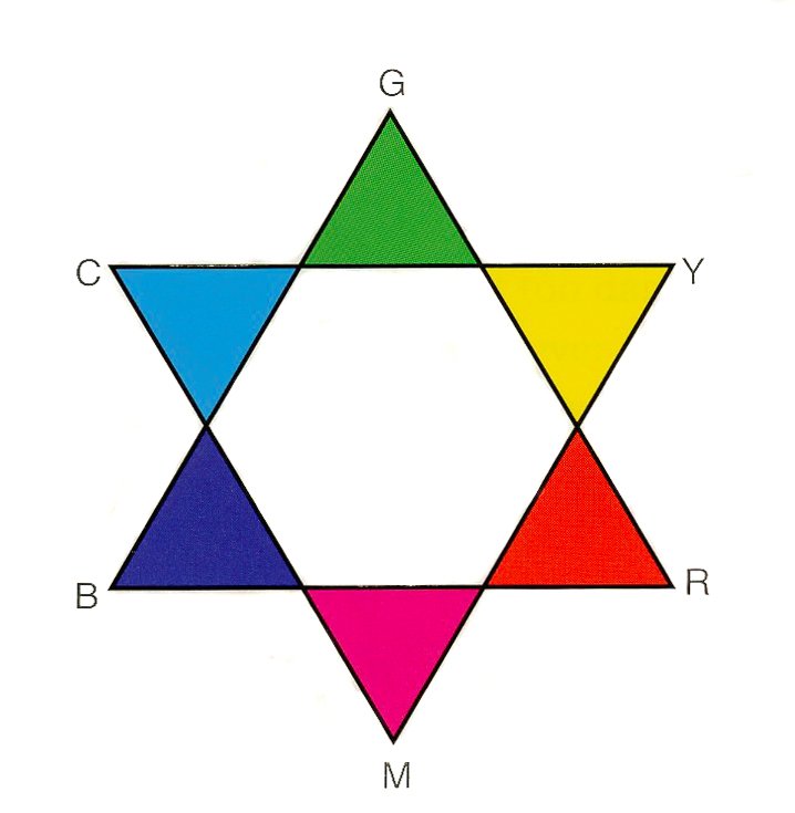 Getting to this stage proved more challenging than initially expected and I found it difficult to think in terms of inverted colours as well as inverted tones. For example, correction for a yellow cast in a print, requires the addition of its' complementary colour i.e. blue (Fig 1. above). The colour produced on the print is however the inverse of colour of the light projected on it so confusingly, to correct a yellow cast it is necessary increase by filtration, the amount of yellow emitted by the light source (see Fig. 2 below). When researching this I realised with regret that I had thrown out all my basic "how to" photography books which at the time seemed redundant but would have contained all this information. I also discovered that in most of the current versions of these books available in the college library, the sections on colour printing in the darkroom have been largely replaced with information on digital imaging but I found a limited amount of what I needed in "Langford's Advanced Photography" (8th Edition).
 Out of the box, colour papers have a cyan coloured coating on the surface which acts as an anti-halation layer and presumably at least partially corrects for the orange mask present on the surface of most colour negative films. My plan is to attempt to make colour photograms and am not using negatives so the cyan coating produced a very strong reddish brown cast on my initial tests (Test print 1) and after experimentation I found that much stronger yellow and magenta filtration than anticipated was needed to achieve anything close to neutral greys (bottom (R) image on Test print 7).
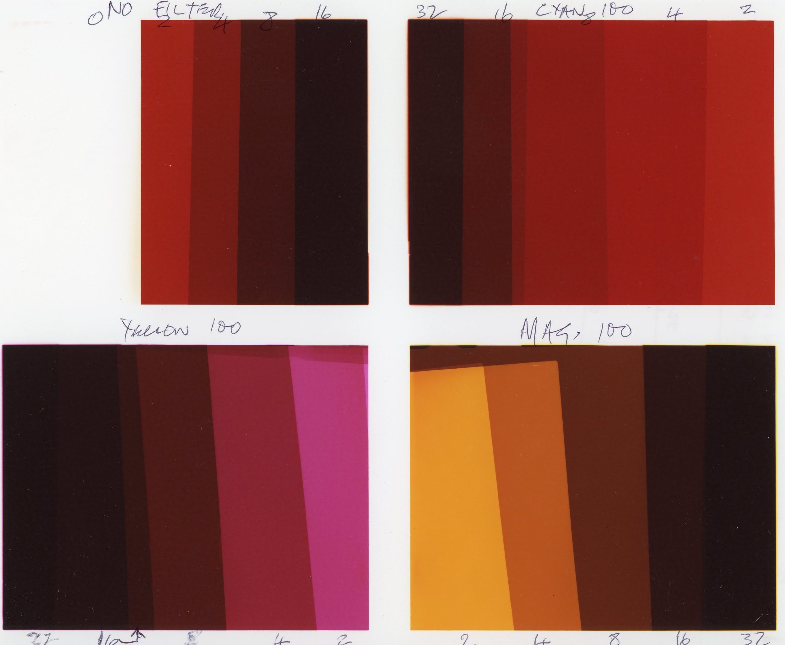

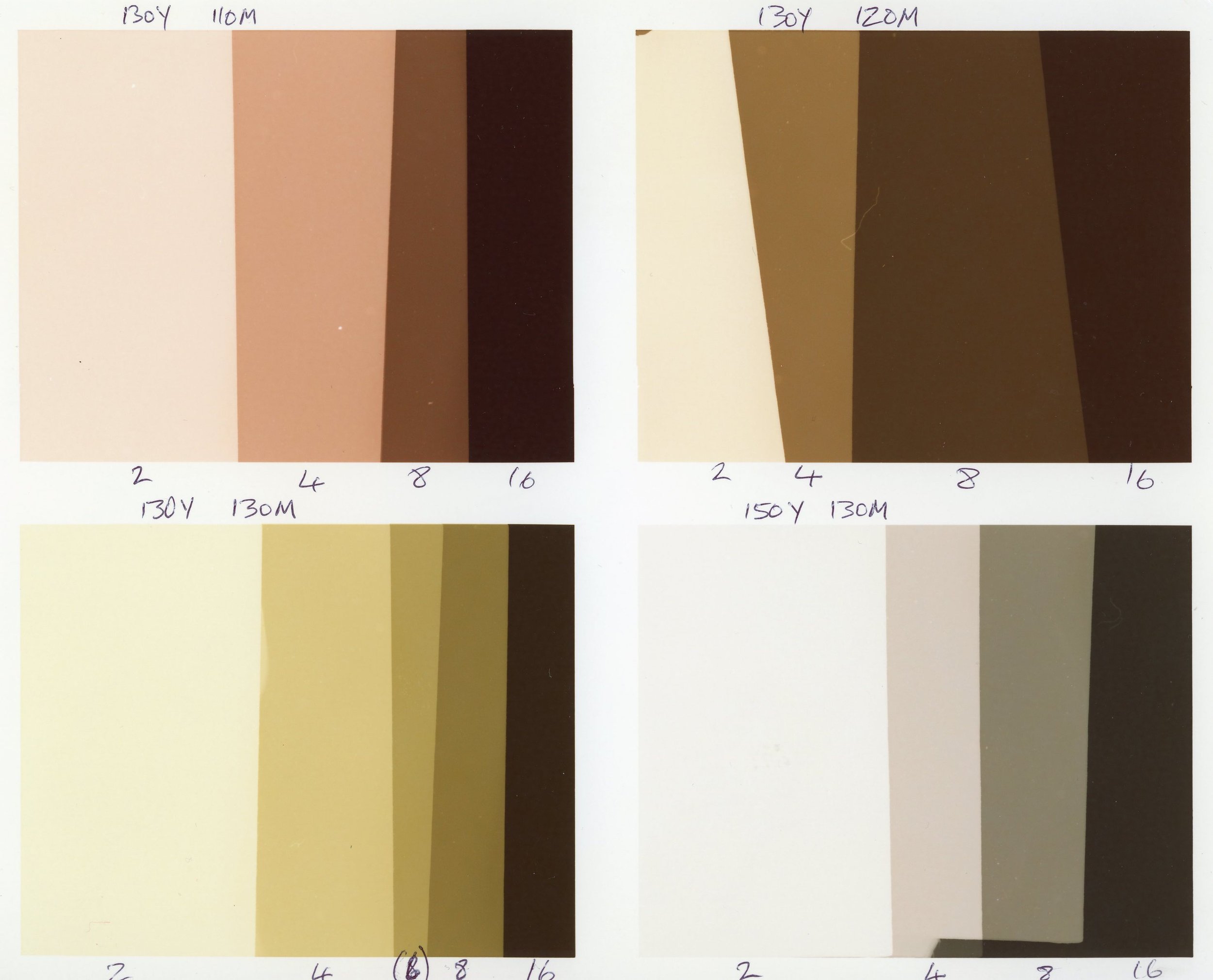 In the process of reaching a reasonable approximation for the basic colour filtration required for neutral tones, I have discovered that it will be possible to produce a wide range of both bold and subtle colours which potentially offer exciting possibilities for the work I am hoping to create. This is will undoubtedly involve more experimentation and although the element of serendipity is often useful in producing photograms, in addition to fine tuning the colours utilised, I will need to develop a technique for getting the objects used into the optimum position on the paper in complete darkness before making the exposure. The image below, my first crude attempt to produce a colour photogram, shows some of the visual potential of the technique, while demonstrating the need to tackle the issue of alignment of the objects on the paper.
 Reference: Langford M and Bilissi E, 'Negative/Positive Colour Printing' In: Langford's Advanced Photography (8th Edition) pp 296-301. Focal Press (an imprint of Elsevier), London, 2011.
‘A Summer of Discovery in Wales: Aerial Archaeology and the Remarkable Heatwave of 2018’
January 29th 2019I went to this lecture, given by Dr Toby Driver on behalf of the Royal Commission on the Ancient and Historical Monuments of Wales at Pontio in Bangor last night. He described the use of aerial photography during the surprisingly hot, dry period in late June and July last year when the cropmarks in the fields throughout Wales, revealed many sites of archaeological interest which have been buried under the ground for hundreds and in some cases thousands of years. These images of the outlines of sites which cannot normally be seen on the surface, included several completely new discoveries in areas previously unknown to contain any historical artefacts. They also revealed many of the recorded sites in unusually clear detail and revealed a number of new areas of potential interest in the land adjacent to them.The lecturer explained that the mechanism by which these cropmarks appear depends on the differential growth, ripening and drying out of the plants due to the amount of water held in the underlying soil. Where the layer of soil is deeper, for example where there have been ditches around fortified buildings or pits for waste, more water is retained and the growth remains lush and green, drying out and yellowing more slowly than the surrounding areas. Here the soil is shallow, over paved areas, roads or the footings of buildings, the crops run out of water and dry out more quickly. The unusual feature of last summer was the length of the period without any rainfall - the cropmarks normally disappear quickly after any rainfall and are also destroyed when they are harvested by the farmers (who need to do this before they spoil) or grazed by livestock. The drought provided the researchers with a three week interval allowing them 35 hours of flying time in which they made a total of 5700 digital exposures. They are still in the process of reviewing and analysing these photographs which can also involve enhancing the information from them in Photoshop, using tonal separation tools in the colour channels (concentrating on shades of greens and yellows) to produce remarkably detailed monochrome images.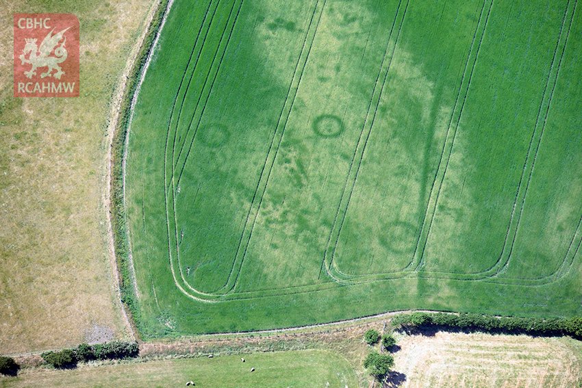 The cultures which created the structures and building outlines seen in the images range from prehistoric tribes, through the Celtic people of the Bronze and Iron Ages, the Roman Occupations and Mediaeval populations right up to the early part of the twentieth century. The structures seen include settlements and hut circles, burial mounds and iron age barrows, ditches, field systems and enclosures, Roman roads, forts, marching camps, villas and bath houses, mediaeval churches, monasteries and graveyards and training camps dating from the first world war (e.g. on the Kinmel Estate near Bodelwyddan). The researchers are particularly interested in the relatively poorly documented routes used by the Roman armies in subjugating the Silurian tribes in South Wales and the Ordovices and Deceangli in North Wales in the period between 47AD and the end of the first century and believe they have identified potential sites for several previously undocumented marching camps and new sections of the Roman road network. While these will need to confirmed by groundwork, geophysics and LIDAR imaging this appears to be a good example of the use of this highly specialised application of photography as a tool for ethnographic research.www.rcahmw.gov.uk (Cymraeg = www.cbhc.gov.uk)www.coflein.gov.ukThe images used to illustrate this post were taken by Dr Toby Driver and were retrieved from the website of the Royal Commission on the Ancient and Historical Monuments of Wales who hold the Crown Copyright for them.
All I know is what's on the internet
This exhibition currently showing at the Photographers' Gallery in London is a study of a group of artists examining several aspects of the effects of digital imaging and online media on the ways in which photography is used in contemporary cultures. The title is a quote from one of Donald Trump's press interviews during the 2016 US presidential election campaign which perhaps reflects the less than positive effects some of the contributors have uncovered in their research. Although the impression is often given that everything that happens on the internet is fully automated, the exhibition looks at the huge workforce required to support the infrastructure of the involved technology companies, service providers, search engines and social media platforms, including among others programmers, online support teams, 'clickworkers', content moderators, people employed to copy books for online publication and google street view camera operators. The issues of manipulation of cultural tastes (the 'like' economy and false social media accounts) and of unequal access to online content in different parts of the world are also explored.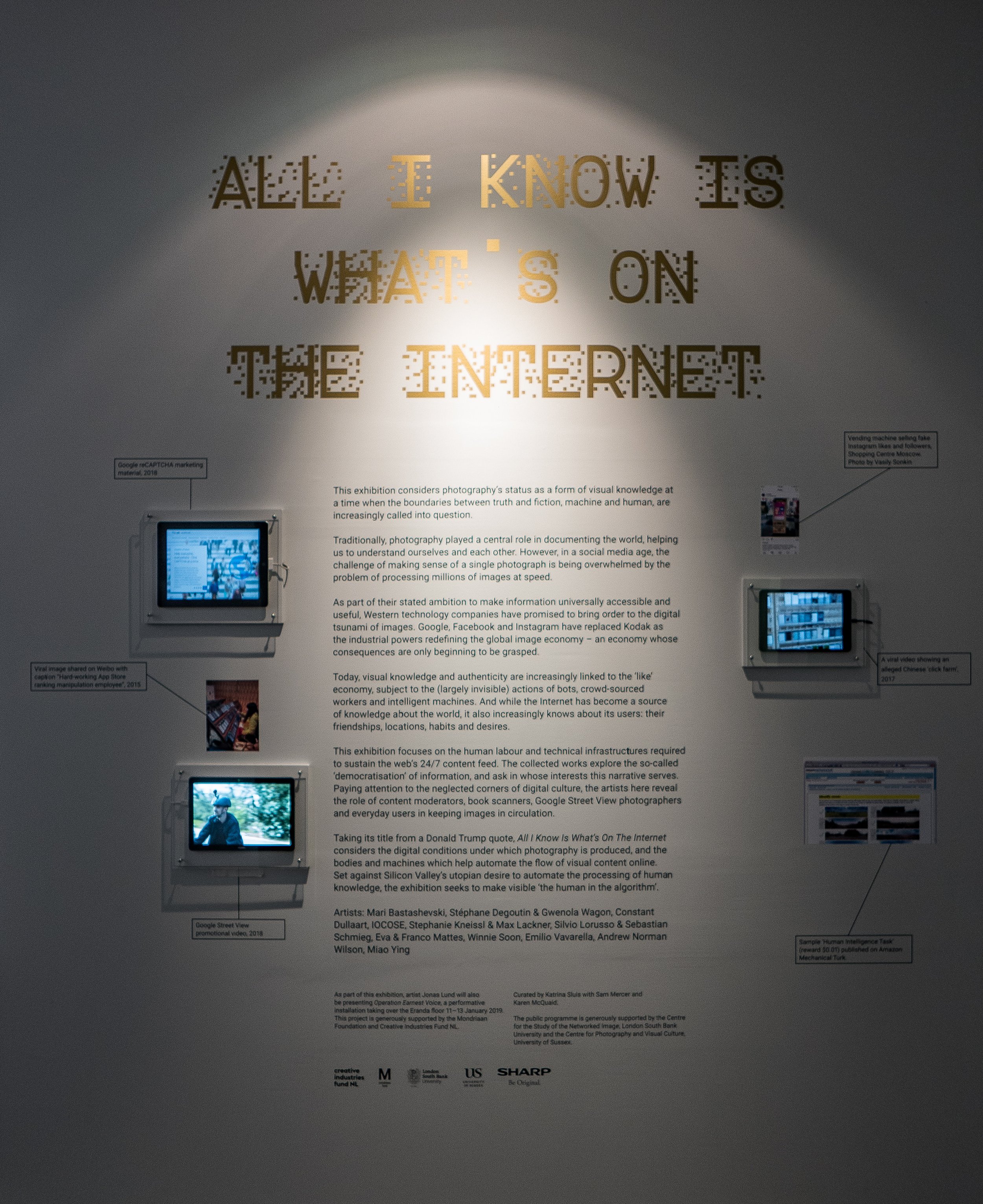 This was not a typical photography exhibition in the sense of the images being visually or aesthetically stimulating but it was certainly thought provoking and there was a lot to take in. The image which left the strongest impression was a mind map produced for the Photographer's Gallery by Mathew Fuller and Olgia Goriunova, exploring the future role of photography which was described as a deliberately 'incomprehensible diagram' based on a Powerpoint slide from a presentation by General Stanley A. McChrystal who was quoted as saying "when we understand that slide we will have won the war"
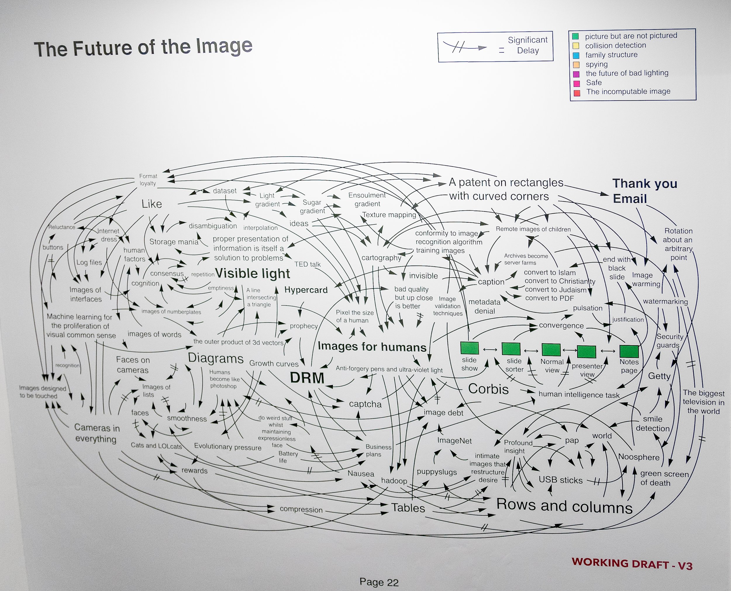 There can be no doubt that the role of still photography is changing rapidly but where it will end up in the future is anybody's guess. I left this exhibition feeling I need to engage more actively with the online world if I am ever going to make any sense of it. Perhaps the exercise of writing this blog will prove to be a good starting point.https://thephotographersgallery.org/whats-on/exhibition/all-i-know-is-whats-on-the-internethttps://thehill.com/blogs/ballot-box/presidential-races/272824-trump-all-i-know-is-whats-on-the-internetPhotographs of the installation used were taken at the exhibition by the blog author.Update 17 Feb 2019 Have recently seen the film 'WhiskyTangoFoxtrot' which was based on the memoir of the American journalist Kim Barker. A copy of the original US Army diagram on which the above image is based appears in a scene set in an army intelligence briefing room.https://www.comingsoon.net/movie/whiskey-tango-foxtrot-2016#/slide/1
The Photographers' Gallery, London
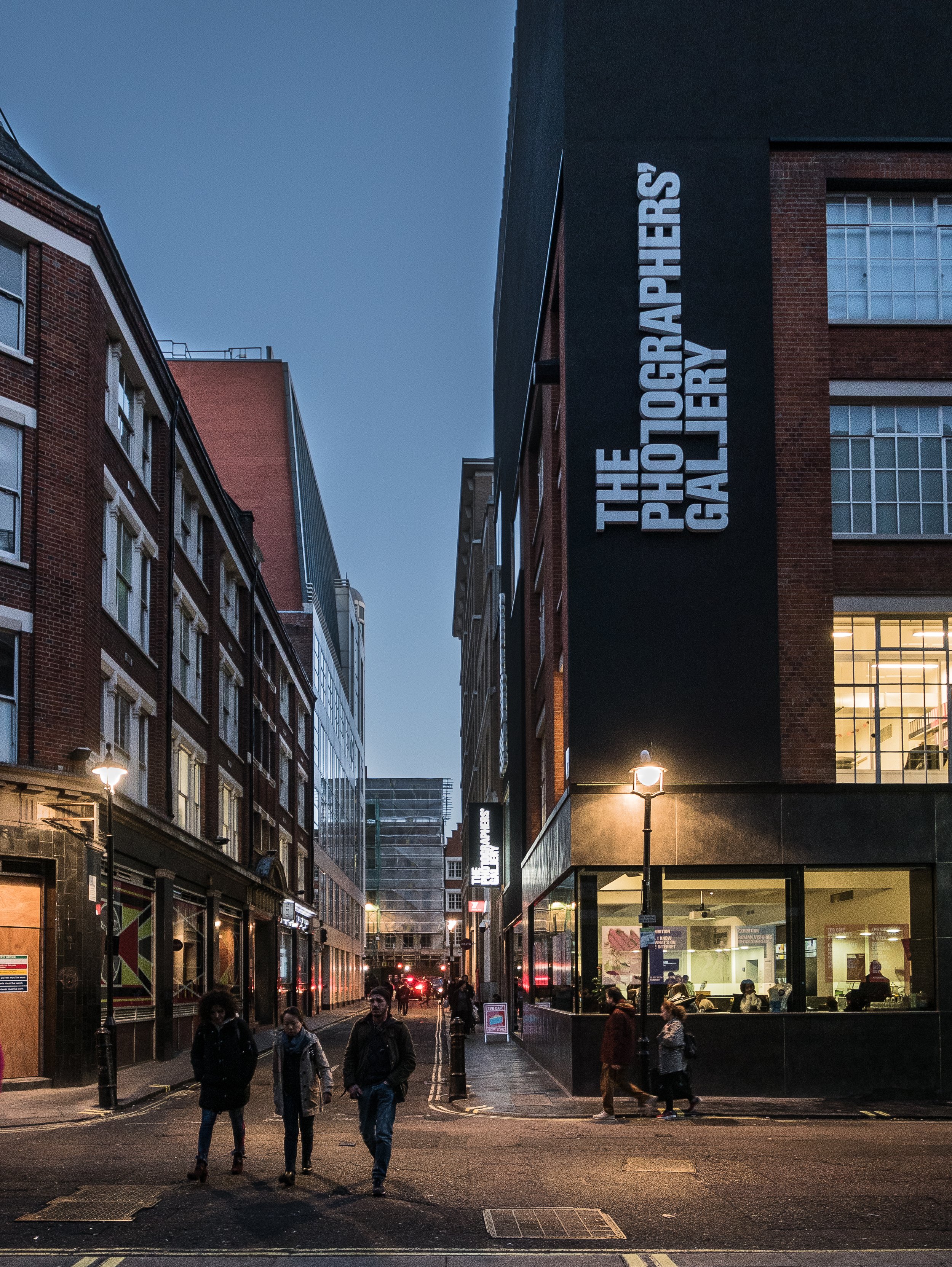 While in London last month I also visited the Photographers' Gallery where the two current exhibitions on show are 'Roman Vishniac Rediscovered' (in collaboration with the Jewish Museum of London) and 'All I Know is What's on the Internet' (a quote from Donald Trump). I will consider the second of these in a separate blog.
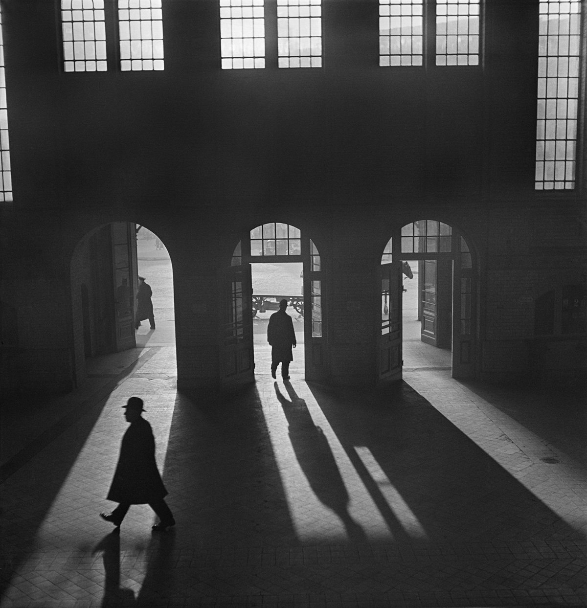 The larger exhibition, on Levels 4 and 5 of the gallery is an extensive retrospective of the Russian born American photographer Roman Vishniac (1897-1990). Vishniac had moved from Moscow to Berlin to escape the aftermath of the Russian Revolution in 1920 and his best known body of work is a large social documentary portrait of the Jewish population of Eastern Europe, mainly Berlin and Warsaw in the inter-war years, coinciding with the evolution of modernism and the rise of fascism with the resultant persecution of these communities. It is a unique document of the dramatic changes in these societies from a atmosphere open to artistic expression and social multiculturalism to the sectarianism and oppression of the Nazi regime and the populations decimated by their policies.The layout of most of the exhibition is a traditional wall mounted chronological sequence of very fine vintage (and some newly re-printed) monochrome prints, including studio and candid portraits as well as street photography and images of agricultural workers. On escaping from Germany in the mid-1930's, he moved to the USA and quickly established a successful commercial portrait studio. His other interest was the photography of microscopic life forms and his pioneering work in colour photomicrography led to an academic career and professorships in biology and fine art photography in several American universities - a selection of these images were presented in a separate room from the main exhibition as a projected slide show along with several of his publications displayed in glass cases.The quality of his work is very impressive and the social documentary work is genuinely moving but aside from this and his imaginative use of atmospheric shadows, the relevance to my own current practice is of limited relevance.www.thephotographersgallery.org/whats-on/exhibition/roman-vishniac-rediscovered
A Very Very Very Dark Matter
My son bought us tickets for this new play at the Bridge Theatre on London’s South Bank, because he knew that I had enjoyed the work of the playwright Martin McDonagh (who wrote the film screenplays for ‘In Bruges’ and ‘Three Billboards Outside Ebbing Missouri’). On that basis but knowing little else about it in advance, we expected a story with dark humour, irreverence, subversion and unpredictable plot twists – and it had all of these, at least in parts. The first and third acts starred Johnetta Eulua’Mae Ackles as a Congolese dwarf imprisoned in a locked cage, suspended from the ceiling of an attic in mid-19th century Copenhagen, in which she was forced to write stories for Hans Christian Andersen (played as a pompous overbearing buffoon by Jim Broadbent), who then published them in his own name and who had also cut off her right foot to stop her escaping. The story was explained by an offstage narrator, voiced by Tom Waits (presumably pre-recorded) and centred on the contradictory and ambiguous aspects of the personality of the prolific and highly successful writer of children’s stories, as well as some less well known novels and travelogues. Other issues explored included disability/deformity, racism, colonialism, genocide (by the Belgian Army in the Congo), authorship/plagiarism, repressed but ambiguous sexuality, obsessive but unrequited passion, time-travelling ghosts and a haunted accordion with a concealed machine gun.While this all sounds like a surrealist fantasy (which is what I think it was), it is evident that the author has undertaken a considerable amount of research in preparation for writing the story. Several biographers have referred to Andersen’s unusual personality, based on contemporary accounts and from his own diaries. He had a difficult childhood in which he was abused by strictly religious adoptive parents. He was celibate because of his religious beliefs and never married but became intensely infatuated at various times in his life with individuals of both sexes, none of whom reciprocated his feelings (Lepage, 2006). The second act, set around Charles Dickens’ dining room table, was based on a visit by Andersen to the author’s home in which he bored and irritated Dickens and his family by outstaying his welcome by several weeks. He died in unusual circumstances after falling out of his bed and a small skeleton with the right foot missing, was found in his attic after his death.Press reviews of the play have been at best mixed, with several commenting that the plot was overcomplicated, disjointed, deliberately shocking to the point of being over-sensationalised and some found the humour gratuitously offensive (Online reviews, 2018). It seemed as if the play had been written in a hurry or possibly originally envisaged as a film and I thought the story did at times stray close to the line between an effective piece of ‘theatre of the absurd’ and flippant or frivolous silliness. For me however this was offset greatly by the dark shadowy lighting and the atmospheric set design of the attic by Anna Fleischle, with Gothic arched ceilings, scattered dolls and children’s toys and hanging puppets.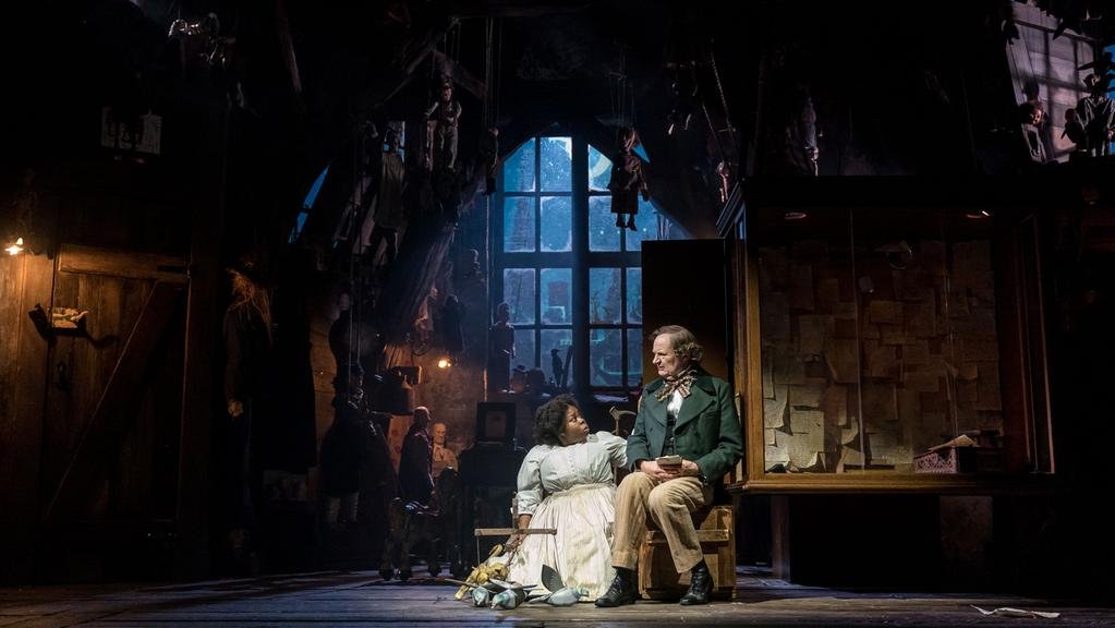 The effect of this was to create a uniquely surreal visual experience and although the script could have been more cohesive, it was a very different and enjoyable theatrical spectacle, a dark stranger than fiction fairytale.ReferencesLepage R, 2006. ‘The perverse side of Hans Christian Andersen’, Guardian newspaper article Accessed on 30/11/2016 at: https://www.theguardian.com/books/2006/jan/18/theatre.classicsOnline reviews, 2018. Accessed on 30/11/2018 at: https://www.whatsonstage.com/london-theatre/news/very-dark-matter-review-round-up-critics-bridge_47880.htmlImagesFeatured banner image copied from the Bridge Theatre website, Accessed on 5/12/2018 at: https://bridgetheatre.co.uk/whats-on/a-very-very-very-dark-matterSet design photograph copied from the Jewish Chronicle website, Accessed on 5/12/2018 at: https://www.thejc.com/culture/theatre/theatre-review-a-very-very-very-dark-matter-1.472020
Viviane Sassen
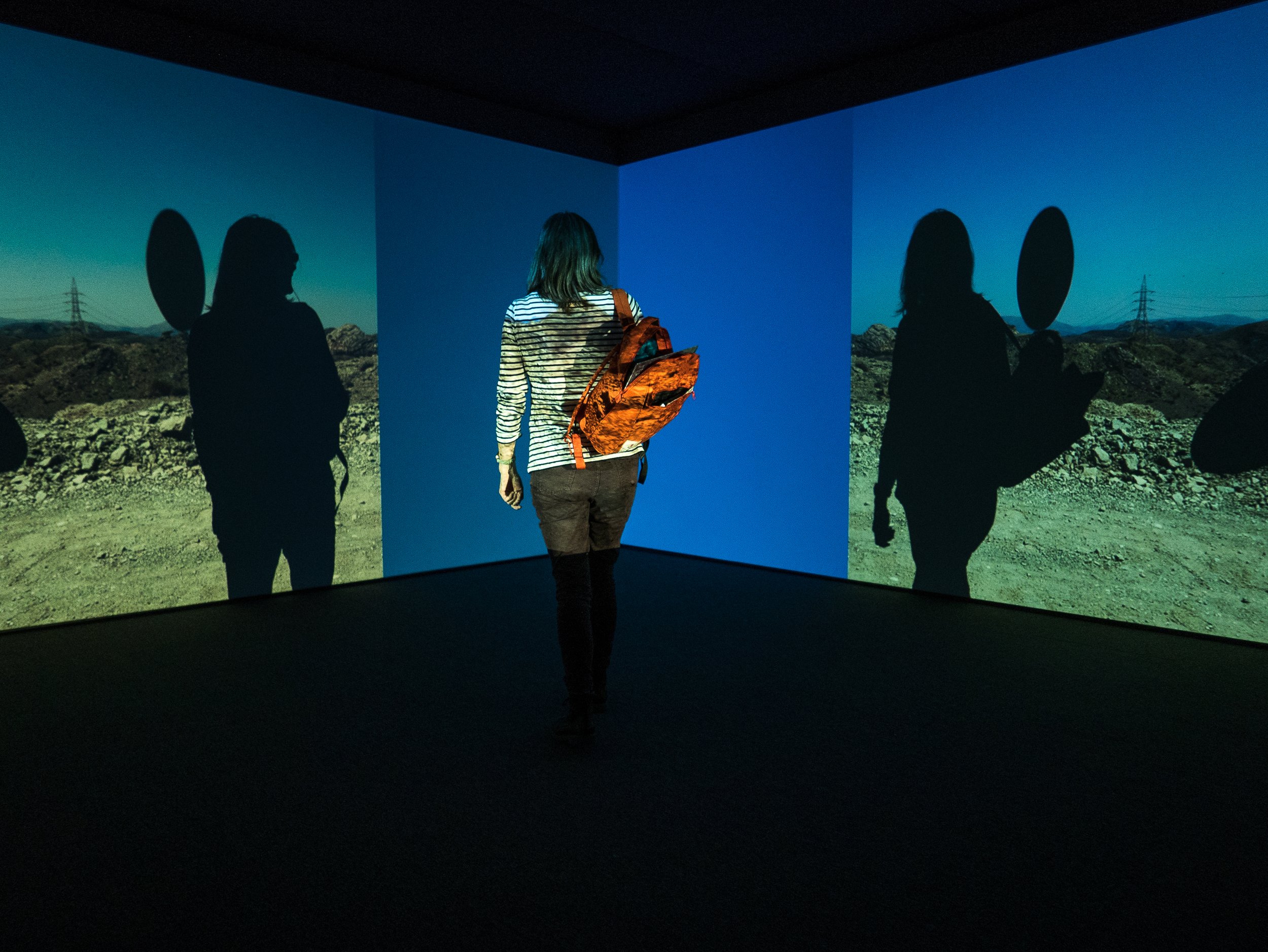
Hepworth Gallery Wakefield, October 2018Also showing contemporaneously with the “Lee Miller and Surrealism in Britain” exhibition at the Hepworth was an exhibition of the work of the Dutch fine art photographer Viviane Sassen and for several reasons, the placement of her work in the adjacent gallery was an inspired curatorial decision. Born in Amsterdam in 1972, Vivienne Sassen initially chose to study fashion and design in Arnhem in 1990 which led to a brief period working as a fashion model while also moving to the other side of the camera to study photography in Utrecht from 1992 until 1996, then back to Arnhem where she completed a Masters degree in fine art in 1998. She has a very successful career as a fashion photographer and although she still lives and works in Amsterdam, she spent several years in her early childhood in East Africa, which subsequently proved to be a major influence on her life and her work, much of which has been made on return visits to Africa as an adult. In an interview for the exhibition catalogue she has explained that although she is now exhibiting mainly her fine art photography, she still derives much of her energy from fashion which has become an outlet for her exuberance. “In fashion I can express my extroverted side; in my more personal work, the introverted side” (Ammerlaan, 2018). In addition to the parallels with the career of Lee Miller, these more personal images often explore the ideas which are commonly associated with Surrealism – dreams, childhood memories, chance associations, eroticism and death. Her work also exploits some of the techniques favoured by the surrealist artists including the use of collage, mixed media, unexpected juxtapositions, disjointed bodies, incongruous colour combinations, mirrors with reflected or refracted light, shadows and on occasions even solarisation. While her books and previous exhibitions of her work have each been based on specific individual projects, on this occasion, working in close collaboration with the curators, the wall mounted photographs have been presented as small groups of images, each consisting of photographs chosen from several different bodies of her work over the last ten years. Through unexpected juxtapositions these individual ‘image poems’ are held together by the themes and motifs which have been features running through her work over this time.The most striking first impression of the images is her use of colour, bright lighting and graphic shapes, drawing on her experience in fashion photography as evident in the quality of her photographic technique, compositional design skills, her ability to work effectively with models and in the presentation of the images . The Hepworth is a gallery designed with large bright open spaces to accommodate the large three-dimensional sculptural works with which it is more often associated. This however also makes it an ideal setting for showcasing her work by giving the groups of wall mounted photographs plenty of ‘room to breathe’. In addition, the middle of the gallery space was occupied by a large white cube which formed the centrepiece (literally) of the exhibition. The exterior of this cube made it appear simply as additional wall space for several further groups of photographs but the interior, accessed by a light-trap door in one corner, was a large square projection room, the innovative design of which is difficult to describe clearly in words alone (hence the attached images).The two walls opposite the entrance to the space were filled by large white projection screens and the images projected onto them consisted of a rolling montage of continually moving high contrast colourful still photographs with graphic shapes, shadows and silhouettes of people, animals or trees and foliage, against backgrounds of desert landscapes, blue skies, urban facades or tarmac roads with lane bright markings. The images projected on the left hand wall flowed across the screen from right to left, while those on the right hand screen were mirror images of the same photographs simultaneously moving from left to right. The resulting appearance this created in that corner of the space was a continuously moving ‘Rorschach effect’ metamorphosis of abstract shapes, patterns and colours. The other two walls in the space were large mirrors, each with a small central aperture for the two projector beams, these mirrors reflecting in focus the continually moving projected images on the opposite walls. The effect for the viewer was further enhanced when on moving into the room they crossed the projector beams, resulting in their own shadows interacting with the shadows and silhouettes in the photographs, such that they effectively became part of the evolving images. (I did say it was difficult to explain in words). The degree of technical precision required to achieve the synchronisation of this installation is itself a major achievement and to combine this with the thought-provoking imagery it produced can only be described as an artistic triumph.My initial interest in visiting this exhibition, in relation to my own work, was stimulated by the little I already knew about her work with shadows on desert sand to create abstract compositions, using mirrors and coloured gels. The complex themes explored in her figurative imagery show that this is the work of a mature, engaged artist and the ground-breaking centrepiece projection installation produced a contemporary surreal experience, which lifted this exhibition to an entirely different level. Although I had previously only associated surrealism with the movement active in the period between the two world wars and into the 1950's, I am now more aware of its lasting influence and continuing relevance to the present time.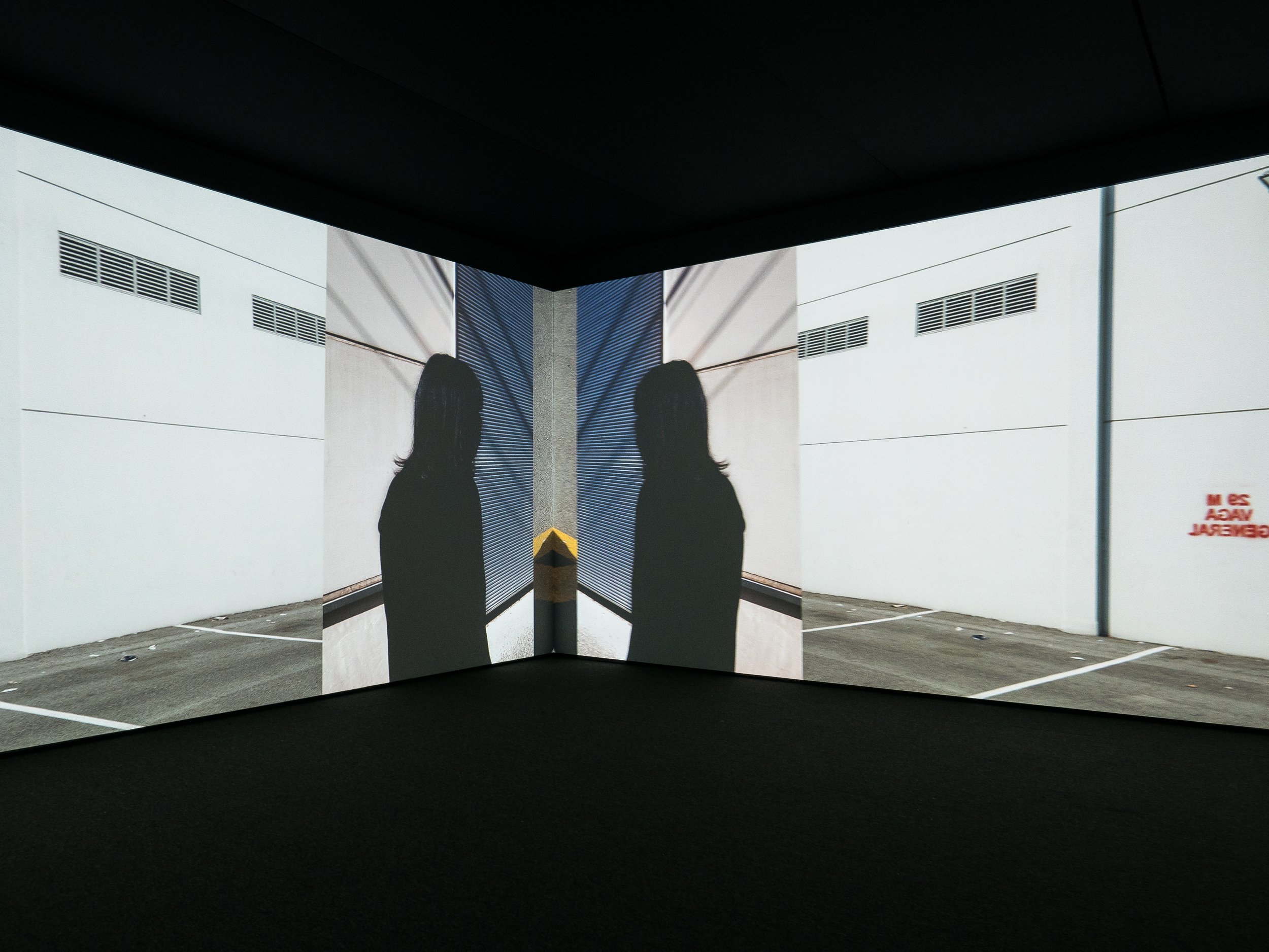
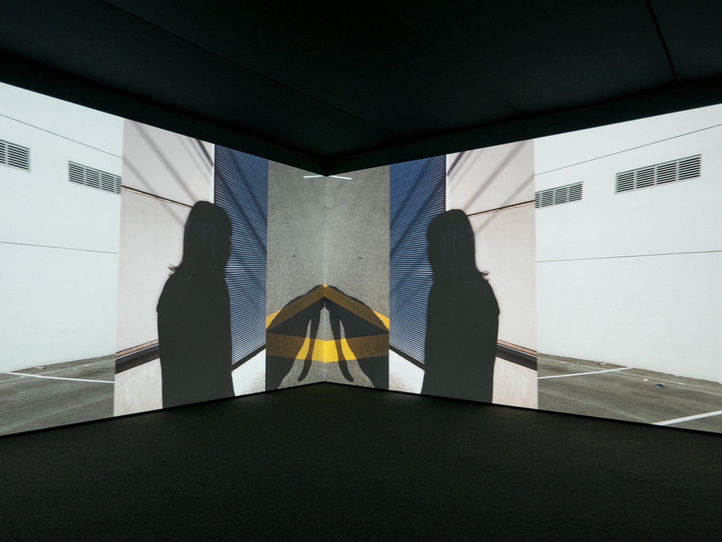
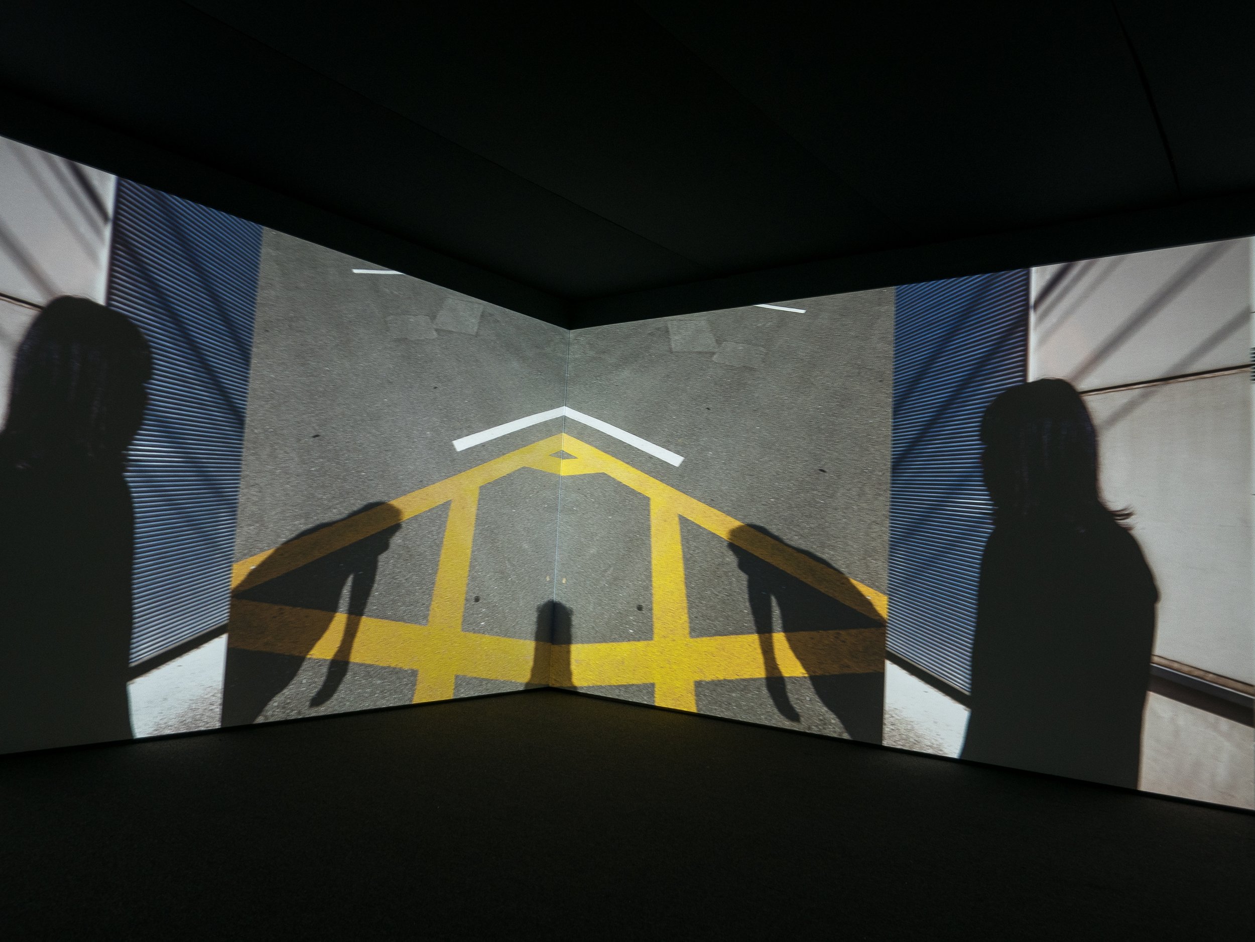
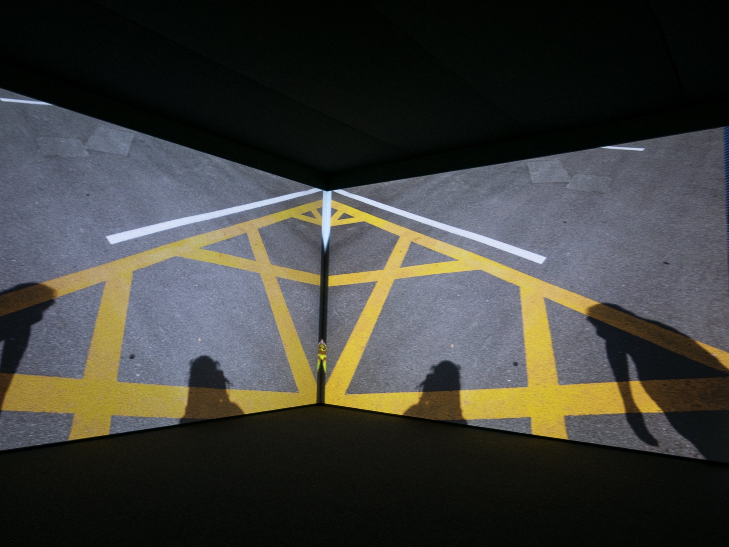
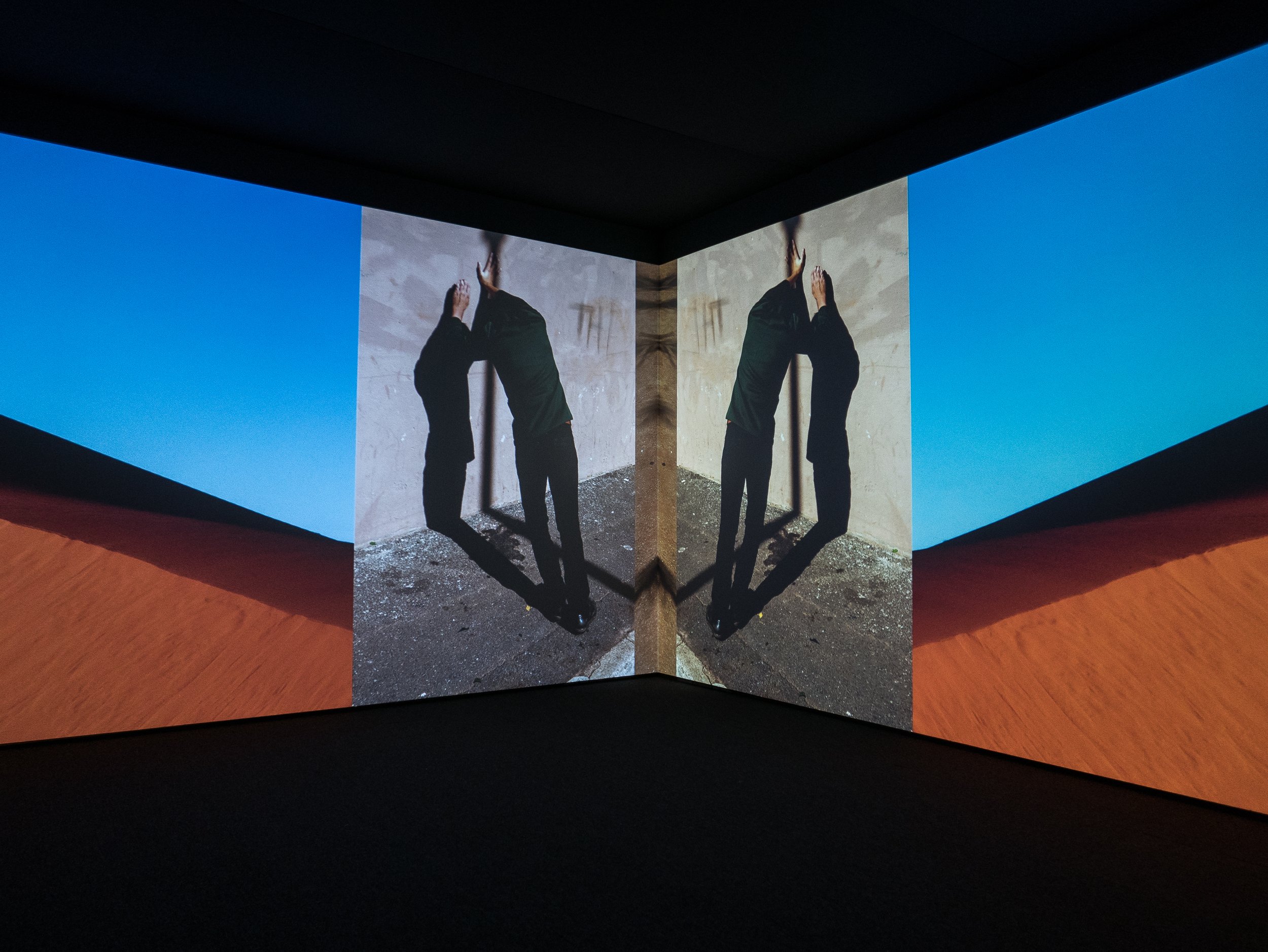
 Ammerlaan R. ‘A Shy Exhibitionist: the Loss and Longing of Viviane Sassen, Photographer and Artist’, In: Hot Mirror Ed. Holtz C., Prestel Verlag, Munich London New York, 2018.https://www.vivianesassen.com/news/https://www.wefolk.com/artists/vivianne-sassen/information
Lee Miller and Surrealism in Britain
Hepworth Gallery Wakefield, October 2018In photography circles the American born photographer Lee Miller (1907-1977) is best known for her work in fashion and war photography and perhaps for Man Ray’s photographs of her while she was his studio assistant/model/muse in Paris from 1929 to 1932. This wide-ranging exhibition explores her less well known role in the evolution and promotion of Surrealist art in Britain, from the 1930’s through to the early 1960’s, using her photographs of many of the active participants in the movement, their work and their exhibitions as well as the photographic work she exhibited alongside them. The works exhibited are a diverse collection of photographs by Lee Miller and artworks by the surrealist artists she knew and collaborated with, in the form of paintings, sculptures, some photographs, mixed media collages, posters, magazines, pamphlets, exhibition catalogues and promotional materials.Lee Miller’s work on show included some formal portraits from her studio in Paris with examples of the solarisation technique she developed along with Man Ray, informal portraits of surrealist artists in various settings, often when they visited the home she set up in England with Roland Penrose, some landscape work from the Mediterranean and Egypt, installation shots of surrealist exhibitions in London, some of her fashion work with Vogue during World War II, some of her wartime photographs on assignment in France, Germany and the holocaust concentration camps as well as the famous photograph of her in the bathtub in Hitler’s apartment in Berlin (by David E Scherman). The surrealist artworks exhibited had all been part of previous exhibitions in England in the years leading up to, during and after the war and included work by Miller herself and (among others) Roland Penrose (her second husband), Man Ray, Max Ernst and Leonora Carrington, Joan Miró, Paul Nash, Yves Tanguy, Salvador Dali, Giorgio de Chirico, Eileen Agar, E.L.T. Mesens, Henry Moore, René Magritte and several other less well known English artists.The exhibition was organised in a series of rooms, with each of these covering separate periods in her career. They were arranged chronologically starting with her time in Paris, moving onto her moving to England, then covering the wartime years and finally, some of her work as a curator in the 1950’s and 1960’s. The overall feel of the exhibition was something akin to that of a history lesson and in that respect, it worked very well. The Lee Miller photographs from Paris, the informal portraits of the artists and the wartime photographs were all powerful images. The examples of studio portraits printed using ‘solarisation’ to create reversal of some of the tones in the images were especially effective and I felt there could have been more of these on show (Man Ray had taken the credit for inventing this effect but Miller later claimed that she had discovered it by chance - when developing a print she transiently switched on the room light after a mouse ran over her foot in his darkroom). While there were several very striking images among the work of the other artists on show, quite a few of them were surprisingly disappointing. The lighting in these galleries was kept quite low, presumably for conservation reasons and many of the paintings, drawings and posters seem to have faded and were quite drab in appearance. They would undoubtedly have been seen as strange, new, sensational, or even shocking when they were first shown but the ability of these surrealist images to astonish appears to have diminished with familiarity and with the passing of time*.Thinking back, a few weeks after visiting the exhibition, I can recall two images which I felt were particularly memorable. The first of these was a small exquisitely delicate painting by Yves Tanguy entitled ‘Imaginary Landscape’ (1933), a panoramic letterbox sized still life presented as a desert scene with several small unusual looking domestic objects and their shadows, similar in appearance to some of Salvador Dali’s more dramatic and fantastical desert landscapes but infinitely more subtle. The second was a pair of photographs by Lee Miller called ‘Untitled (Severed Breast from Radical Surgery in a Place Setting 1 and 2)’ (Paris, 1929). These are photographs of a surgical mastectomy specimen on a plate at a dinner table, with a knife and fork on either side. The first of these shows the skin ellipse and nipple/areola complex (showing evidence of retraction by the cancer) facing upwards and is clearly recognisable as a breast but the second has been placed with the skin facing downwards which in a black and white photograph makes the specimen look like a plate of minced meat. These images conform with the recurring surrealist themes of unexpected juxtaposition of finding unusual objects in everyday settings and depictions of fragmented or distorted body parts but could also indicate that Miller was commenting on the fact that the fragmented bodies often seen in surrealist images (usually by male artists) were almost always female. I am sure this image was felt to be shocking at the time it was made and suspect most people would still be shocked by it. As a retired surgeon who specialised in treating breast cancer patients my reaction is perhaps understandably less typical – rather than shock, I simply felt uneasy, considering how the patient would have felt if she had seen these photographs and the ethical issues of patient confidentiality and respect for her dignity (and I thought I was immune to political correctness).* The gallery did not allow any photographs to be taken in this exhibition space. The featured banner image is a copy of the cover of the catalogue book written for the exhibition, copied from the Hepworth Wakefield website, accessed on 27/10/2018 at: www.hepworthwakefield.org/whats-on/lee-miller-and-surrealism-in-britain/
The first post
This is my first attempt to create a blog which will be used to record the research I will be undertaking in support of my studies for a Bachelor of Arts Honours degree in Photography at Coleg Llandrillo in North Wales. As a complete novice, the first challenge has been to work out how a blog functions and how to then set one up so if you are reading this online, I have at least achieved that. The software packages available are relatively easy to navigate and I watched several 'youtube' videos before starting which varied significantly in quality and in how hard they try to convince you that their approach and to use the discount code they provide to give you a better deal with their preferred site hosting option (and thereby provide them with some income).
The most helpful of them explained the differences between using one of the packages provided by 'Wordpress.com' (with a domain name and hosting by them) or using 'Wordpress.org', the original creators of the software (having sourced a domain name and web hosting from one of the many independent providers e.g. 'Bluehost', 'HostGator' or 'Sitebuilder'). As it has taken me about two hours to get this far, any of the video tutorials which claim to get you up and running in ten minutes need to be taken with a large pinch of salt. I finally opted to use 'Wordpress.com' as although there are limitations with their 'free' package, everything needed is available on the one site. Most of the independent providers do however link directly to 'Wordpress.org' and seem to take you through the process one step at a time with very similar initial set-up costs to the cheapest 'Wordpress.com' package.Getting up and running was initially quite challenging due to the variety of options for customising the appearance of the blog and organising the content but learning to use the Wordpress interface is no different from learning any other software package - it simply requires experimentation and perseverance until a reasonable approximation of the desired appearance is achieved. As the main potential area of interest for my research project are likely to be around the interfaces between analogue and digital imaging technologies (hence the title for the blog), this has been a useful learning experience.
