
It is expected that a competent photographer should be capable of producing carefully exposed, precisely focused, technically perfect images. Learning the skills set required to master the controls of the camera can lead to a fixation on exposure and sharpness, a constant imperative that this must be done 'correctly', which in turn may constrain the development of personal visual expression (Ulrich, 2018). One way of balancing these conflicting processes, arriving at an equipoise between obsession with technique and freedom of expression, could be to concentrate on the basic elements, defined by Angela Faris Belt as constituting the 'grammar of photographic language'; framing and borders, quality of focus (using lenses and apertures to control depth of field), time and motion (determined by shutter speed) and the physical media used to present the final image (Belt, 2008).Patricia Townsend discusses this in her essay in 'Photographers and Research', stressing the importance of being able to respond to all aspects of the medium (camera, processing of film, digital process, printing technique or darkroom equipment), and then listen to what the medium has to 'say'. In the essay, she quotes photographer Liz Rideal as follows: "it's about the happy accident but it's also about recognising something when it's coming to the surface" (Townsend, 2017). The photogram below could be considered as and example of an accidental discovery arising from the challenge of working with colour photographic paper, which being polychromatic has to be handled in complete darkness. I was attempting to produce an image with a single plastic insert, using a seemingly 'simple' makeshift masking technique with scrap cardboard, to make four separate exposures and create a futuristic grid like structure. I gave up when it proved impossible to align the plastic accurately in the dark and the cardboard masks kept slipping between exposures.
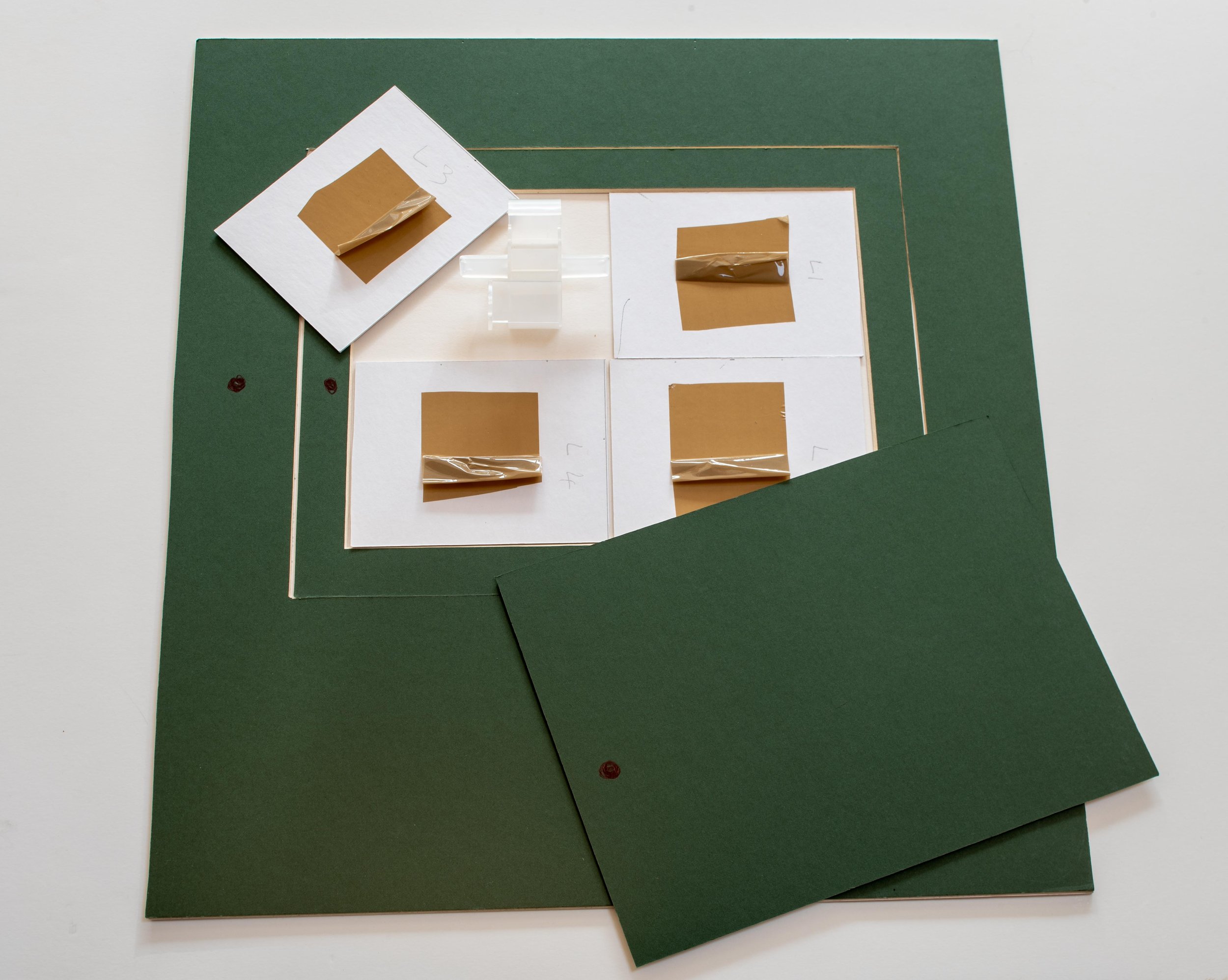 On reviewing the dried prints the following morning, I realised that the randomly overlapping placement of the card and the plastic insert had produced different levels of exposure (particularly in the bottom right hand corner), creating unexpected shapes with different tones of the same colour. The resulting image is almost certainly more interesting, than it would have been if the technique had worked 'correctly' and I now know (roughly) how to repeat the effect.Psychoanalysis has identified that the freedom to be creative is dependent on the ability to enter a state of mind which is similar to that found in children (and adults) engaging in uninhibited play (Winnicott, 1971). Is it possible to create these happy accidents or do we have to keep working, trying to find ways around the limitations of our processes and materials and hope that we can recognise them when they eventually come along?Belt A F (2008). 'The Elements of Photography'. Oxford; Focal Press (Elsevier Inc.), p XIX.Townsend P (2017). 'Between Inner and Outer Worlds'. In: Photographers and Research, ed. Read S and Simmons M; Abingdon, Oxon., Focal Press (Routledge). pp 211-212.Ulrich D (2018). 'Zen Camera'; New York, Watson-Guptill Publications, p 140.Winnicott D W (1971). 'Playing and Reality'. Abingdon, Oxon., Routledge. p 71.
Colour theory - Itten and Albers
Two of the most influential texts on colour theory were written in the 1960's by two men with similar backgrounds but very different approaches to the subject. Both by that stage had recently retired from distinguished teaching careers to concentrate on being working artists, Johannes Itten (1888-1967) having been Director of the Museum of Arts and Crafts in Zurich and Josef Albers (1888 -1976), Chair of The Department of Design at the Yale University School of Art in Connecticut. Both men had strong connections with the Bauhaus School in Weimar Germany. Itten developed and ran the Preliminary Course which was compulsory for all first year students from its inception in 1919 until he fell out with Walter Gropius in 1923 and moved to Berlin to start his own school of design. He moved briefly to the Netherlands in 1938 before returning home to Switzerland later that year (Art Directory Gmbh, 2019). Having enrolled initially in 1920 Albers was the first Bauhaus student to join the teaching faculty as a Master in the glassmaking studio, at the time the school moved to Dessau in 1925. When the National Socialists came to power in Germany in 1933 and the Bauhaus finally closed, he and his wife were invited to establish the inaugural visual arts course at the Black Mountain College in North Carolina (albersfoundation.org, 2019). 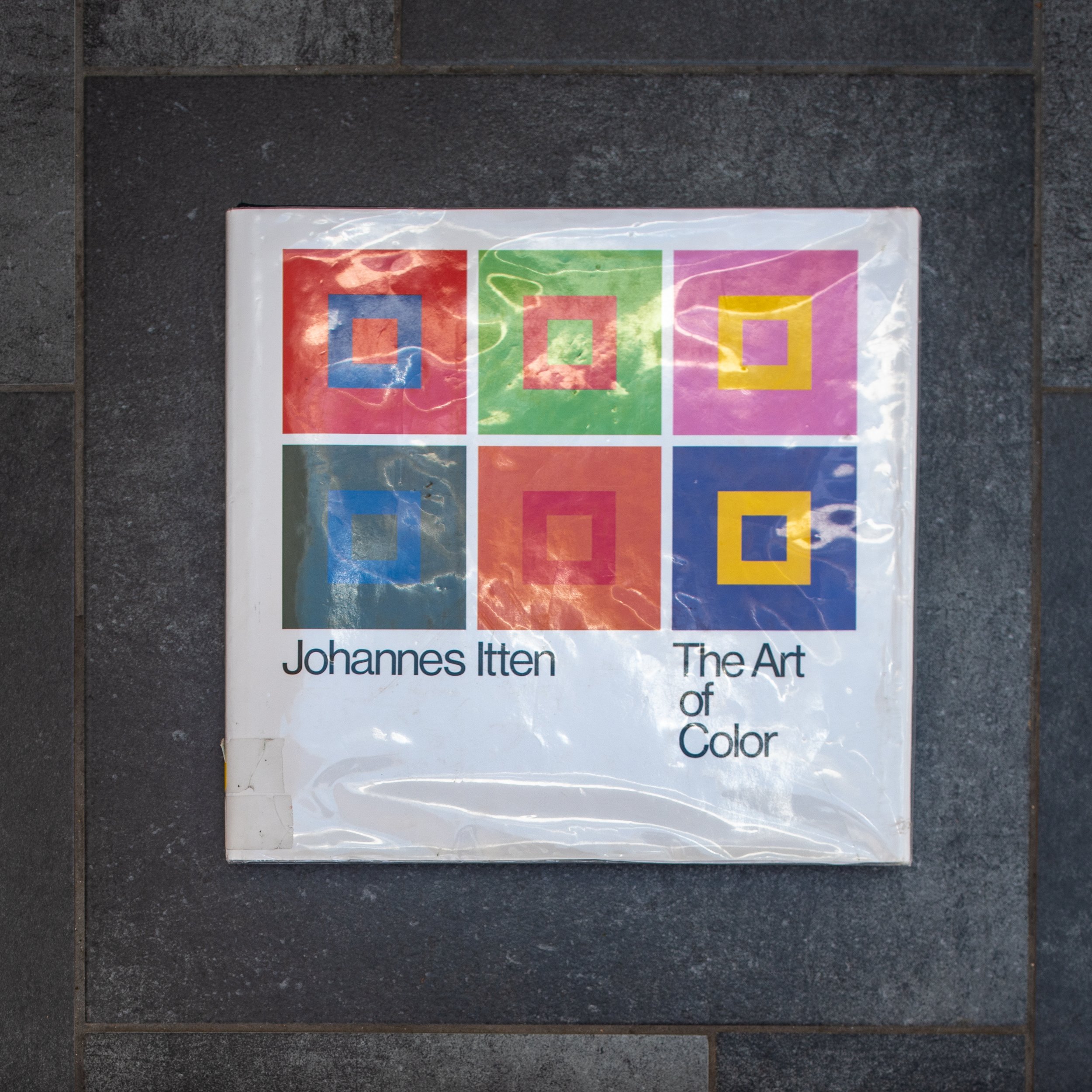 On first impression Art of Color : The subjective experience and objective rationale of color by Johannes Itten has the look and feel of a beautifully illustrated traditional large format textbook. The early chapters explain colour physics, with brief descriptions of the colour spectrum, the light forming wavelengths of electromagnetic radiation which are focused via the optical mechanism of the eye (cornea and lens) to be captured by the photosensitive cells in the retina (the sensor), then transmitted to the optical cortex of the brain to be perceived as a continually refreshed image. Subsequent chapters move on from these objective principles to his own theories (expanding on earlier work by Adolf Holzel with whom he had trained in Stuttgart), which explore how our subjective perception can be influenced by emotional and symbolic factors in combination with the visual interactions of complementary and contrasting colours (bauhaus100.com, 2019). "Color perception is the psycho-physiological reality as distinguished from the physio-chemical reality of color" (Itten, 1963). His explanations of the significance of these phenomena are illustrated by reference to a series of paintings ranging chronologically from eighth century religious paintings, through the work of the European old masters, to the abstract modern art of Klee (a fellow Master in the Bauhaus teaching faculty), Mondrian and Picasso. The book is worth reading for these comprehensive insightful explanations alone.The approach taken by Albers in the more modest looking Interaction of Color is that of a practical course manual for students in a colour theory classroom, presented as a series of exercises using swatches of coloured papers, designed to demonstrate rather than simply describe how interacting colours are perceived. The illustrations linked to each chapter are presented separately from the exercises, the aim being that students should first try to reproduce them for themselves, presumably as a more effective way of learning. Many of the exercises recreate apparent optical illusions (colour deceptions) but in doing so, provide rational explanations for complex phenomena and like Itten, demonstrating that "in visual perception there is a discrepancy between physical fact and psychic effect" (Albers, 1963). His demonstrations of the use of the effect of colour intensity (brightness) to show how an identical swatch of colour is perceived differently depending on the background it is placed against (page 8) and the phenomenon of the after image (page 22) are simple but remarkably effective.
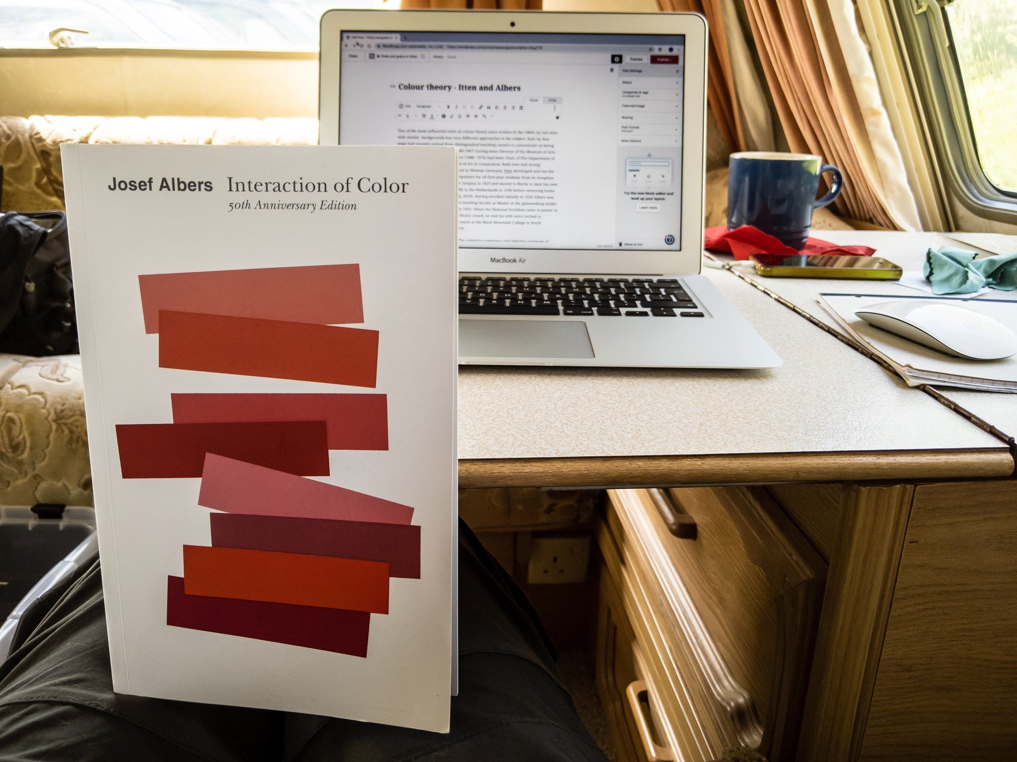 I am working my way through both of these books at present and am only just beginning to get to get to grips with the subject. The featured image below is my digital photograph of a step in a bathroom ceiling which is painted entirely white.
 The colours have been produced through manipulation of the RAW file in Adobe Photoshop Lightroom, simply by accentuating (albeit grossly) the existing colour casts in the image. The sunlit area is warm in tone, producing the primary colour yellow when enhanced, while the tone of the area in shadow is cool forming the complementary blue when accentuated. These casts are barely perceptible in the original photograph and not normally 'seen' by the naked eye as, knowing that the paint is white, our brain 'corrects' this for us. Photographers working in colour, in trying to obtain colours which are true to life, usually correct these casts when they become apparent. This experiment for me suggests that in reality the colours are already there, which would mean that in striving to obtain tones which will be perceived as 'true', we may in fact be perpetrating a deception. Albers J (1963). 'Interaction of Color'. New Haven, Yale University Press. (My edition of this is the Fiftieth Anniversary (4th) Edition of the paperback version, still in print and published in 2013)albersfoundation.org (2019). Josef and Anni Albers biographies. Online, Accessed 27 April, 2019 at: www.albersfoundation.org/artists/biographies/Art Directory Gmbh (2019). Johannes Itten Biography. Online, Accessed 2 May, 2019 at: www.johannes-itten.combauhaus100.com (2019) Johannes Itten. Online, Accessed 2 May 2019 at: https://www.bauhaus100.com/the-bauhaus/people/masters-and-teachers/johannes-itten/Itten J (1973) 'Art of Color : The subjective experience and objective rationale of color'. New York, John Wiley and Sons Inc. (first published in Germany in 1961 by Otto Maier Verlag)

Elucidation or obfuscation: a reflection on academic writing styles.
The ability to adopt an 'academic' style of writing is a recognised requirement for any degree level research report and students soon discover that a good thesaurus is an invaluable tool for finding novel words, with which they can present their thoughts concisely but also precisely. Academic literature could be considered as one of the last remaining bastions protecting our languages from the phenomenon of 'dumbing down'. If a single specific word could replace a phrase or most of a sentence then it seems logical to utilise it. The problem with using relatively obscure terminology is that many people will never have encountered these words and find it necessary to refer to a dictionary to comprehend them. Their resulting perception of an author who uses technical or grandiose language, could generate a sense of frustration sufficient to discourage the reader from continuing any further, which would become counter-productive. The importance of using appropriate language was considered in our tutorial on auto-ethnographic research on 30th November. In writing for other people, if the aim is to explain a complex concept in comprehensive detail, while avoiding unnecessary verbosity, this requirement for clarity but also brevity is potentially contradictory. Slight miscalculation of the perceived intellectual capacity of the intended audience may create a risk that the excessive use of what to some becomes incomprehensible jargon, will to them equate with elitism, designed to preclude their participation. In others, the contrary perception of apparently being talked down to, may generate an equally negative effect. My ambiguous personal views in this respect, derive from my experience as a clinician, guiding patients through complex medical dilemmas, where effective communication was essential. I discovered that it was important to vary the level at which the discussion was pitched to where the individual patient was comfortable but in general, the more complex the issues, the greater the need for less obscure language.While this should not be a dilemma in an academic setting, one consequence of my past experiences is a (possibly irrational) sense of trying to appear to be intellectually ostentatious resulting in a strong desire to avoid this. Resolution of this will entail finding a balance between my compulsive tendency to oversimplification in the form of over-elaborate description and my need to get back into the habit of using appropriately formal academic terminology. Fortunately, I feel that I am developing a better sense of realising this degree of equipoise in the visual language of my photography, hence the featured image chosen as the header for this post.

Progress with colour photograms
Having achieved at least a degree of control over colour filtration settings I have started to explore the potential of the process for making photograms in colour. To reproduce textural details in the images, the materials used need to be at least semi-transparent and the designs in waste plastic and glass food and drink containers from my recycle bin are looking like promising subjects. This has evolved from some earlier monochrome work and I have also photographed the textures in other more dense packaging using digital cameras. As a further strand of the exploration of this issue I have also started photographing rubbish and household goods washed up on beaches or illegally disposed in the countryside, problems which particularly affect coastal, island and rural communities, where access to recycling facilities is relatively limited.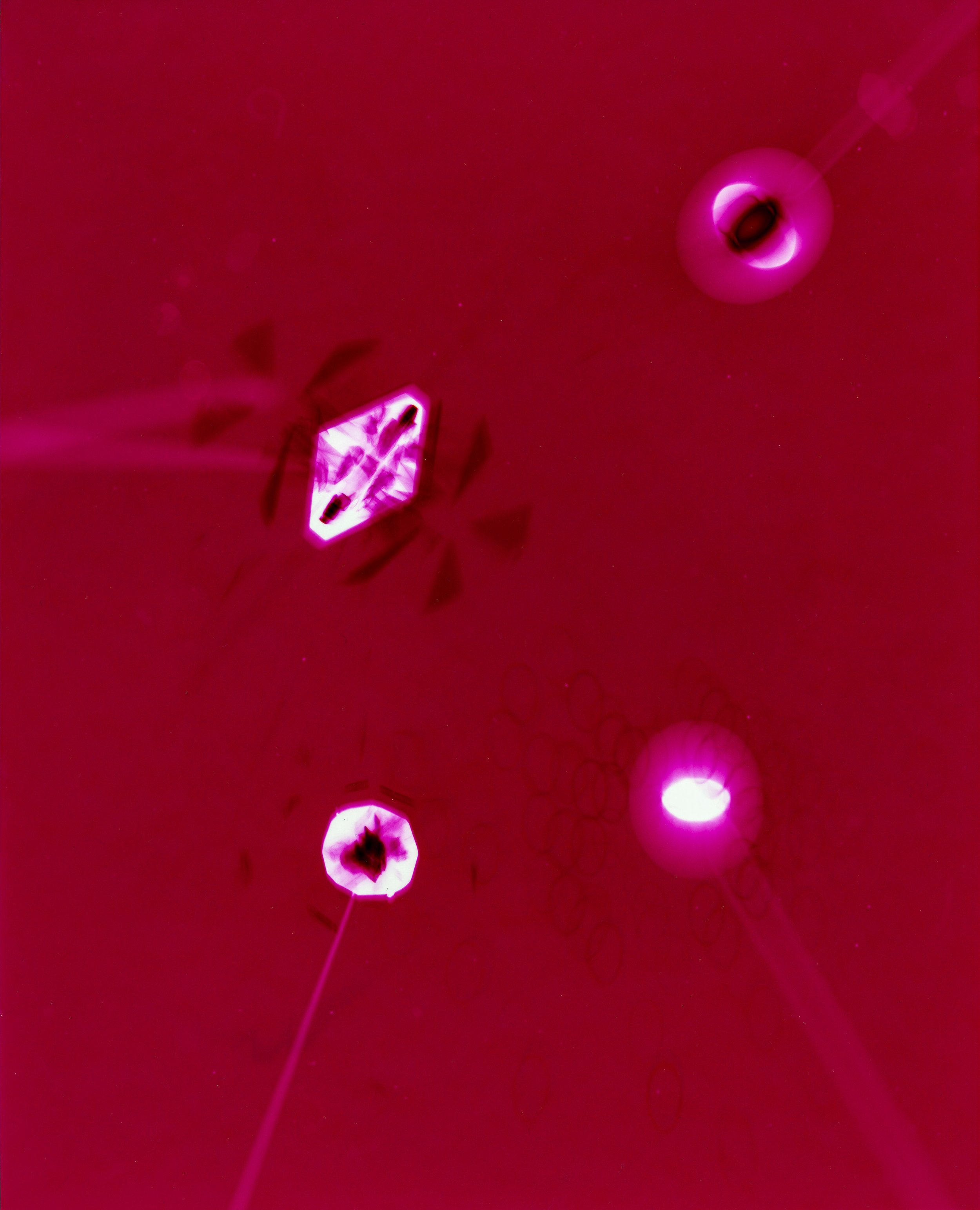 In these images, I have also tried to consider the design elements manufacturers incorporate to improve the effectiveness of the protection the packaging provides as well as making them more aesthetically attractive to potential customers. Although the images have been scanned for inclusion in this post, the original images were all produced using RA4 chemistry with colour photographic papers, sometimes using multiple exposures . The colours in some have been produced entirely by manipulation of the enlarger filters as in the image above but in others, the inherent colour of the materials has also been utilised - the image below was made using a turquoise blue container lid (the process resulting the in reverse complementary colour in the image)
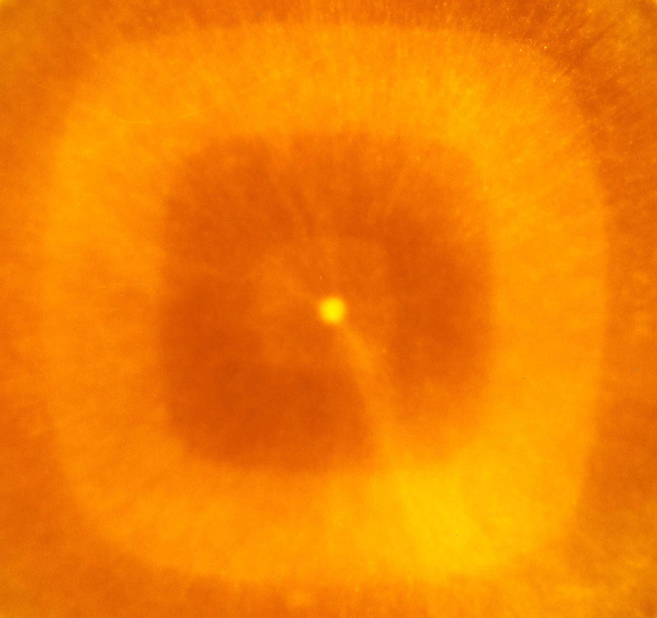 The analogue process used to produce the images could also be considered as a form of 'recycled' technology. Although still in use, the range of colour papers and chemistry is now very limited and most of those available are packaged in quantities for commercial automated machine processors rather than small scale or home use. The range and depth of colour which can be obtained is very encouraging - further experimentation is called for.
All I know is what's on the internet (2)
When down in London in February, I re-visited this exhibition in the Photographers Gallery just before it finished. I had spent relatively little time with the exhibits on my first visit (I had gone to the gallery primarily to see Roman Vishniac's photographs) and was anxious that I was perhaps missing the point of some of the work. The various contributors were all presenting images or artefacts from their ongoing research projects making it very relevant to this module but they were all concentrating on negative aspects of internet culture and I had struggled to find any positive messages. I felt that the issues highlighted were all important, the cynicism of the hardware manufacturers and social media platforms, the blatant deceptions perpetrated by individual and corporate users and even governments and the levels of exploitation of their workforce, potentially affecting any one of us.
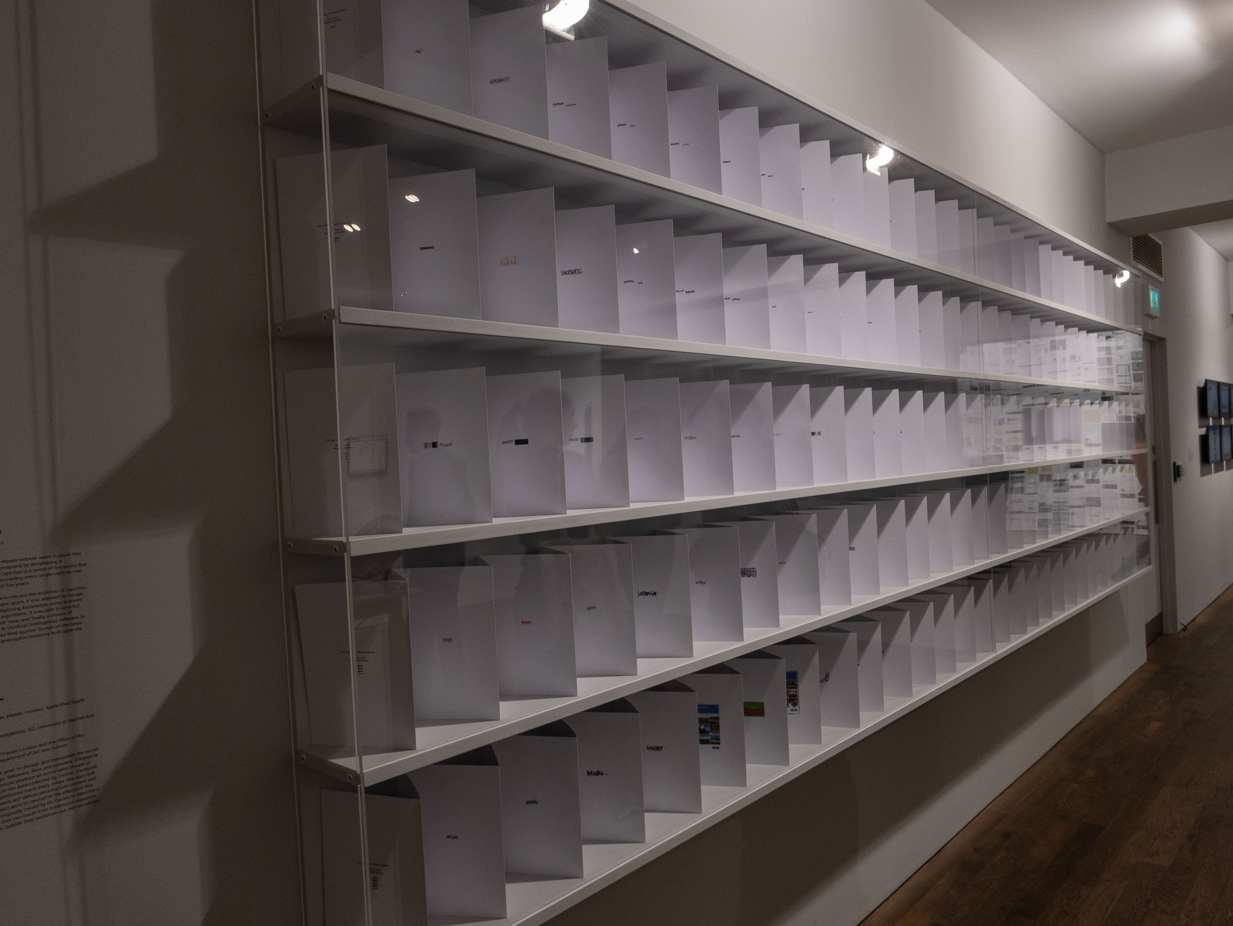 My second visit confirmed this impression and although there were several examples of novel ways of exhibiting work, and some interesting videos by groups experimenting with off grid lifestyles, there was nothing about the benefits of the digital imaging media which many currently enjoy. I initially felt that this was a missed opportunity to explore the democratisation of opportunities to use photography creatively, resulting from the ease of use and access to sophisticated technologies and sources of information but this would have needed a much larger platform and was clearly not the intention of the curators.
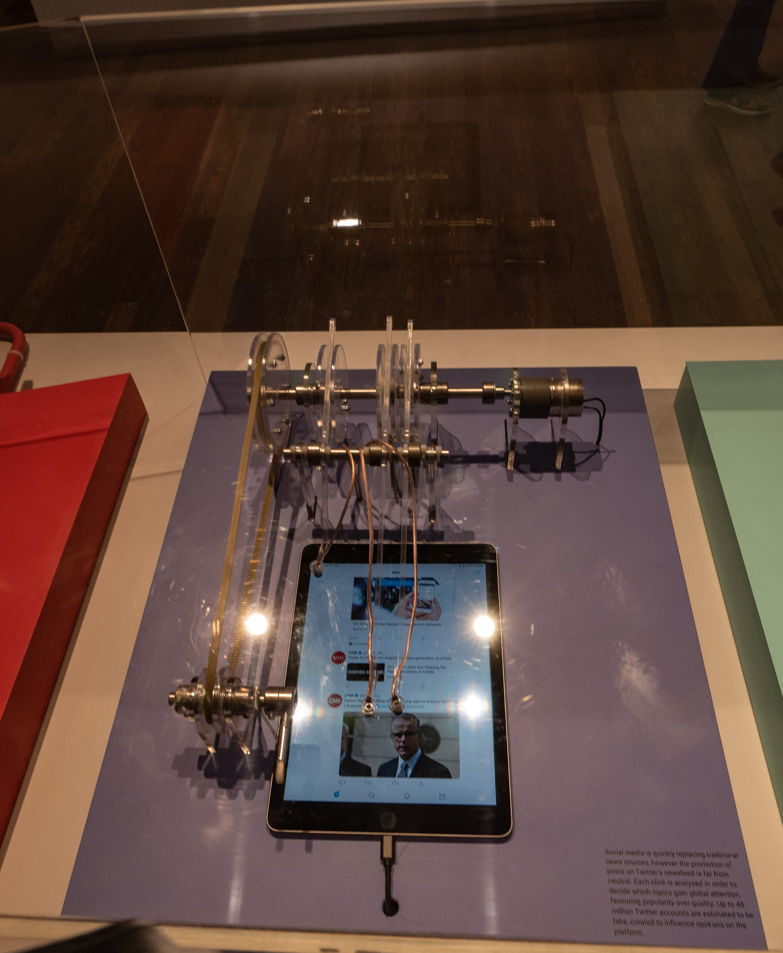
 For photographers, the issues which give rise to imminent concern, online financial fraud, plagiarism or repeated recycling of cliched ideas, the rapid turnover of vast numbers of increasingly homogeneous imagery and the built in obsolescence of expensive digital hardware and software (with the failure of manufacturers to provide continuing support) are all well known but were not specifically addressed by the exhibition. Good research often leads to more questions than answers and this exhibition highlighted several new areas of concern, especially in relation to the practices of the large multi-national companies providing our online services but without offering any immediate solutions. All digital photographs of the exhibits used to illustrate this post captured in situ at the Photographers Gallery, London by the author.Featured Image: Photograph of the exhibit - 'The driver and the cameras' (Google street view camera operators), Emilio Vavarelli 2012.Further information about the exhibitors is available from: www.thephotographersgallery.org.uk/whats-on/exhibition/all-i-know-is-whats-on-the-internet
Anders Pleass : Making and taking pictures - a selective relation between painting and photography.
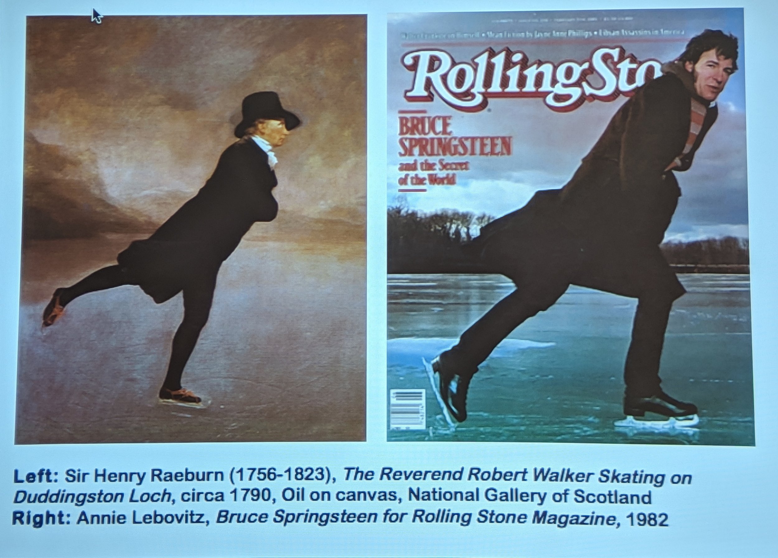
This gallery lecture was delivered by Anders Pleass, at Oriel Colwyn on 28th February, in support of their current exhibition of John Hedley's images of rock formations and trees, which are produced using a combination of digital photography with traditional intaglio printmaking. In a wide-ranging presentation, he described his personal journey from an undergraduate in environmental biology to studying fine art and his attempts to take the lessons from his scientific background into painting, incorporating these in a creative model in developing his 'post-painterly abstraction' techniques for making images. As the slide from his talk used as a featured image for this post shows, he has a detailed knowledge of art history and an ability to recognise when artists (and photographers) reference work from the past when researching their ideas for projects. He described in detail his own research into art theory, significantly influenced by the writings of modernist and post-modernist thinkers, notably the visual art critic Clement Greenberg, the philosopher A. J. Ayer and the novelist and art theorist André Malraux. The artists whose work influenced his practice included Morris Lewis, Ian Davenport, Calum Innes and Bernard Frize but in addition to post-painterly abstraction he studied Systems Theory (Humberto Maturana), Chaos Theory (Edward Norton Lorenz) and comparative embryology, Emergence Theory and more general interests including theatre (especially Shakespeare and the Riddle of the Sphinx from Oedipus Rex).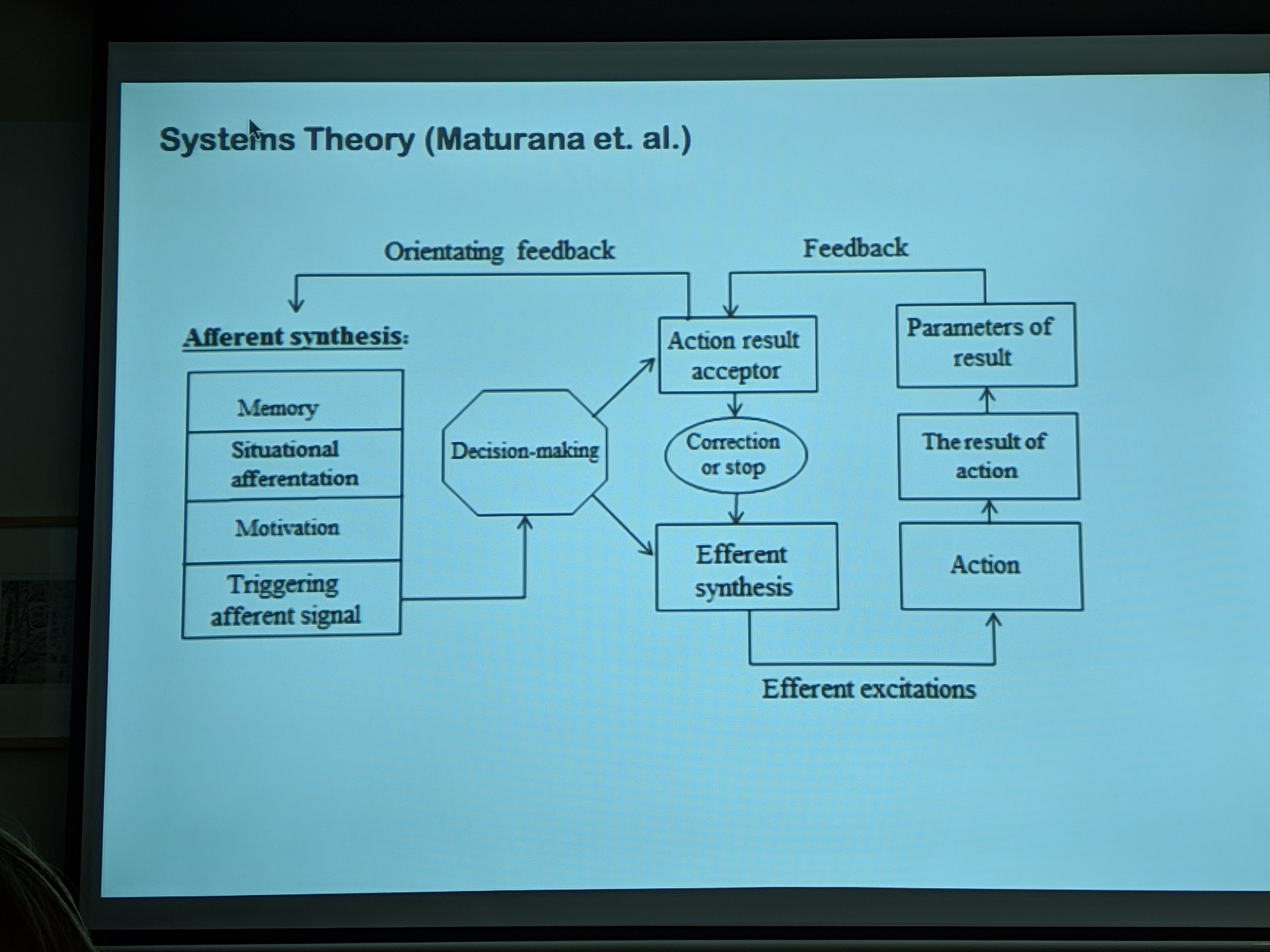 The artist he worked most closely with was Brad Lochore, some of whose large paintings of shadows (which I was previously unaware of) are superficially very similar to a series of photographs I have been making over the last two years. Pleass assisted in the making of these paintings for several years as a painter technician and explained that they were based on photographs which were transcribed onto canvas, section by section using a technique which he described as being almost like 'painting with numbers'.
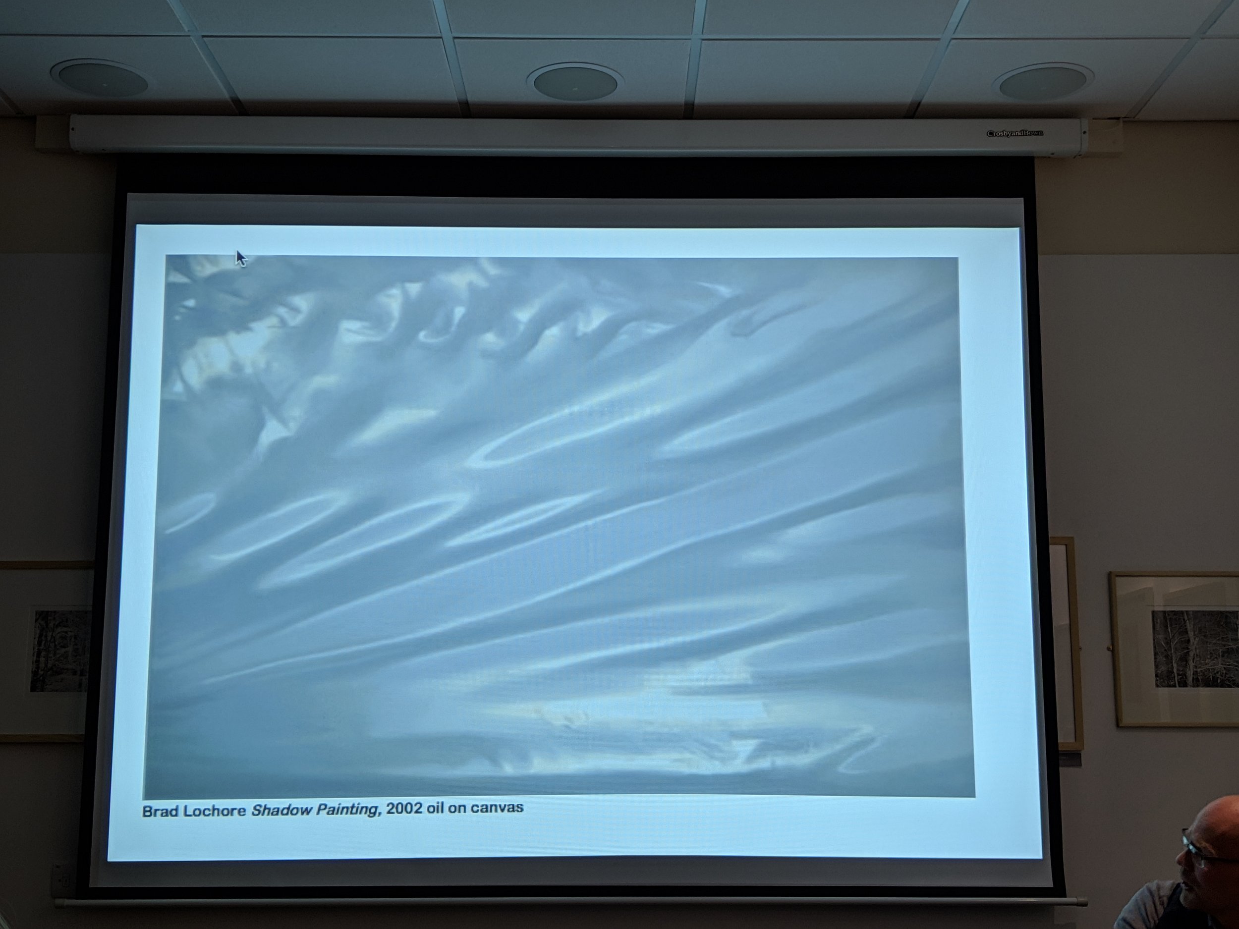 Although his work with Lochore provided an income, he had no artistic input (Lochore never involved him in the creative process or even discussed the images with him) and he went on to talk candidly about the tribulations of trying to establish his own career as an artist and his subsequent transition to his present vocation as a freelance curator. He first met John Hedley in 2014 when they were both teaching in the Arts Department at Coleg Llandrillo and credits Hedley with introducing him to the educational concepts of visual literacy and hermeneutics. He described the working process used by Hedley as 'primordial image formation', images which appear as metamorphoses evolving from the natural world. The two groups of intaglio prints in this exhibition are firstly monochrome images trees in a woodland and secondly the surfaces of rock formations (in Anglesey and Crete). Pleass feels that the real subject of them is 'time', as in ideas of time moving slowly, the timescales of their references to art history and geological time. He also commented on the similarities in some of them to satellite images and aerial photography.My interest in the work and the reason for going to this lecture, was in the process used as an example of a hybrid technique which combining photography with traditional printmaking. While I am still exploring several potential areas for my research project, it will include studying an aspect of the interface between analogue and digital technology (hence the title of my blog). I also have a shared interest in his subject matter having worked with textures in, rock surfaces, tree bark and sand dunes as well as my photographs of shadows, reflected light and paintwork. The additional bonuses of attending this talk were the depth of the contextual background information covered by Pleass and learning about several artists whose work I should now consider. John Hedley is giving his own talk about his working methods in the next few weeks and I hope to be able to get there.

All I know is what's on the internet
This exhibition currently showing at the Photographers' Gallery in London is a study of a group of artists examining several aspects of the effects of digital imaging and online media on the ways in which photography is used in contemporary cultures. The title is a quote from one of Donald Trump's press interviews during the 2016 US presidential election campaign which perhaps reflects the less than positive effects some of the contributors have uncovered in their research. Although the impression is often given that everything that happens on the internet is fully automated, the exhibition looks at the huge workforce required to support the infrastructure of the involved technology companies, service providers, search engines and social media platforms, including among others programmers, online support teams, 'clickworkers', content moderators, people employed to copy books for online publication and google street view camera operators. The issues of manipulation of cultural tastes (the 'like' economy and false social media accounts) and of unequal access to online content in different parts of the world are also explored.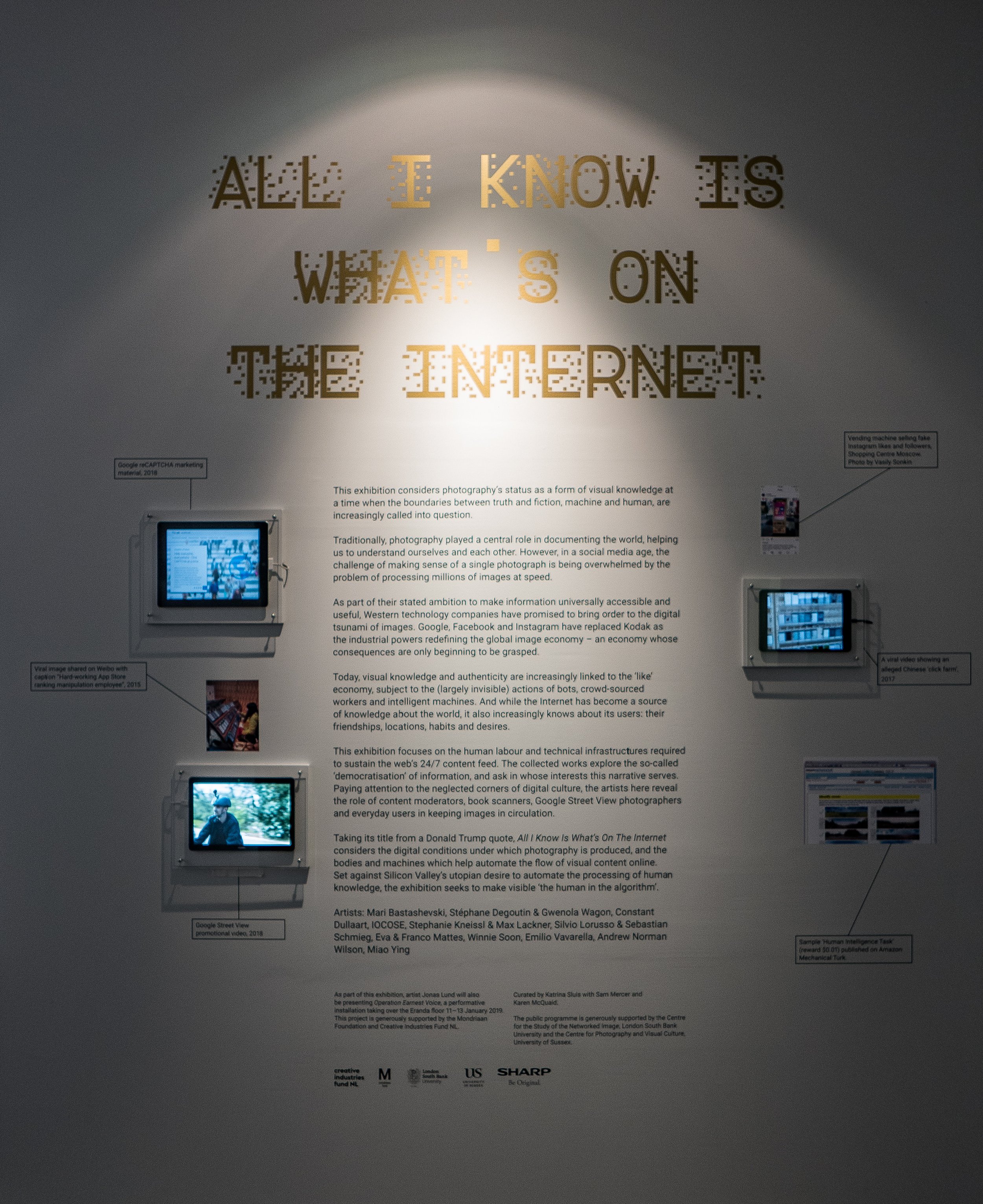 This was not a typical photography exhibition in the sense of the images being visually or aesthetically stimulating but it was certainly thought provoking and there was a lot to take in. The image which left the strongest impression was a mind map produced for the Photographer's Gallery by Mathew Fuller and Olgia Goriunova, exploring the future role of photography which was described as a deliberately 'incomprehensible diagram' based on a Powerpoint slide from a presentation by General Stanley A. McChrystal who was quoted as saying "when we understand that slide we will have won the war"
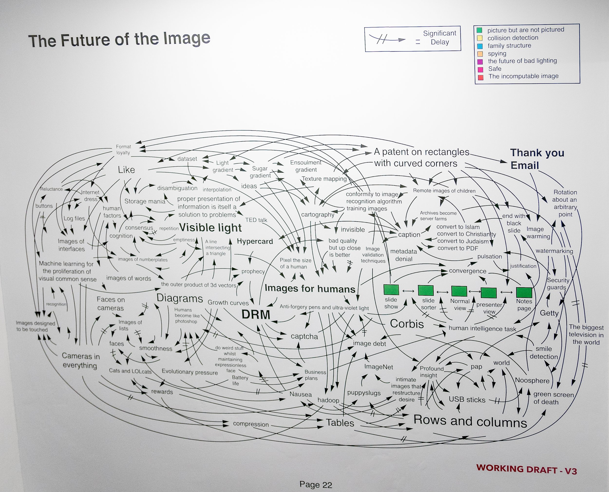 There can be no doubt that the role of still photography is changing rapidly but where it will end up in the future is anybody's guess. I left this exhibition feeling I need to engage more actively with the online world if I am ever going to make any sense of it. Perhaps the exercise of writing this blog will prove to be a good starting point.https://thephotographersgallery.org/whats-on/exhibition/all-i-know-is-whats-on-the-internethttps://thehill.com/blogs/ballot-box/presidential-races/272824-trump-all-i-know-is-whats-on-the-internetPhotographs of the installation used were taken at the exhibition by the blog author.Update 17 Feb 2019 Have recently seen the film 'WhiskyTangoFoxtrot' which was based on the memoir of the American journalist Kim Barker. A copy of the original US Army diagram on which the above image is based appears in a scene set in an army intelligence briefing room.https://www.comingsoon.net/movie/whiskey-tango-foxtrot-2016#/slide/1

A Very Very Very Dark Matter
My son bought us tickets for this new play at the Bridge Theatre on London’s South Bank, because he knew that I had enjoyed the work of the playwright Martin McDonagh (who wrote the film screenplays for ‘In Bruges’ and ‘Three Billboards Outside Ebbing Missouri’). On that basis but knowing little else about it in advance, we expected a story with dark humour, irreverence, subversion and unpredictable plot twists – and it had all of these, at least in parts. The first and third acts starred Johnetta Eulua’Mae Ackles as a Congolese dwarf imprisoned in a locked cage, suspended from the ceiling of an attic in mid-19th century Copenhagen, in which she was forced to write stories for Hans Christian Andersen (played as a pompous overbearing buffoon by Jim Broadbent), who then published them in his own name and who had also cut off her right foot to stop her escaping. The story was explained by an offstage narrator, voiced by Tom Waits (presumably pre-recorded) and centred on the contradictory and ambiguous aspects of the personality of the prolific and highly successful writer of children’s stories, as well as some less well known novels and travelogues. Other issues explored included disability/deformity, racism, colonialism, genocide (by the Belgian Army in the Congo), authorship/plagiarism, repressed but ambiguous sexuality, obsessive but unrequited passion, time-travelling ghosts and a haunted accordion with a concealed machine gun.While this all sounds like a surrealist fantasy (which is what I think it was), it is evident that the author has undertaken a considerable amount of research in preparation for writing the story. Several biographers have referred to Andersen’s unusual personality, based on contemporary accounts and from his own diaries. He had a difficult childhood in which he was abused by strictly religious adoptive parents. He was celibate because of his religious beliefs and never married but became intensely infatuated at various times in his life with individuals of both sexes, none of whom reciprocated his feelings (Lepage, 2006). The second act, set around Charles Dickens’ dining room table, was based on a visit by Andersen to the author’s home in which he bored and irritated Dickens and his family by outstaying his welcome by several weeks. He died in unusual circumstances after falling out of his bed and a small skeleton with the right foot missing, was found in his attic after his death.Press reviews of the play have been at best mixed, with several commenting that the plot was overcomplicated, disjointed, deliberately shocking to the point of being over-sensationalised and some found the humour gratuitously offensive (Online reviews, 2018). It seemed as if the play had been written in a hurry or possibly originally envisaged as a film and I thought the story did at times stray close to the line between an effective piece of ‘theatre of the absurd’ and flippant or frivolous silliness. For me however this was offset greatly by the dark shadowy lighting and the atmospheric set design of the attic by Anna Fleischle, with Gothic arched ceilings, scattered dolls and children’s toys and hanging puppets.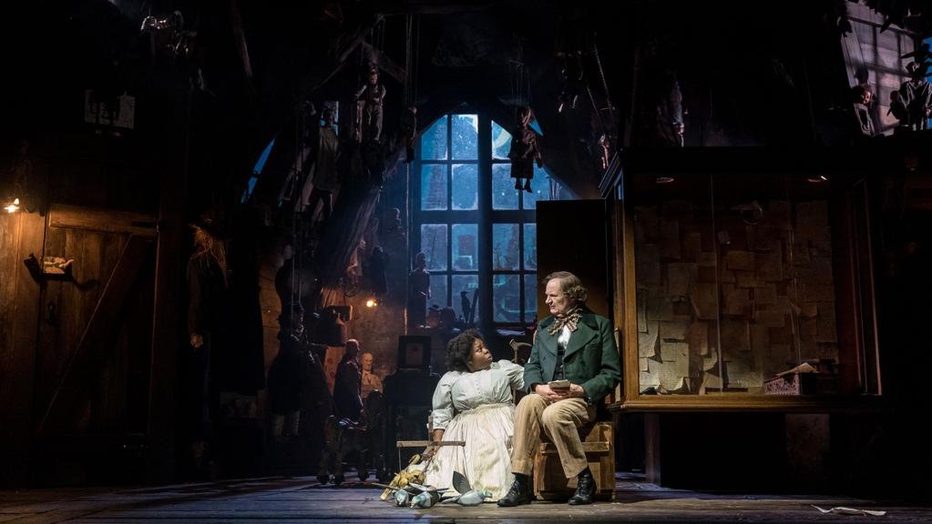 The effect of this was to create a uniquely surreal visual experience and although the script could have been more cohesive, it was a very different and enjoyable theatrical spectacle, a dark stranger than fiction fairytale.ReferencesLepage R, 2006. ‘The perverse side of Hans Christian Andersen’, Guardian newspaper article Accessed on 30/11/2016 at: https://www.theguardian.com/books/2006/jan/18/theatre.classicsOnline reviews, 2018. Accessed on 30/11/2018 at: https://www.whatsonstage.com/london-theatre/news/very-dark-matter-review-round-up-critics-bridge_47880.htmlImagesFeatured banner image copied from the Bridge Theatre website, Accessed on 5/12/2018 at: https://bridgetheatre.co.uk/whats-on/a-very-very-very-dark-matterSet design photograph copied from the Jewish Chronicle website, Accessed on 5/12/2018 at: https://www.thejc.com/culture/theatre/theatre-review-a-very-very-very-dark-matter-1.472020