
The Maison Européenne de la Photographie is a permanent gallery in the Hotel Henault de Cantobre (built in 1706) in the Rue de Fourcy in central Paris. Owned by the city of Paris, it opened as a gallery devoted solely to photography in 1985 and the current director Simon Baker was appointed in 2018, having previously worked as Senior Curator (International Art - Photography) at Tate Modern in London. He has now initiated a programme aiming to cover a diverse range of contemporary photography. The main feature exhibition when I visited in November, was the work of London based photographer Hassan Hajjaj, who had emigrated there with his parents from Larache in Morocco, when he was aged thirteen.This was an extensive exhibition featuring some of his earlier black and white and hand coloured monochrome prints but much of the space was devoted to his large scale almost life size vividly colourful portraits of his friends and colleagues from a wide variety of artistic backgrounds. The other really striking feature drawing from his background was his imaginative use of highly stylised frames featuring tins of food, canned drinks, sauce bottles or bobbins of thread.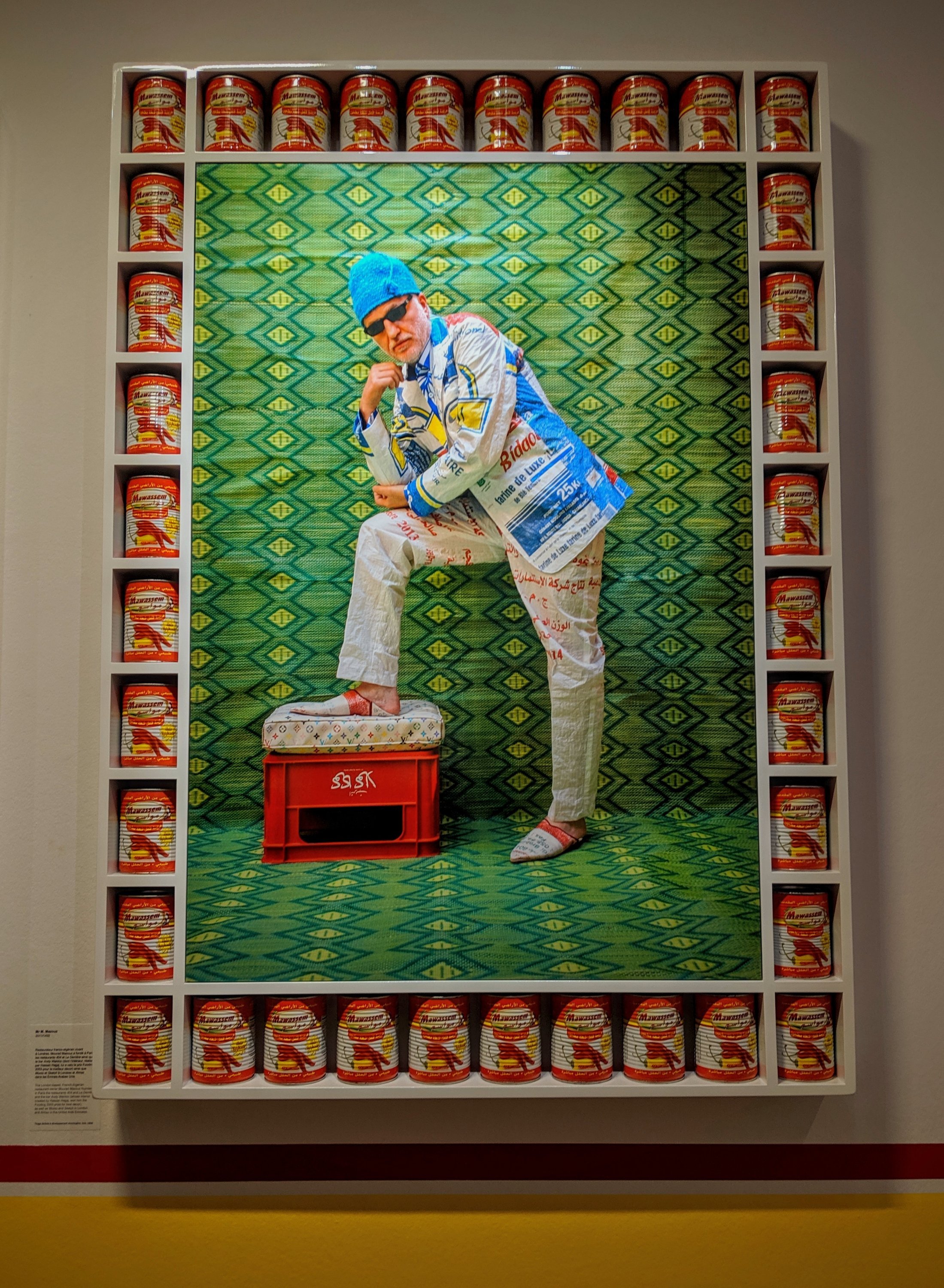
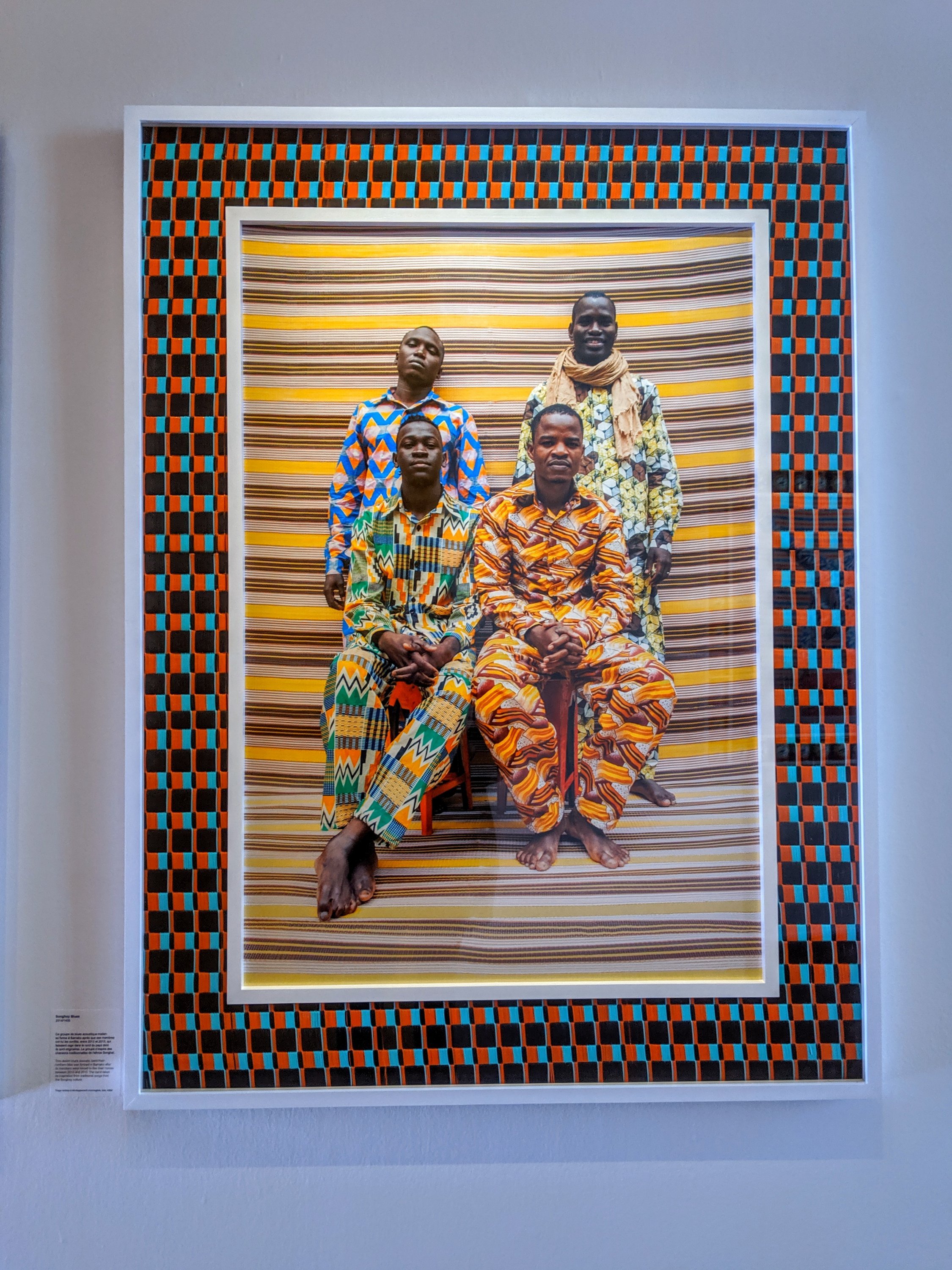 There is a strong thread of ironic humour running through his work but also a real sense of his pride in the communities he works in and his desire to see them represented fairly, in the positive light they deserve. There was a lot of excellent photography to see as running concurrently, the gallery was also showing some work by the female Moroccan photographers Zahrin Kahlo and Lamia Naji, with as a bonus a small selection of monochrome prints in a basement gallery by Malick Sidibé and Seydou Keita (both from Mali).www.mep-fr.orgwww.bjp-online.com/2019/10/hassan-hajjaj/

The World of Roger Ballen
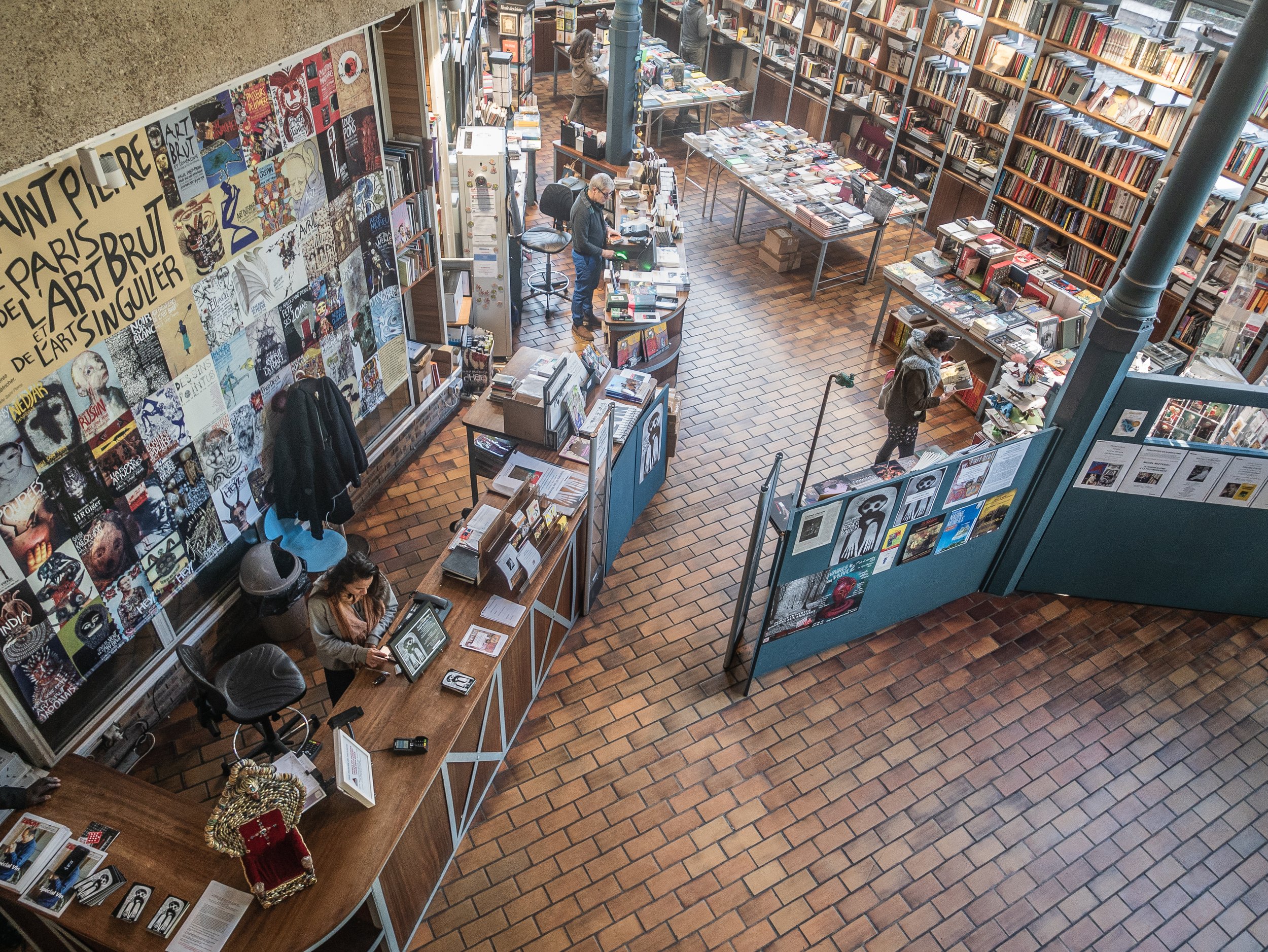 "The World of Roger Ballen" is an exhibition of the work of one of the most innovative contemporary photographers, showing currently and until July 2020 at the Halle St Pierre in Montmartre, Paris. The gallery itself is a light airy space on two levels, the upper galleries being accessed from a balcony overlooking the ground floor cafe and bookshop. It specialises in showing 'Art Brut' or outsider art, makes it particularly appropriate for this work. The current exhibition uses the upper floor for a fairly standard formal presentation of a generous selection Ballen's photographs as large framed prints, with some of his drawings directly on the walls and some of the props used in his work. Downstairs, the gallery contains recreations of several of the spaces he has photographed in the form of a series of vignettes, again using the photographer's own props, models, artworks and even a life sized model of himself with his Rolleiflex on a rotating pedestal. There was also a separate projection room showing a sequence of short films of the places and people he has worked with.
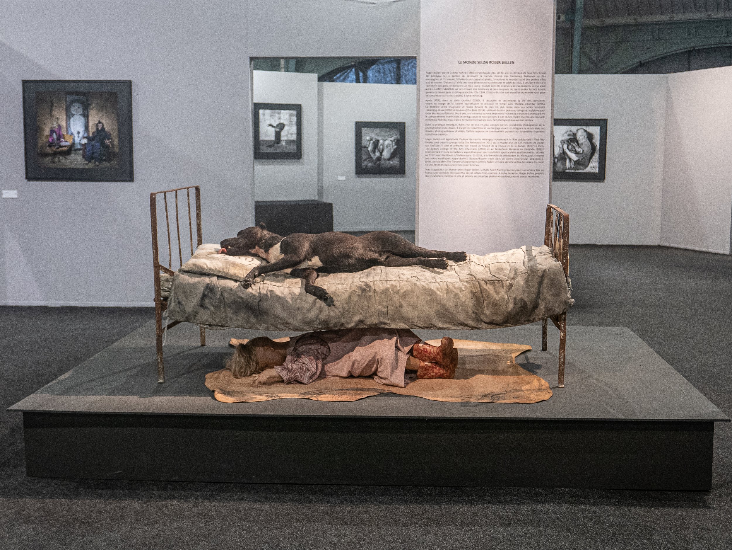
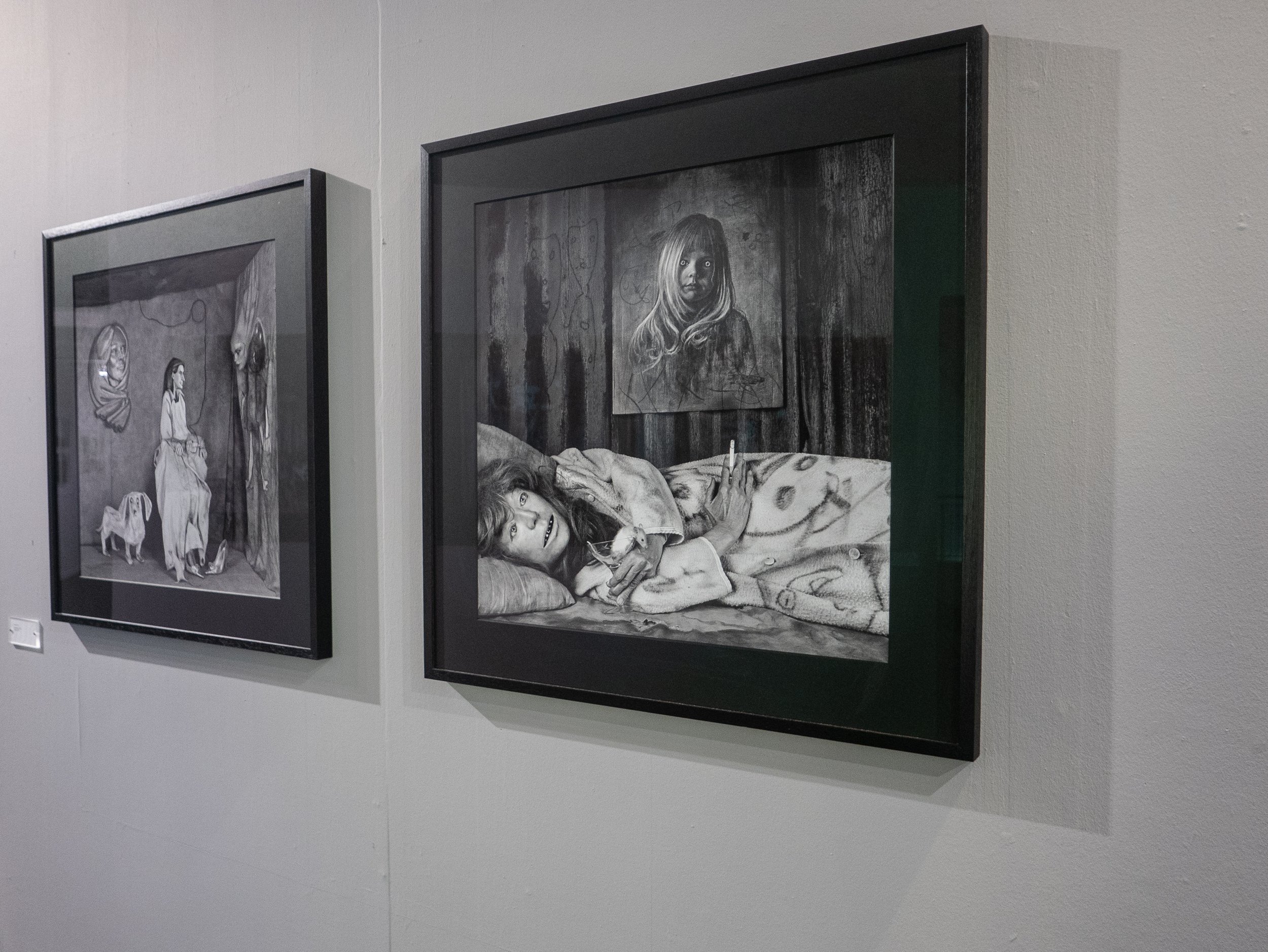
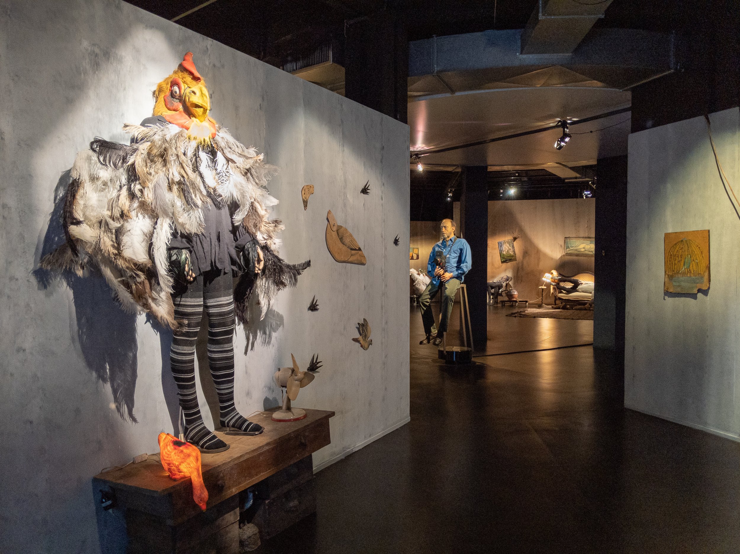
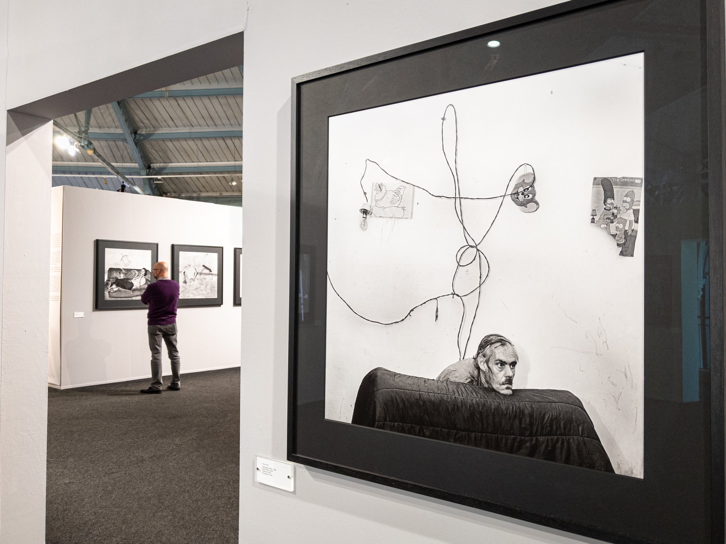
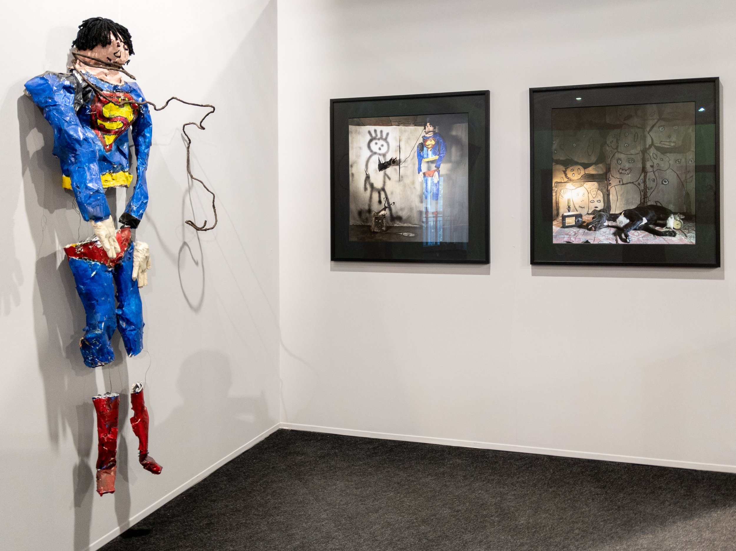
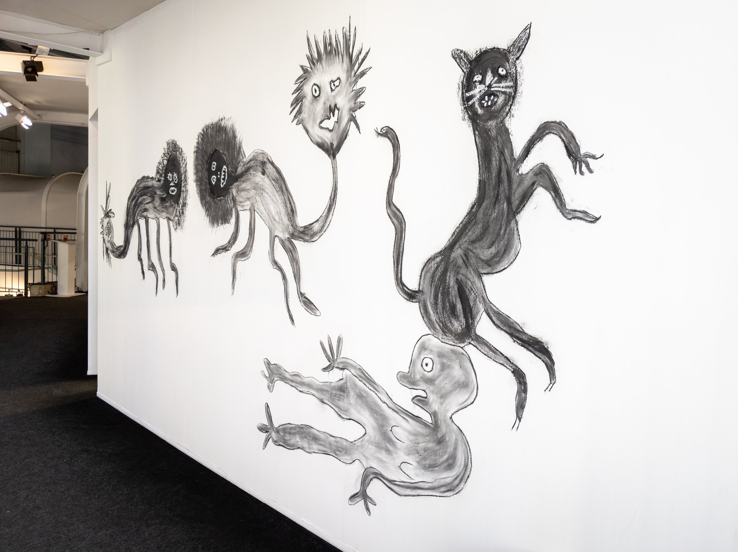
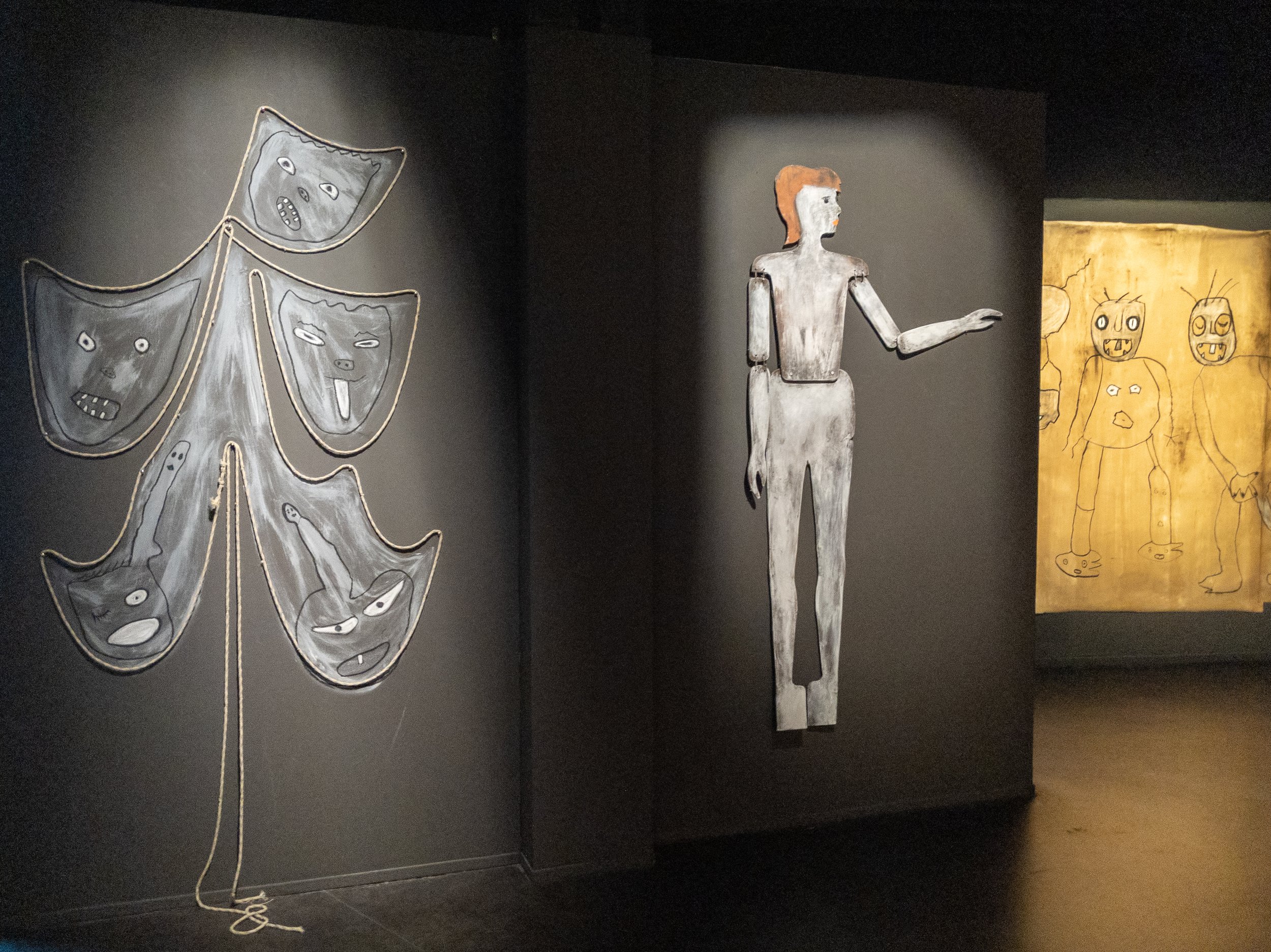


 As can be seen above, the places and people he has photographed would perhaps best be described as being on the very fringes of society and the images are imaginative, darkly humorous, intriguing and sometimes challenging. The films shown at the gallery are also available on his website and perhaps give a better feel for the atmosphere in which his work is created. Ballen has recently been interviewed for the October edition of the British Journal of Photography by Michael Grieve and an interview with him at Paris Photo is also available on their websitewww.rogerballen.comhttps://www.hallesaintpierre.org/wp-content/uploads/2012/01/DP-HSP_Roger-Ballen.pdfGrieve M. 'The World according to Roger Ballen', British Journal of Photography, Issue No.7888, pp 38-49, October 2019.

Colour in the landscape
The recent darkroom experiments with colour photograms have unexpectedly raised my level of awareness of colour when I am out walking with my camera. One of the drawbacks of digital imaging technology is the tendency to produce images with luridly over-saturated colours, either through over-enthusiastic processing by the users or their over-reliance on the software algorithms built in to modern cameras and mobile phones. The prevalence of this particularly in social media platforms has resulted in an expectation that landscapes will be vividly coloured, almost like a re-setting of the expected norm. We all however perceive colours differently and inconsistently - "in visual perception a colour is almost never seen as it really is - as it physically is" - and - "it is necessary to recognise that colour deceives continually", (Albers 1963).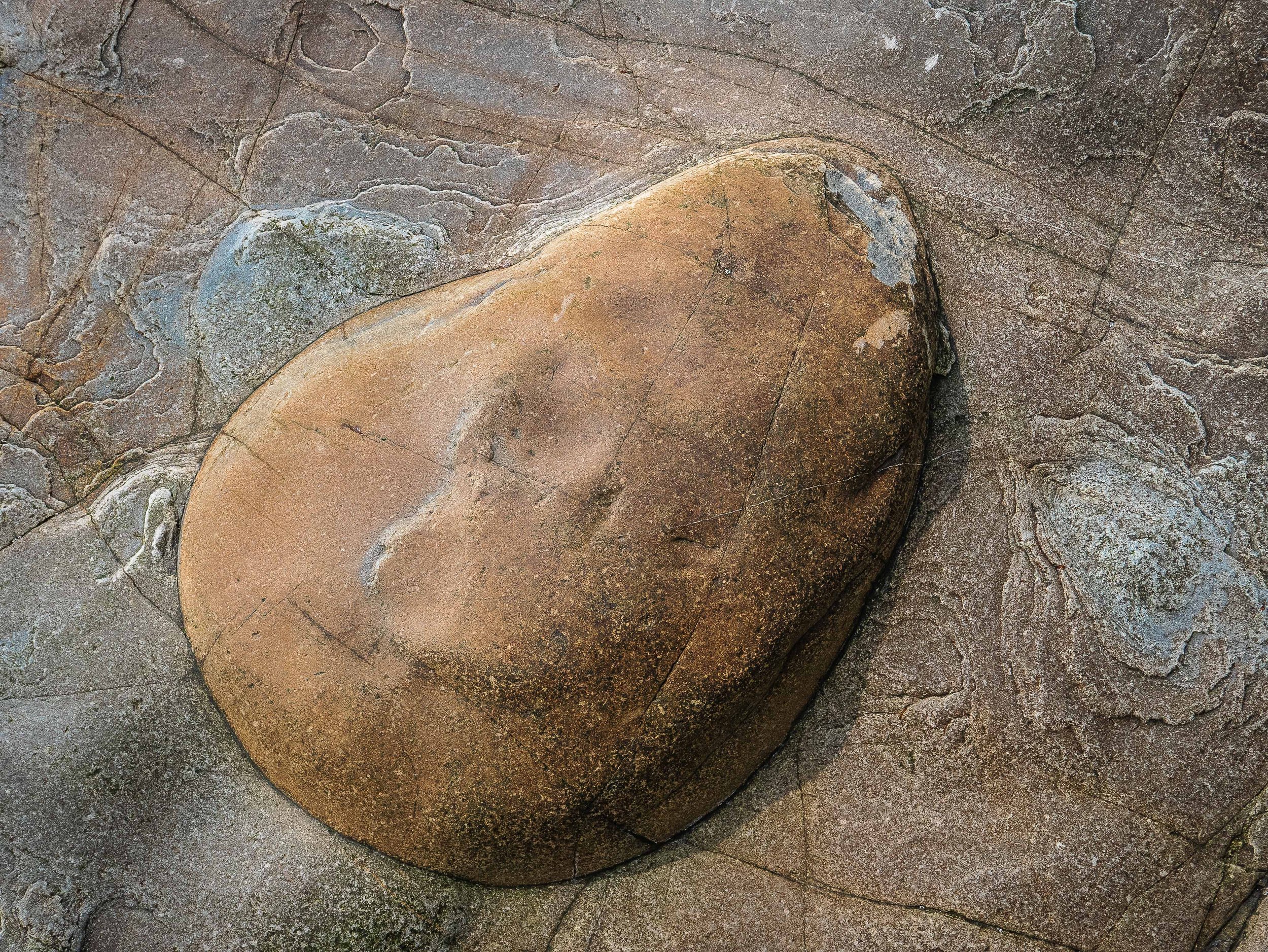 The rock formations photographed for this article are near the Western end of Porth Ceiriad on the Lleyn Peninsula. The colours in life are subtle and muted and I have 'enhanced' them to a point where they are no longer true representations of what I saw but the photographs are now a better representation of their perceived effect when I was there. I doubt if I would previously have treated them in this way but the result feels acceptable, perhaps because the interaction of the almost complementary orange browns and bluish greys remains harmonious. Nobody unless they were there at that time could know the difference but have I sacrificed photographic integrity for a more pleasing aesthetic effect?Albers J (1963). 'Interaction of Color'. New Haven, Yale University Press. p1 (My edition of this is the Fiftieth Anniversary (4th) Edition of the paperback version, still in print and published in 2013).

Progress with colour photograms
Having achieved at least a degree of control over colour filtration settings I have started to explore the potential of the process for making photograms in colour. To reproduce textural details in the images, the materials used need to be at least semi-transparent and the designs in waste plastic and glass food and drink containers from my recycle bin are looking like promising subjects. This has evolved from some earlier monochrome work and I have also photographed the textures in other more dense packaging using digital cameras. As a further strand of the exploration of this issue I have also started photographing rubbish and household goods washed up on beaches or illegally disposed in the countryside, problems which particularly affect coastal, island and rural communities, where access to recycling facilities is relatively limited.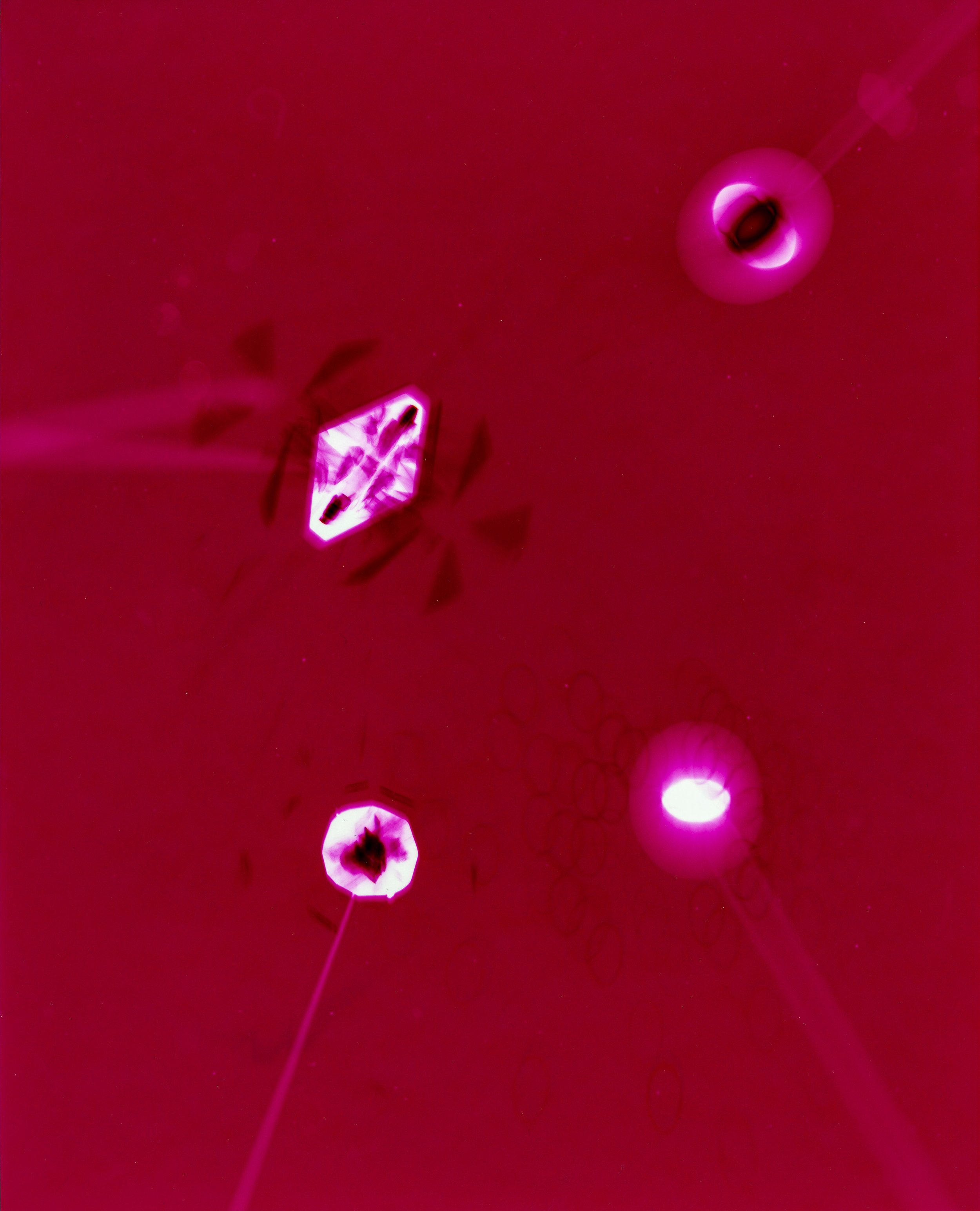 In these images, I have also tried to consider the design elements manufacturers incorporate to improve the effectiveness of the protection the packaging provides as well as making them more aesthetically attractive to potential customers. Although the images have been scanned for inclusion in this post, the original images were all produced using RA4 chemistry with colour photographic papers, sometimes using multiple exposures . The colours in some have been produced entirely by manipulation of the enlarger filters as in the image above but in others, the inherent colour of the materials has also been utilised - the image below was made using a turquoise blue container lid (the process resulting the in reverse complementary colour in the image)
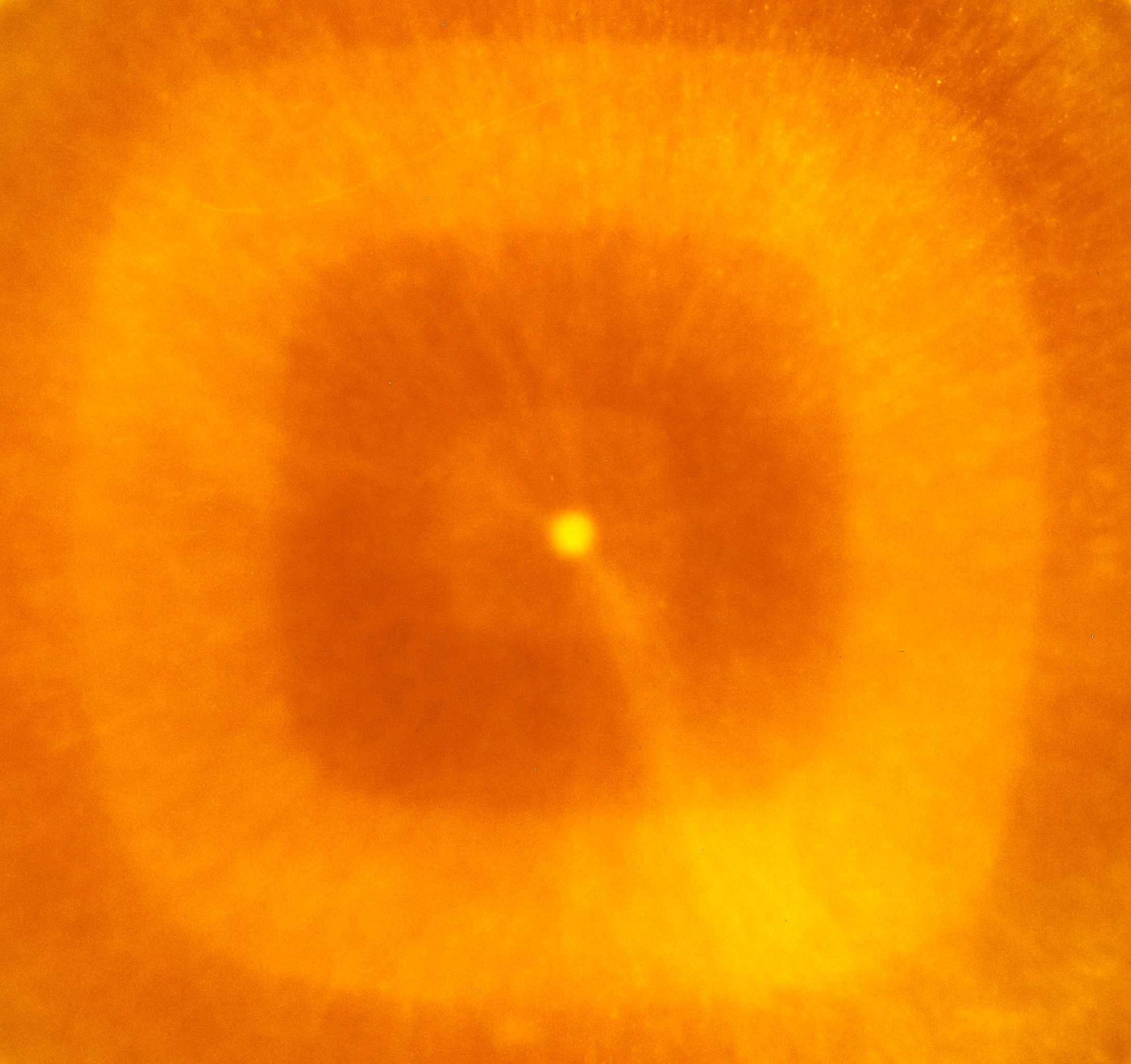 The analogue process used to produce the images could also be considered as a form of 'recycled' technology. Although still in use, the range of colour papers and chemistry is now very limited and most of those available are packaged in quantities for commercial automated machine processors rather than small scale or home use. The range and depth of colour which can be obtained is very encouraging - further experimentation is called for.

Diane Arbus : 'in the beginning'
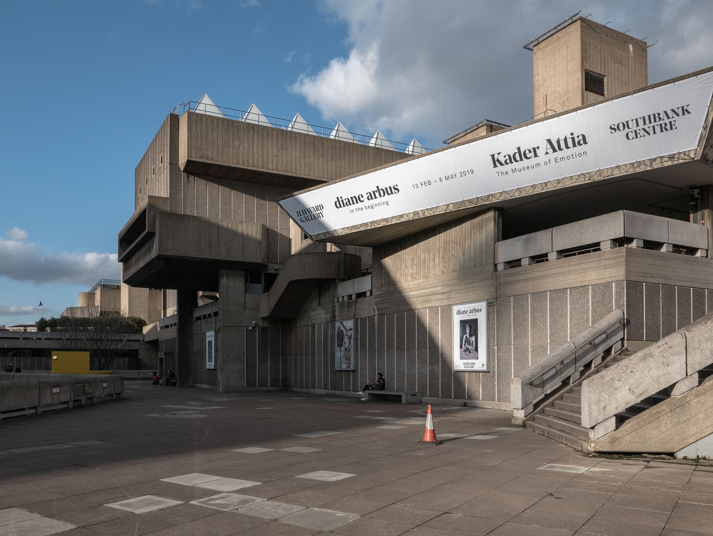 The Hayward gallery in the South Bank Centre in London is currently showing an exhibition of original monochrome analogue photographs made by Diane Arbus (1923-1971) between 1956 and 1962. Although from the age of eighteen, she had worked in fashion and advertising alongside her husband, the actor and photographer Allan Arbus, she did not embark on the work for which she is now well known, until she was in her early thirties. At that time, while she was studying with Lisette Model, she began to make photographs of people she met in the street in and around the less affluent areas of New York City and Coney Island. These images, best described as her early formative work, were made using 35mm film cameras printed at 6 x 9 inches by Arbus herself and two thirds of them have not been shown previously in the U.K.
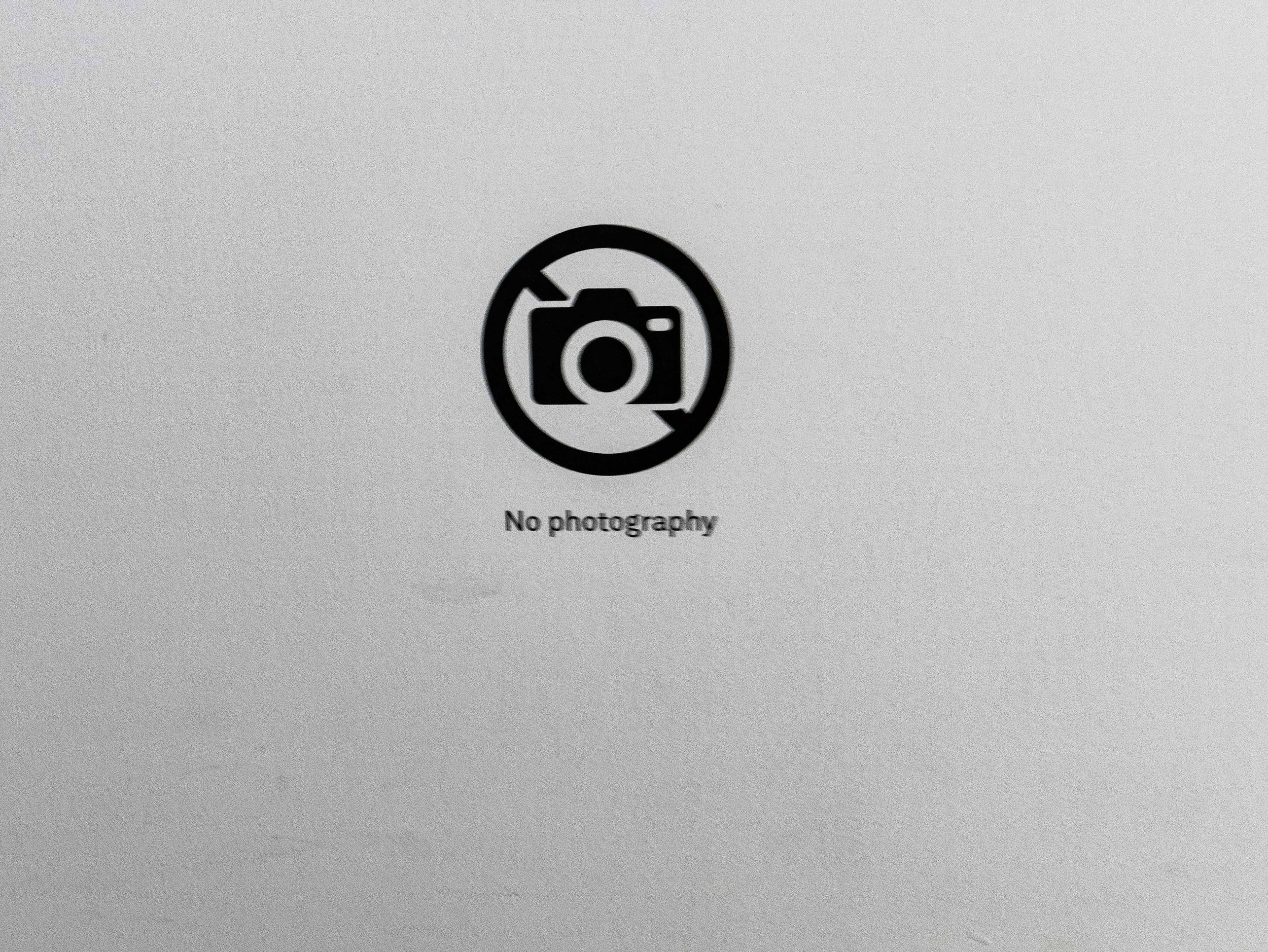 As perhaps expected, the quality of the images does not equate with that of her much better known later medium format photographs but the gallery did not permit photography in this exhibition so I have no available examples to show. There was a small area, separate from the main body of the exhibition, showing a folio of ten of her medium format prints (printed at 20 x 20 inches) and the difference in quality was clearly evident. That said, the earlier photographs explored a wider range of subject matter, informal portraits, street photography, people in fairgrounds or at the beach, cinema and theatre audiences and people through restaurant windows. A few images appeared to be screen shots on television sets and there were some found still lives on wet pavements. Several of the prints showed pronounced grain effects and in some (especially the low-light images) the focus was quite soft but this imparted a degree of freshness or rawness to the work which appeared less planned or staged than her photographs from the mid 1960's onwards. This would be an important collection for anyone studying Diane Arbus, demonstrating the early stages of the evolution of her working practice.
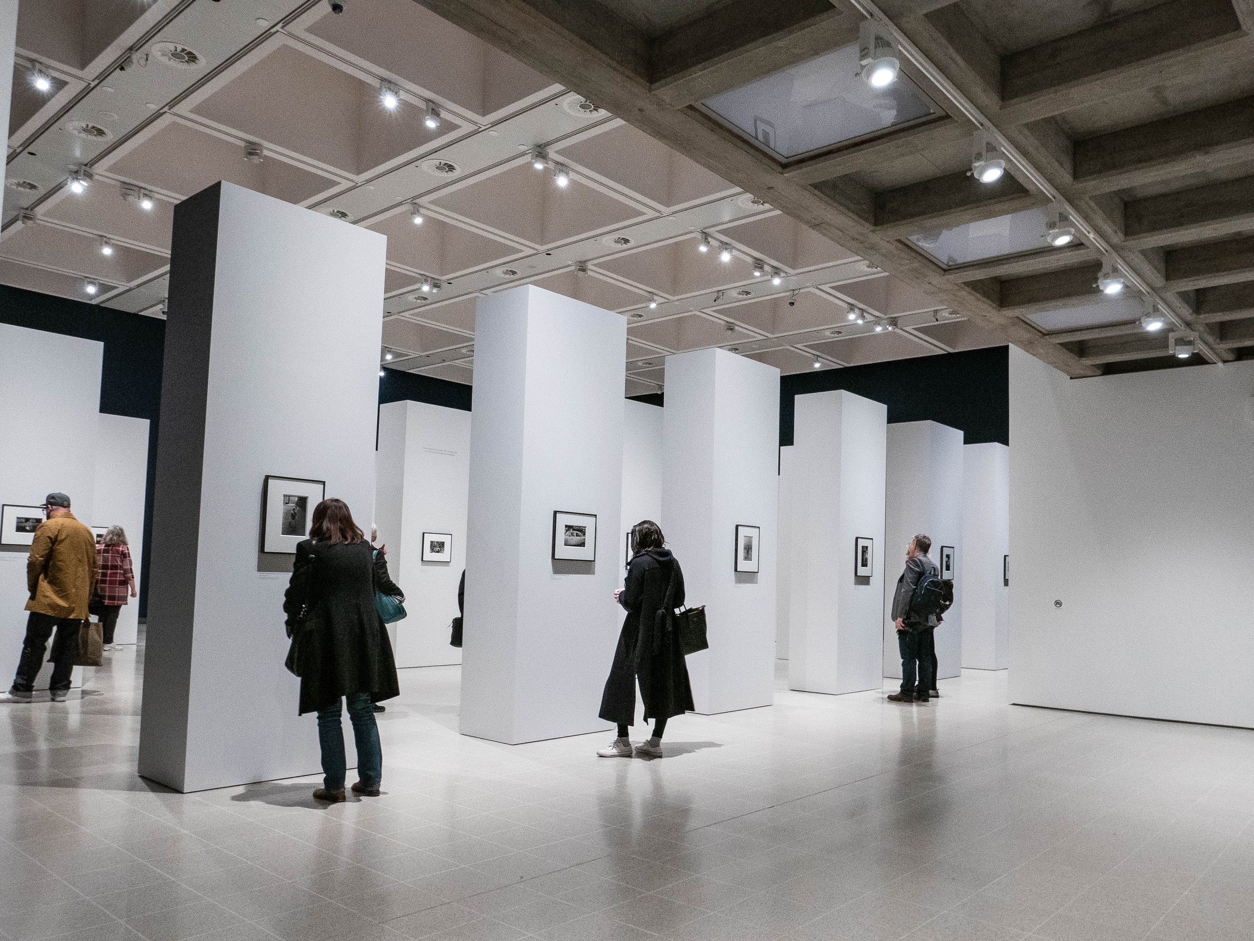 For my own research, perhaps the most striking aspect of this exhibition was the way in which the work was presented (I made the one photograph shown above before I noticed the small 'No Photography' sign on the plain wall on the right of the image). There were no photographs on the perimeter walls of the space, which were painted in a deep rich matt navy blue (almost black) colour. As shown, the main gallery contained about forty evenly spaced free standing pillars painted in matt white with one photograph only on each long side. The prints were traditionally window mounted in dark metallic pewter like frames and the immediate impressions created by the design were of light airiness and opulently high quality minimalist precision, with a hushed atmosphere indicating genuine reverence for the work being presented.Diane Arbus tragically took her own life in 1971 and I think she would have been pleased with this exhibition but although the gallery has gone to great lengths (and expense) to create an impressive setting for the photographs, I felt to an extent that the design almost overwhelmed the actual images, perhaps reinforcing my impression that this was not her best work. In the information at the gallery entrance, the curators explained that the work had not been arranged in any chronological order and that viewers should feel free to find their own route around the gallery at their own pace. This worked well while the gallery was initially quiet but it filled up quite quickly and I was conscious of people around me moving from pillar to pillar in different directions at different speeds to the extent that I felt under pressure to move on, to avoid holding them up. Although many were individually fascinating, the disparate selection of images were placed surprisingly randomly with no obvious attempt to formally sequence them. This could of course have been an attempt to subliminally re-create the feel of the circumstances in which they were created but overall it felt more like a triumph of style over substance.https://www.southbankcentre.co.uk/whats-on/exhibitions/hayward-gallery-art/diane-arbus-beginninghttps://www.biography.com/people/diane-arbus-9187461

A Very Very Very Dark Matter
My son bought us tickets for this new play at the Bridge Theatre on London’s South Bank, because he knew that I had enjoyed the work of the playwright Martin McDonagh (who wrote the film screenplays for ‘In Bruges’ and ‘Three Billboards Outside Ebbing Missouri’). On that basis but knowing little else about it in advance, we expected a story with dark humour, irreverence, subversion and unpredictable plot twists – and it had all of these, at least in parts. The first and third acts starred Johnetta Eulua’Mae Ackles as a Congolese dwarf imprisoned in a locked cage, suspended from the ceiling of an attic in mid-19th century Copenhagen, in which she was forced to write stories for Hans Christian Andersen (played as a pompous overbearing buffoon by Jim Broadbent), who then published them in his own name and who had also cut off her right foot to stop her escaping. The story was explained by an offstage narrator, voiced by Tom Waits (presumably pre-recorded) and centred on the contradictory and ambiguous aspects of the personality of the prolific and highly successful writer of children’s stories, as well as some less well known novels and travelogues. Other issues explored included disability/deformity, racism, colonialism, genocide (by the Belgian Army in the Congo), authorship/plagiarism, repressed but ambiguous sexuality, obsessive but unrequited passion, time-travelling ghosts and a haunted accordion with a concealed machine gun.While this all sounds like a surrealist fantasy (which is what I think it was), it is evident that the author has undertaken a considerable amount of research in preparation for writing the story. Several biographers have referred to Andersen’s unusual personality, based on contemporary accounts and from his own diaries. He had a difficult childhood in which he was abused by strictly religious adoptive parents. He was celibate because of his religious beliefs and never married but became intensely infatuated at various times in his life with individuals of both sexes, none of whom reciprocated his feelings (Lepage, 2006). The second act, set around Charles Dickens’ dining room table, was based on a visit by Andersen to the author’s home in which he bored and irritated Dickens and his family by outstaying his welcome by several weeks. He died in unusual circumstances after falling out of his bed and a small skeleton with the right foot missing, was found in his attic after his death.Press reviews of the play have been at best mixed, with several commenting that the plot was overcomplicated, disjointed, deliberately shocking to the point of being over-sensationalised and some found the humour gratuitously offensive (Online reviews, 2018). It seemed as if the play had been written in a hurry or possibly originally envisaged as a film and I thought the story did at times stray close to the line between an effective piece of ‘theatre of the absurd’ and flippant or frivolous silliness. For me however this was offset greatly by the dark shadowy lighting and the atmospheric set design of the attic by Anna Fleischle, with Gothic arched ceilings, scattered dolls and children’s toys and hanging puppets.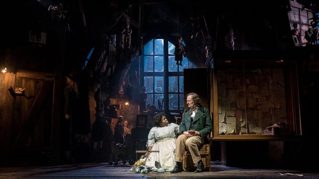 The effect of this was to create a uniquely surreal visual experience and although the script could have been more cohesive, it was a very different and enjoyable theatrical spectacle, a dark stranger than fiction fairytale.ReferencesLepage R, 2006. ‘The perverse side of Hans Christian Andersen’, Guardian newspaper article Accessed on 30/11/2016 at: https://www.theguardian.com/books/2006/jan/18/theatre.classicsOnline reviews, 2018. Accessed on 30/11/2018 at: https://www.whatsonstage.com/london-theatre/news/very-dark-matter-review-round-up-critics-bridge_47880.htmlImagesFeatured banner image copied from the Bridge Theatre website, Accessed on 5/12/2018 at: https://bridgetheatre.co.uk/whats-on/a-very-very-very-dark-matterSet design photograph copied from the Jewish Chronicle website, Accessed on 5/12/2018 at: https://www.thejc.com/culture/theatre/theatre-review-a-very-very-very-dark-matter-1.472020